Python Plotting for Exploratory Data Analysis
The simple graph has brought more information to the data analyst's mind than any other device.
Contents
- Introduction
- Examples
- Bar Chart
- Histogram
- Box Plot
- Scatter Plot
- Time Series
- Scatter Plot with Faceted with Color
- Scatter Plot with Points Sized by Continuous Value
- Scatter Plot Faceted on One Variable
- Scatter Plot Faceted on Two Variables
- Scatter Plot and Regression Line with 95% Confidence Interval Layered
- Smoothed Line Plot and Scatter Plot Layered
- Stacked Bar Chart
- Dodged Bar Chart
- Stacked KDE Plot
- Heatmap
Introduction
As a data scientist, I spend much of my time making simple plots to understand complex data sets (exploratory data analysis) and help others understand them (presentations).
In particular, I make a lot of bar charts (including histograms), line plots (including time series), scatter plots, and density plots from data in Pandas data frames. I often want to facet these on various categorical variables and layer them on a common grid.
Python Plotting Options
Python has many plotting libraries. Matplotlib is the best known, and several others build on it.
"Matplotlib makes easy things easy and hard things possible." It hands you figures, axes, and drawing primitives. You assemble everything above that level yourself: faceting, stacking, density estimation, smoothing. That assembly is what sends analysts to Stack Overflow.
Put the Matplotlib and ggplot2 versions of the two-variable faceted scatter plot below side by side: eighteen lines of subplot bookkeeping against four lines of grammar. If Matplotlib annoys you and you haven't read Effectively Using Matplotlib by Chris Moffitt, go read it.
Matplotlib-Based Libraries
Pandas plotting provides "the basics ... to easily create decent looking plots" from data frames. That is about 70% of what I do day-to-day. It has no faceting, no categorical color mapping, no smoothing, and no heatmap, so six of the examples below have no pandas column.
Seaborn calls itself "statistical data visualization." Its classic interface is a set of named functions (histplot, scatterplot, countplot, lmplot, kdeplot) plus FacetGrid, which I use for faceting more than anything else in the library. It covers every plot below, once you know which function to reach for.
Seaborn 0.12 added seaborn.objects, a second interface built on the grammar of graphics. It composes a plot from marks and statistical transforms instead of dispatching to a named plotting function. The interface has no loess smoother, no regression confidence band, and neither a box-plot nor a rectangle mark, so four of the examples are missing.
"plotnine is a data visualization package for Python based on the grammar of graphics." It tracks ggplot2 closely enough that most R code translates line for line, down to the + for layering. I reach for it when I want ggplot2 semantics without leaving Python.
Interactive Plotting Libraries
These libraries draw in the browser. The examples here are static PNGs, so their tooltips, panning, and linked selection are gone.
"Vega-Altair is a declarative visualization library for Python," built on Vega-Lite. According to Jake Vanderplas, "Declarative visualization lets you think about data and relationships, rather than incidental details." You describe the encoding and Altair chooses the marks, scales, and legend.
"plotly's Python graphing library makes interactive, publication-quality graphs." The examples here use Plotly Express, which the project calls "the recommended starting point for creating most common figures." Express covers most of these plots in one call; the regression and smoothing examples fall back to graph_objects and statsmodels.
JetBrains writes Lets-Plot, which it calls "a faithful port of R's ggplot2 to Python and Kotlin." The claim holds up: most of the examples below are the ggplot2 column with lp. prefixes. Like Altair, it renders to HTML in the notebook.
"Bokeh is a Python library for creating interactive visualizations for modern web browsers." The Bokeh examples below go through hvPlot, which adds an .hvplot accessor to data frames. The accessor echoes the pandas .plot API, so most of these plots are one call plus a few keyword arguments. hvPlot has no regression line or loess smoother, so it is absent from those two examples.
Further Reading
Jake Vanderplas's PyCon 2017 talk The Python Visualization Landscape still explains how these libraries relate to one another, as does Dan Saber's A Dramatic Tour through Python's Data Visualization Landscape (including ggplot and Altair), though both predate several of the libraries here.
Hearty Thank You
Open source developers do most Python plotting development, an (almost) thankless job. I am grateful for the hours they have spent helping me do mine. Please keep it up!
Why all the talk about ggplot?
Before I started using Python, I did most of my data analysis work in R. Like many Pythonistas, I remain a fan of Hadley Wickham's ggplot2, a "grammar of graphics" implementation in R, for exploratory data analysis.
Like scikit-learn for machine learning in Python, ggplot2 has a consistent API and sane defaults. The consistent interface lets me iterate without stopping to think. The sane defaults make it easy to drop plots right into an email or presentation.
ggplot2 makes basic plots (bar, histogram, line, scatter, density, violin) from data frames with faceting and layering by discrete values.
Hadley Wickham and Garrett Grolemund's R for Data Science teaches ggplot2 well.
Humble Rosetta Stone for Visualization in Exploratory Data Analysis
Below is a list of basic plots for exploratory data analysis, each made with as many libraries as time (and library) permit.
I hope it helps you work with what exists today and inspires what gets built next.
Contributing instructions are on GitHub. General feedback or other plot suggestions are welcome.
Data
ggplot2 ships the datasets used below: the Prices of 50,000 round cut diamonds and Fuel economy data from 1999 and 2008 for 38 popular models of car.
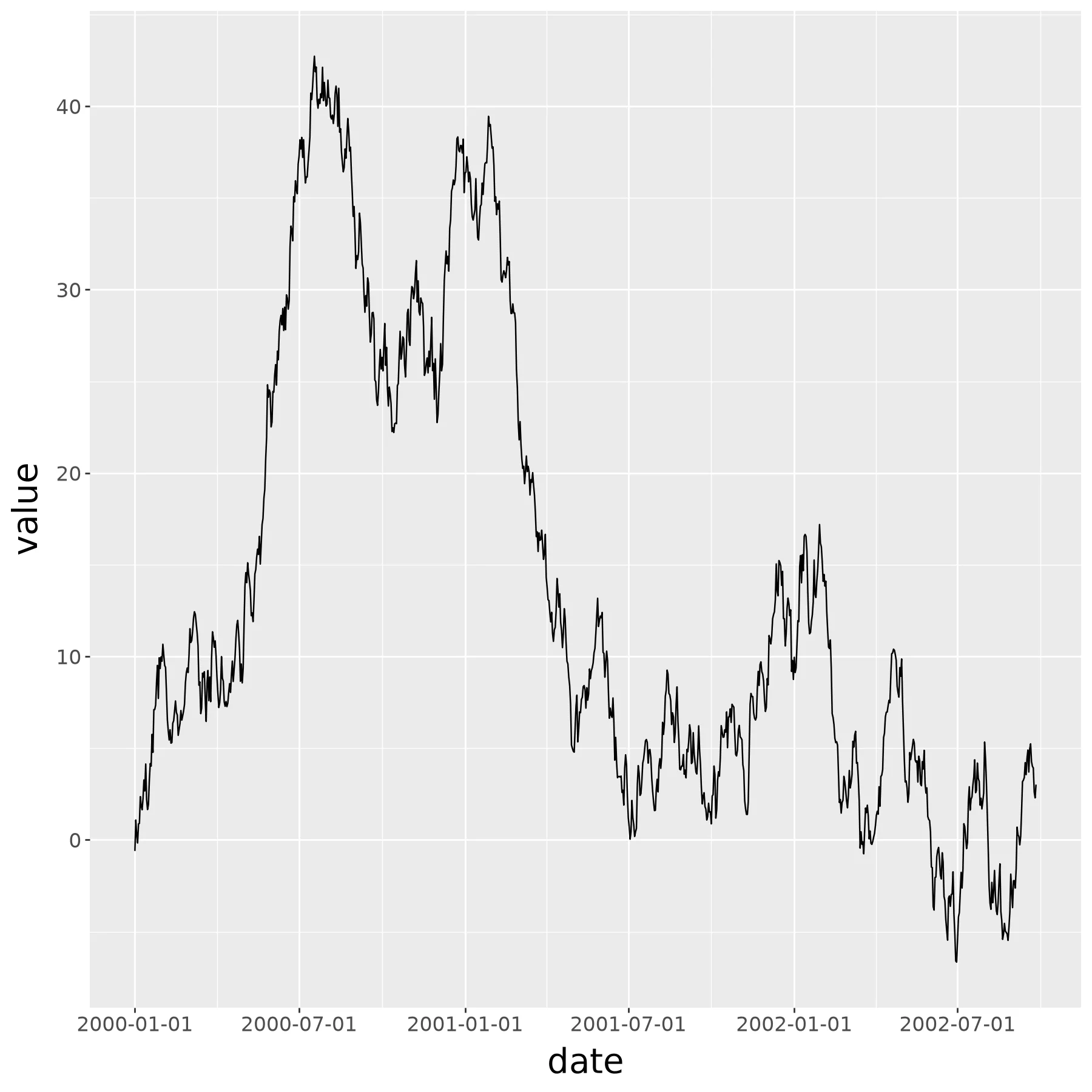
The time series example is a random walk I generate with a quick Python script.
A few rows of each:
ts
| date | value |
|---|---|
| 2000-01-01 | -0.604491 |
| 2000-01-02 | 1.082778 |
| 2000-01-03 | 0.243922 |
| 2000-01-04 | -0.167070 |
| 2000-01-05 | 0.872835 |
mpg
| manufacturer | model | displ | year | cyl | trans | drv | cty | hwy | fl | class |
|---|---|---|---|---|---|---|---|---|---|---|
| audi | a4 | 1.8 | 1999 | 4 | auto(l5) | f | 18 | 29 | p | compact |
| audi | a4 | 1.8 | 1999 | 4 | manual(m5) | f | 21 | 29 | p | compact |
| audi | a4 | 2.0 | 2008 | 4 | manual(m6) | f | 20 | 31 | p | compact |
| audi | a4 | 2.0 | 2008 | 4 | auto(av) | f | 21 | 30 | p | compact |
| audi | a4 | 2.8 | 1999 | 6 | auto(l5) | f | 16 | 26 | p | compact |
diamonds
| carat | cut | color | clarity | depth | table | price | x | y | z |
|---|---|---|---|---|---|---|---|---|---|
| 0.23 | Ideal | E | SI2 | 61.5 | 55.0 | 326 | 3.95 | 3.98 | 2.43 |
| 0.21 | Premium | E | SI1 | 59.8 | 61.0 | 326 | 3.89 | 3.84 | 2.31 |
| 0.23 | Good | E | VS1 | 56.9 | 65.0 | 327 | 4.05 | 4.07 | 2.31 |
| 0.29 | Premium | I | VS2 | 62.4 | 58.0 | 334 | 4.20 | 4.23 | 2.63 |
| 0.31 | Good | J | SI2 | 63.3 | 58.0 | 335 | 4.34 | 4.35 | 2.75 |
Bar Chart#
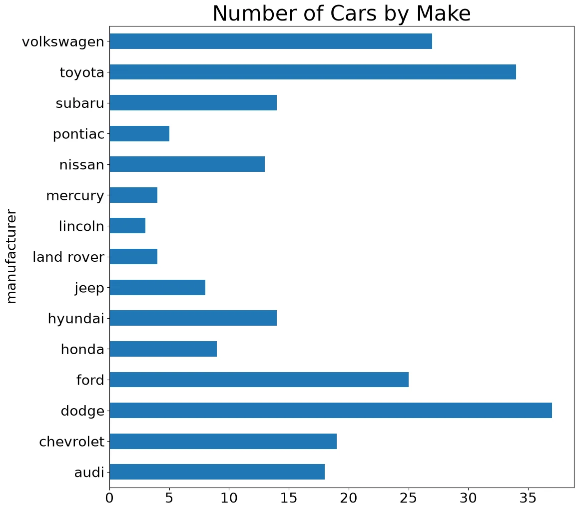
Code:
(mpg['manufacturer']
 .value_counts(sort=False)
 .plot.barh()
 .set_title('Number of Cars by Make')
)
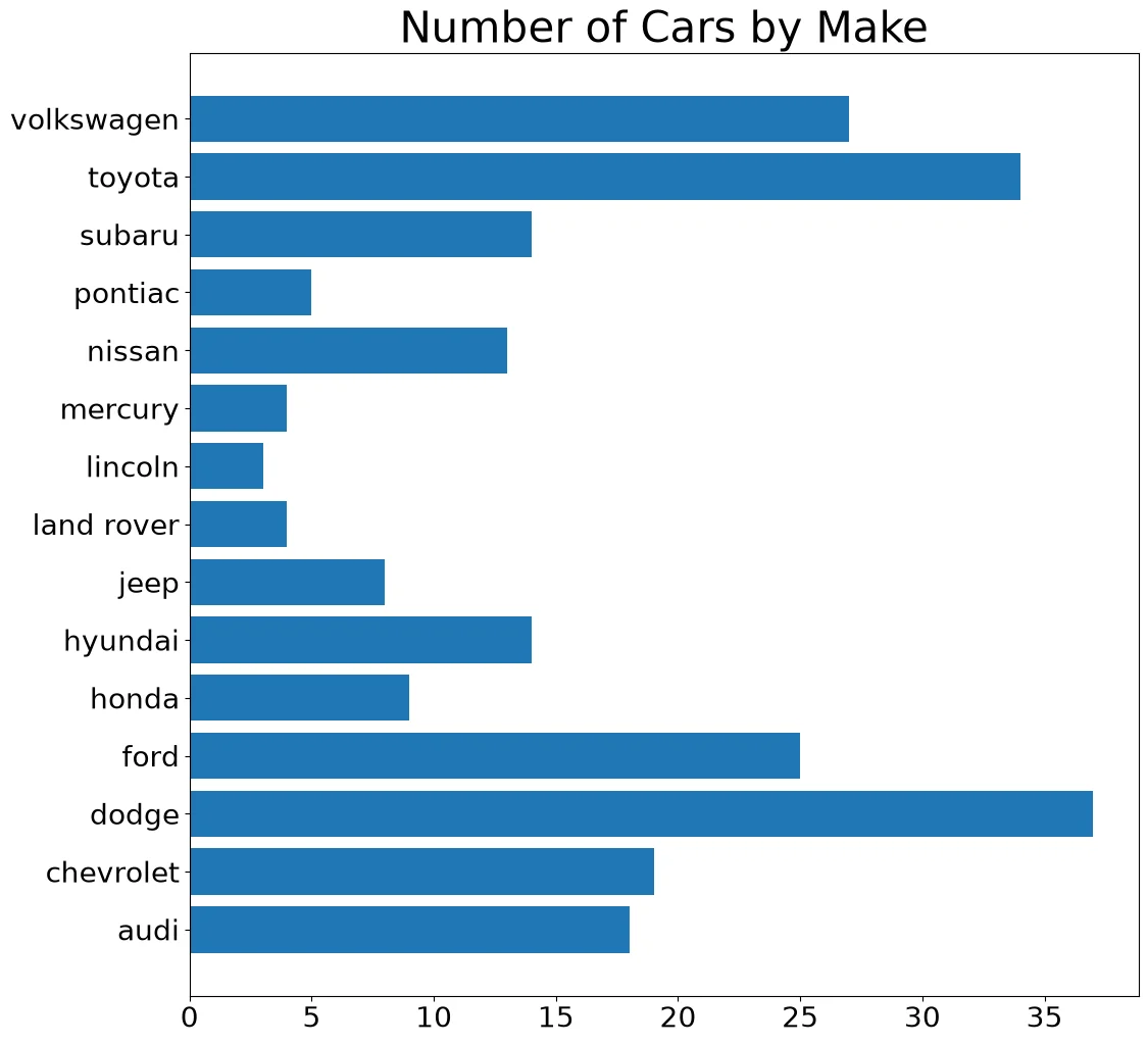
Code:
counts = mpg['manufacturer'].value_counts(
    sort=False)
fig, ax = pyplot.subplots()
ax.barh(counts.index, counts.values)
ax.set_title('Number of Cars by Make')
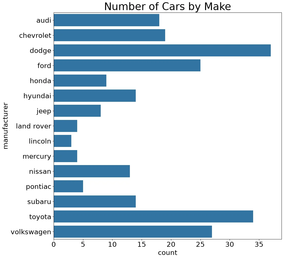
Code:
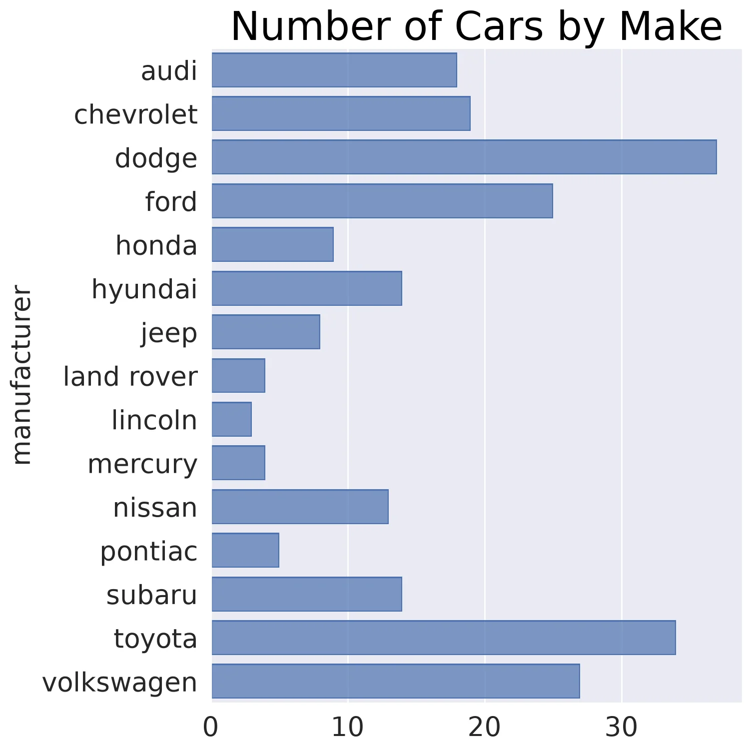
ax = sns.countplot(mpg, y='manufacturer')
ax.set_title('Number of Cars by Make')
Code:
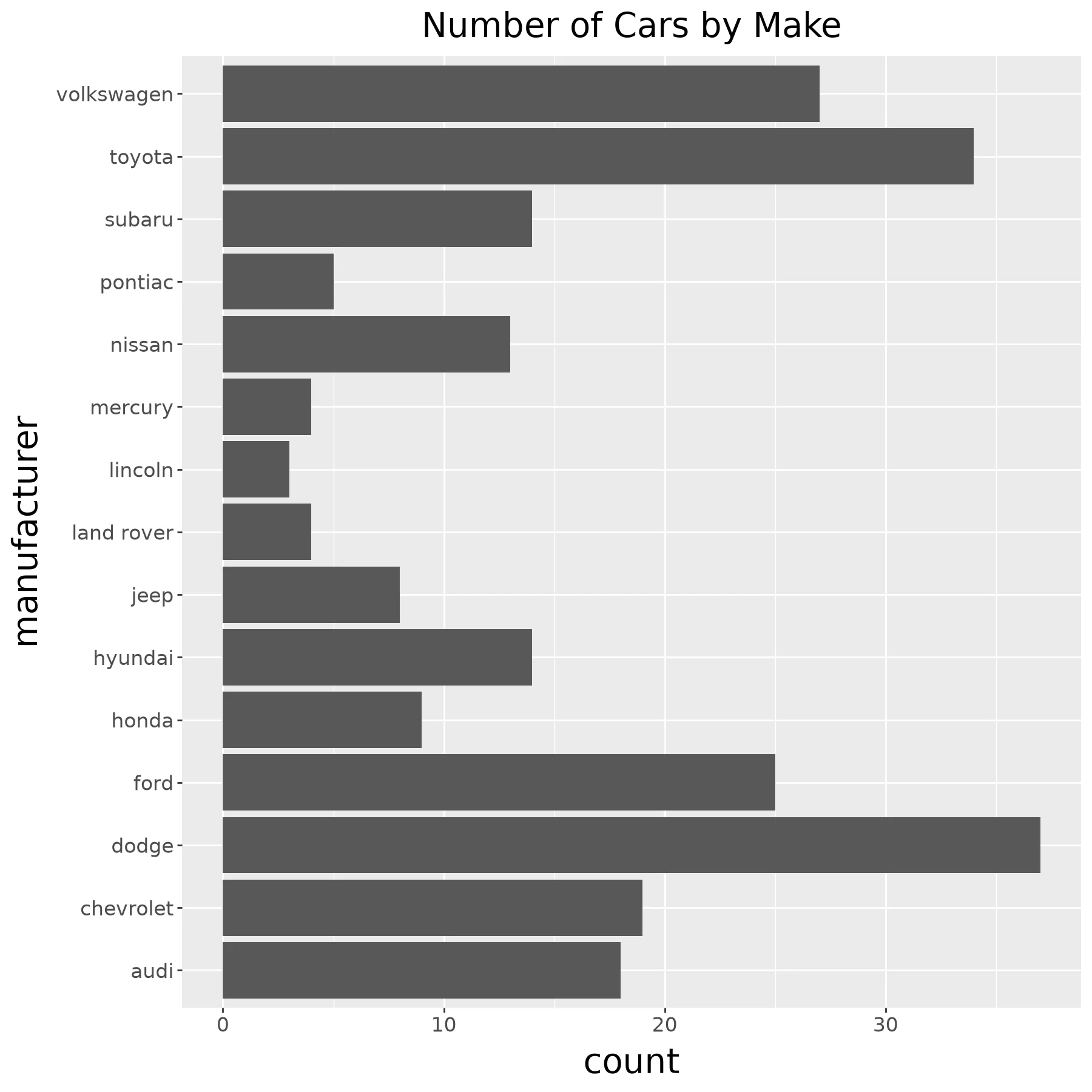
(so.Plot(mpg, y='manufacturer')
 .add(so.Bar(), so.Count())
 .label(title='Number of Cars by Make'))
Code:
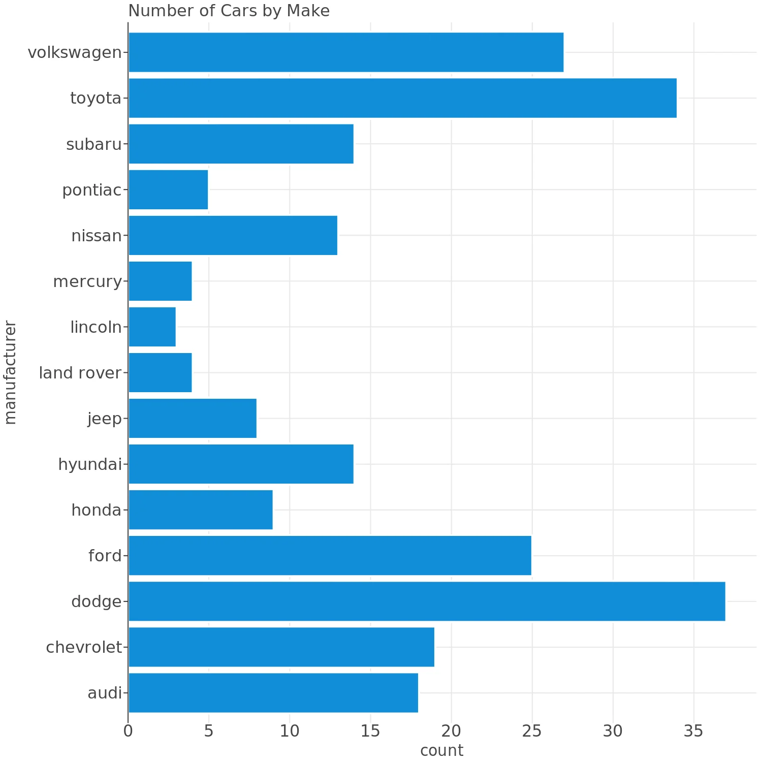
(ggplot(mpg) +
   aes(x='manufacturer') +
   geom_bar(size=20) +
   coord_flip() +
   ggtitle('Number of Cars by Make')
)
Note:
plotnine gives an error on ggplot(data=mpg).
Code:
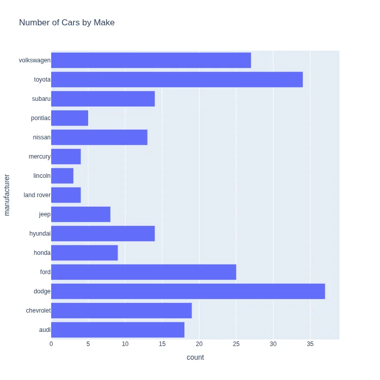
(lp.ggplot(mpg) +
   lp.aes(x='manufacturer') +
   lp.geom_bar() +
   lp.coord_flip() +
   lp.ggtitle('Number of Cars by Make'))
Note:
Lets-Plot mirrors the ggplot2 grammar. It is imported as lp here
so its names don't collide with plotnine's.
Code:
px.histogram(
    mpg, y='manufacturer',
    title='Number of Cars by Make'
)
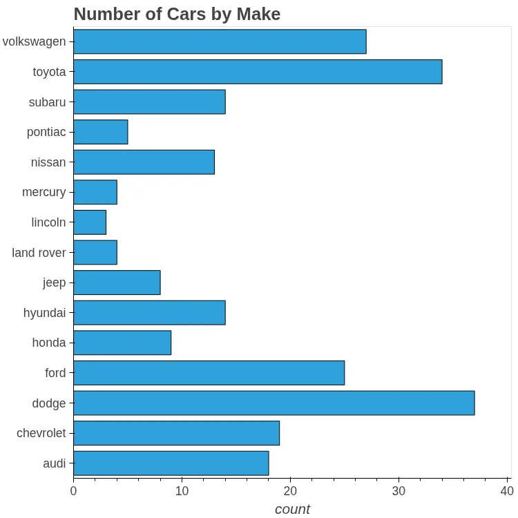
Code:
(mpg['manufacturer']
 .value_counts(sort=False)
 .hvplot.barh(
     title='Number of Cars by Make'))
Note:
hvPlot exposes Bokeh through a .hvplot
accessor that mirrors pandas' own .plot.
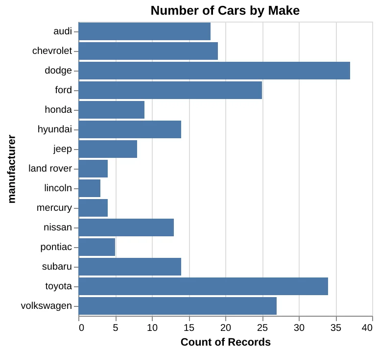
Code:
(
    alt.Chart(
        mpg, title='Number of Cars by Make'
    )
    .mark_bar()
    .encode(
        x='count()', y=alt.Y('manufacturer')
    )
)
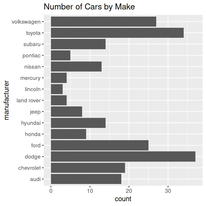
Code:
ggplot(data=mpg) +
    aes(x=manufacturer) +
    geom_bar() +
    coord_flip() +
    ggtitle('Number of Cars by Make')
Histogram#
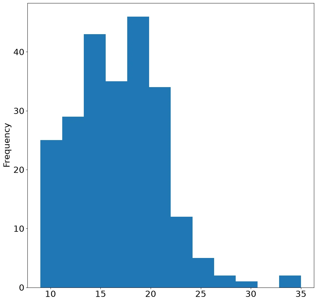
Code:
(mpg['cty']
 .plot
 .hist(bins=12))
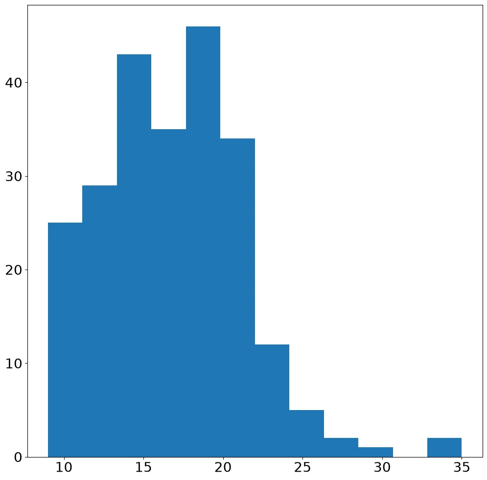
Code:
pyplot.hist('cty', bins=12, data=mpg)
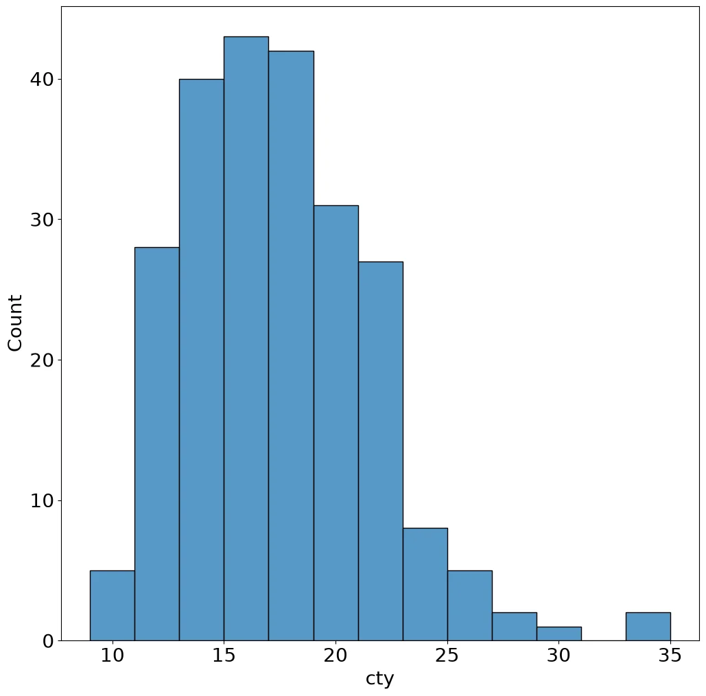
Code:
sns.histplot(mpg, x='cty', binwidth=2)
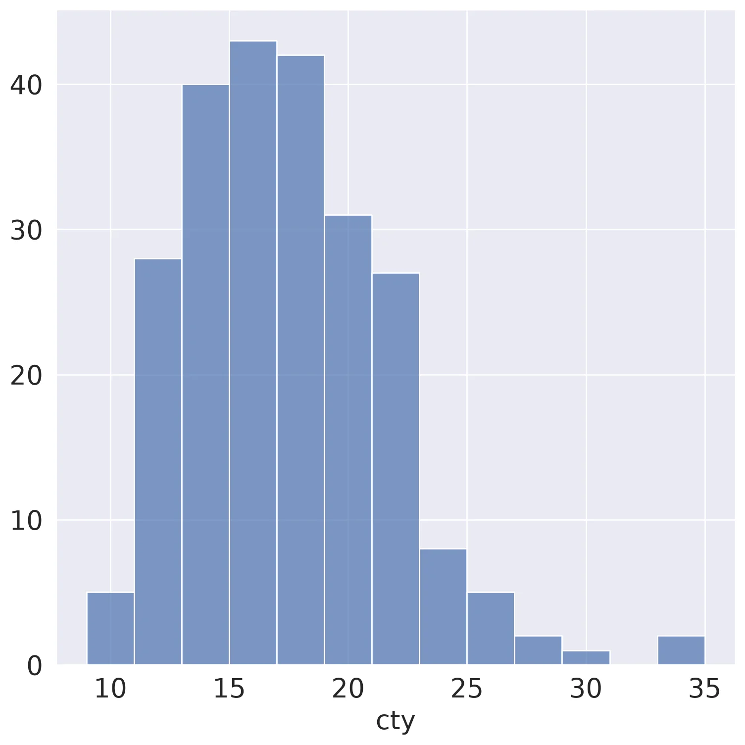
Code:
(so.Plot(mpg, x='cty')
 .add(so.Bars(), so.Hist(binwidth=2)))
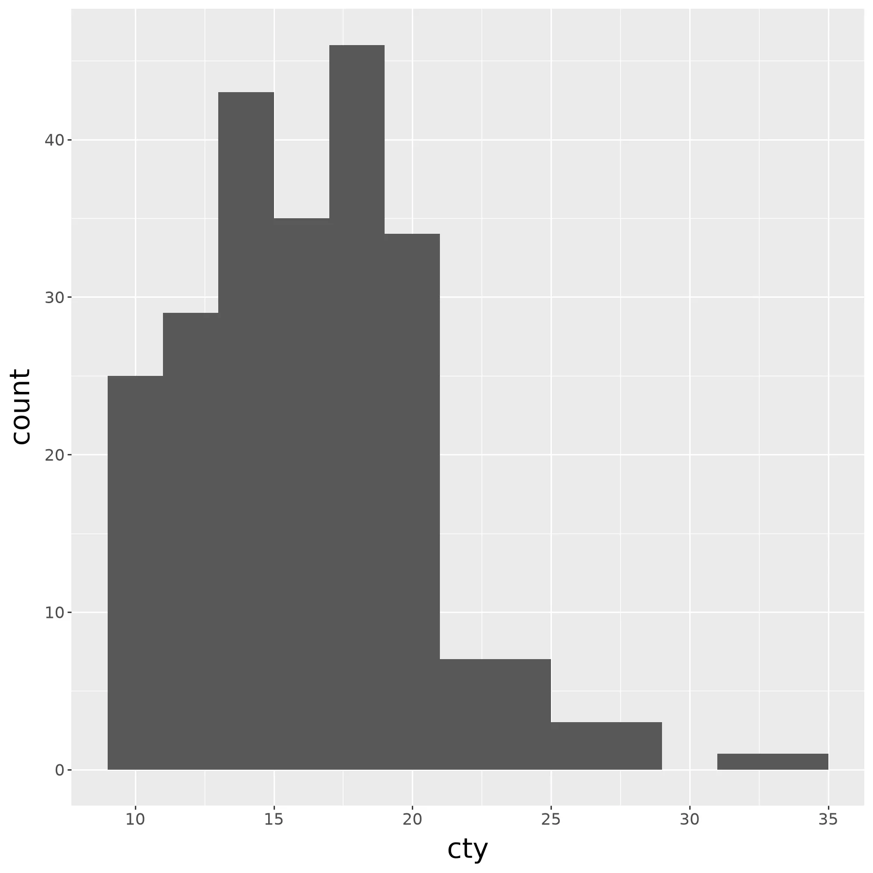
Code:
(ggplot(mpg) +
    aes(x='cty') +
    geom_histogram(binwidth=2))
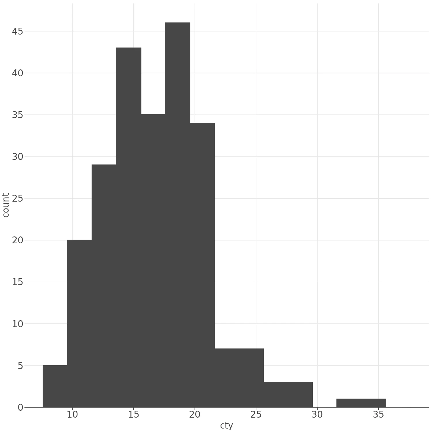
Code:
(lp.ggplot(mpg) +
    lp.aes(x='cty') +
    lp.geom_histogram(binwidth=2))
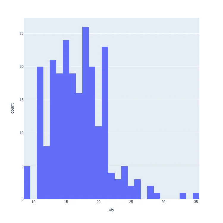
Code:
px.histogram(
    mpg, x='cty'
)
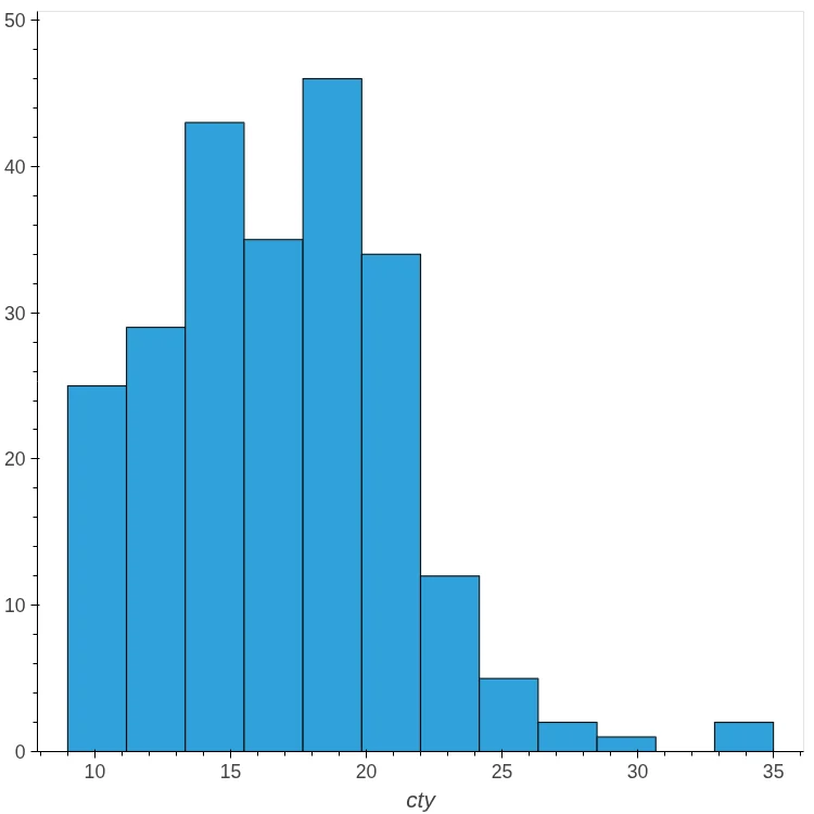
Code:
mpg.hvplot.hist('cty', bins=12)
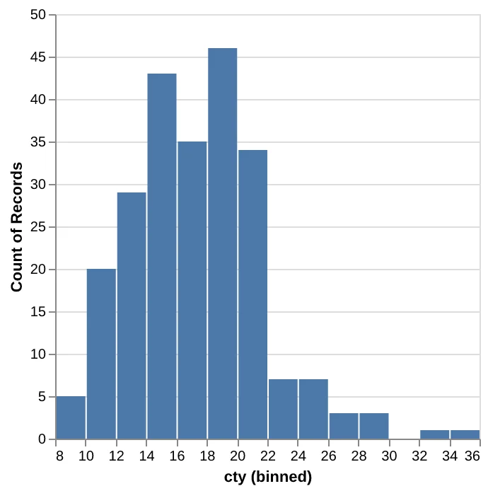
Code:
(
    alt.Chart(mpg)
    .mark_bar()
    .encode(
        alt.X('cty', bin=alt.Bin(step=2)),
        y='count()',
    )
)
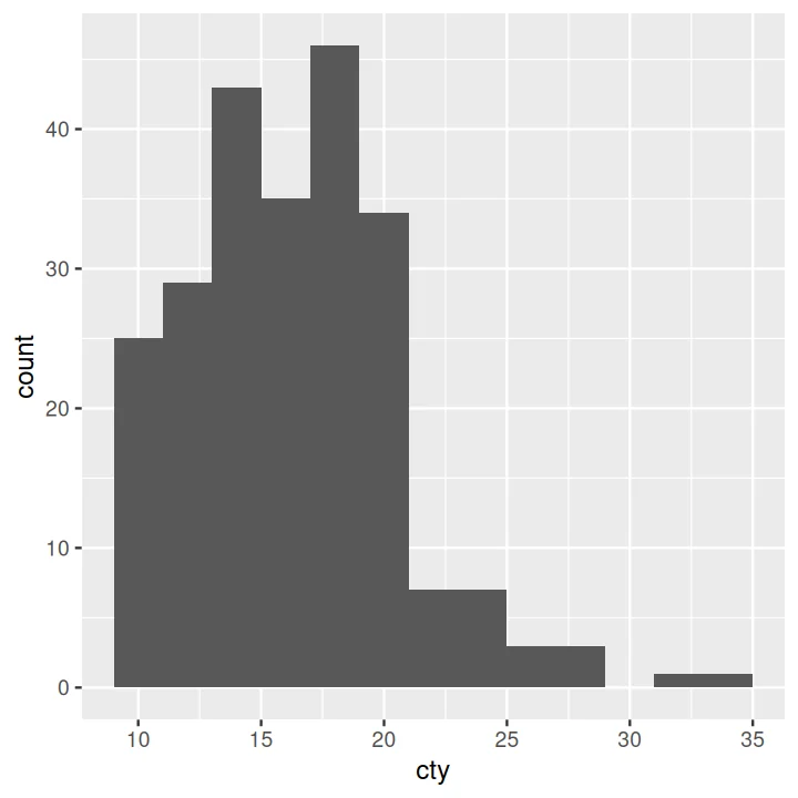
Code:
ggplot(data=mpg) +
    aes(x=cty) +
    geom_histogram(binwidth=2)
Box Plot#
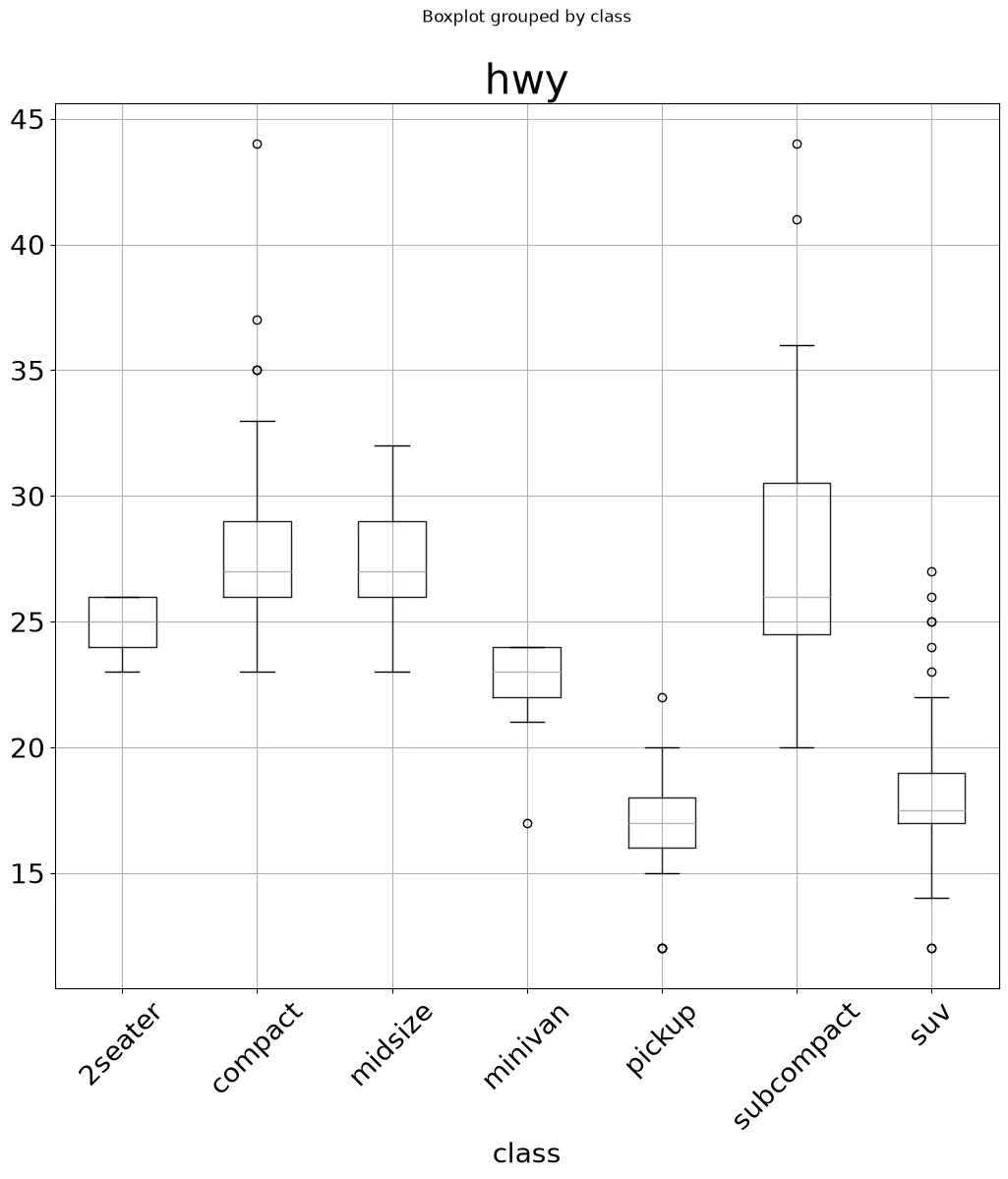
Code:
mpg.boxplot(column='hwy', by='class',
            rot=45)
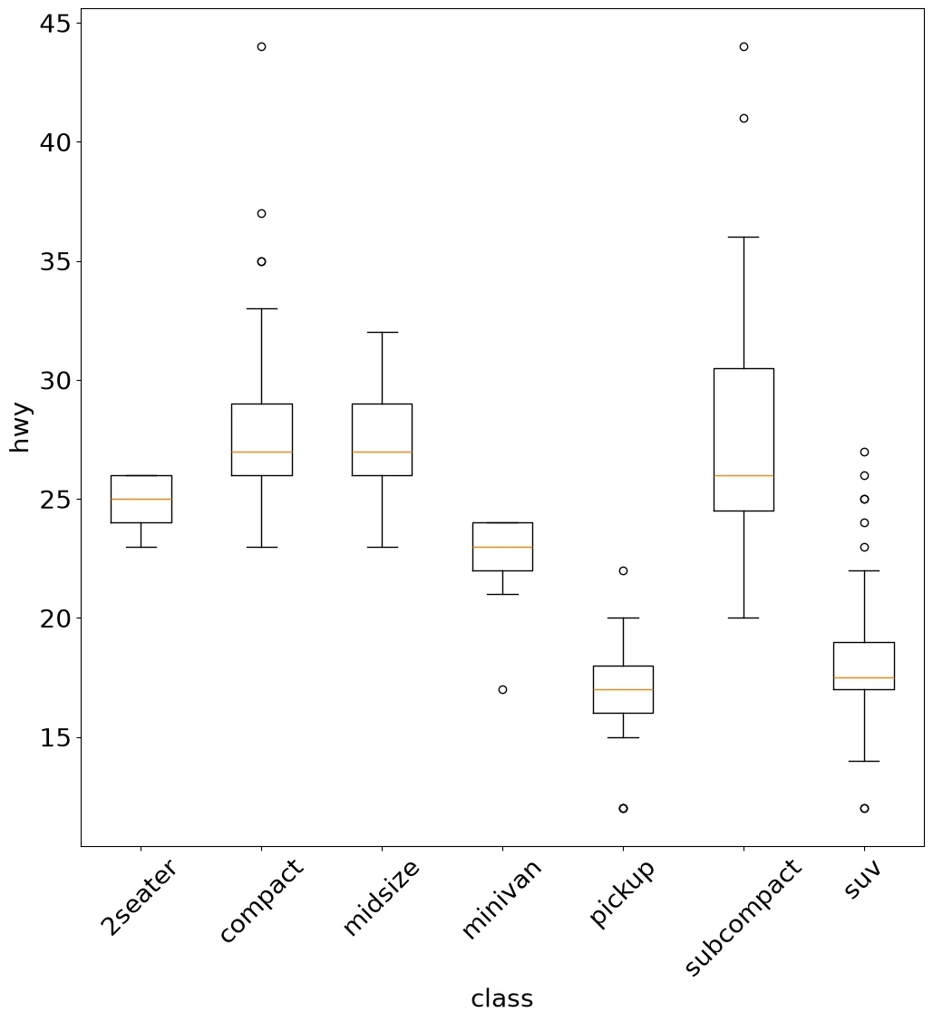
Code:
groups = mpg.groupby('class')['hwy']
fig, ax = pyplot.subplots()
ax.boxplot([v for _, v in groups],
           tick_labels=list(groups.groups))
ax.set_xlabel('class')
ax.set_ylabel('hwy')
pyplot.xticks(rotation=45)
Note:
boxplot takes a list of arrays, so the
groups are split by hand.
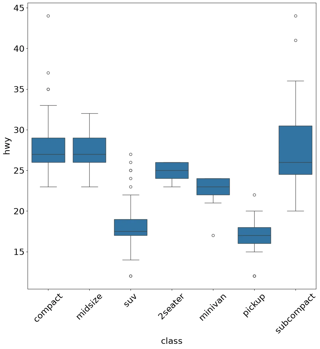
Code:
ax = sns.boxplot(mpg, x='class', y='hwy')
ax.tick_params(axis='x', rotation=45)
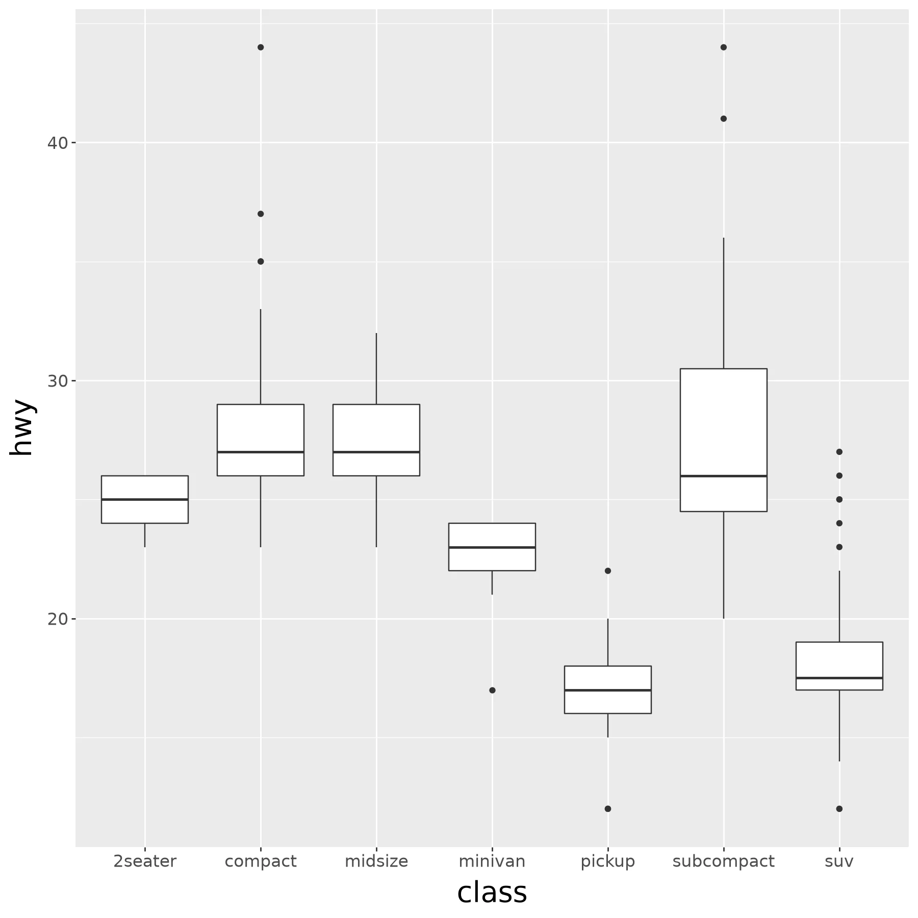
Code:
(ggplot(mpg) +
    aes(x='class', y='hwy') +
    geom_boxplot())
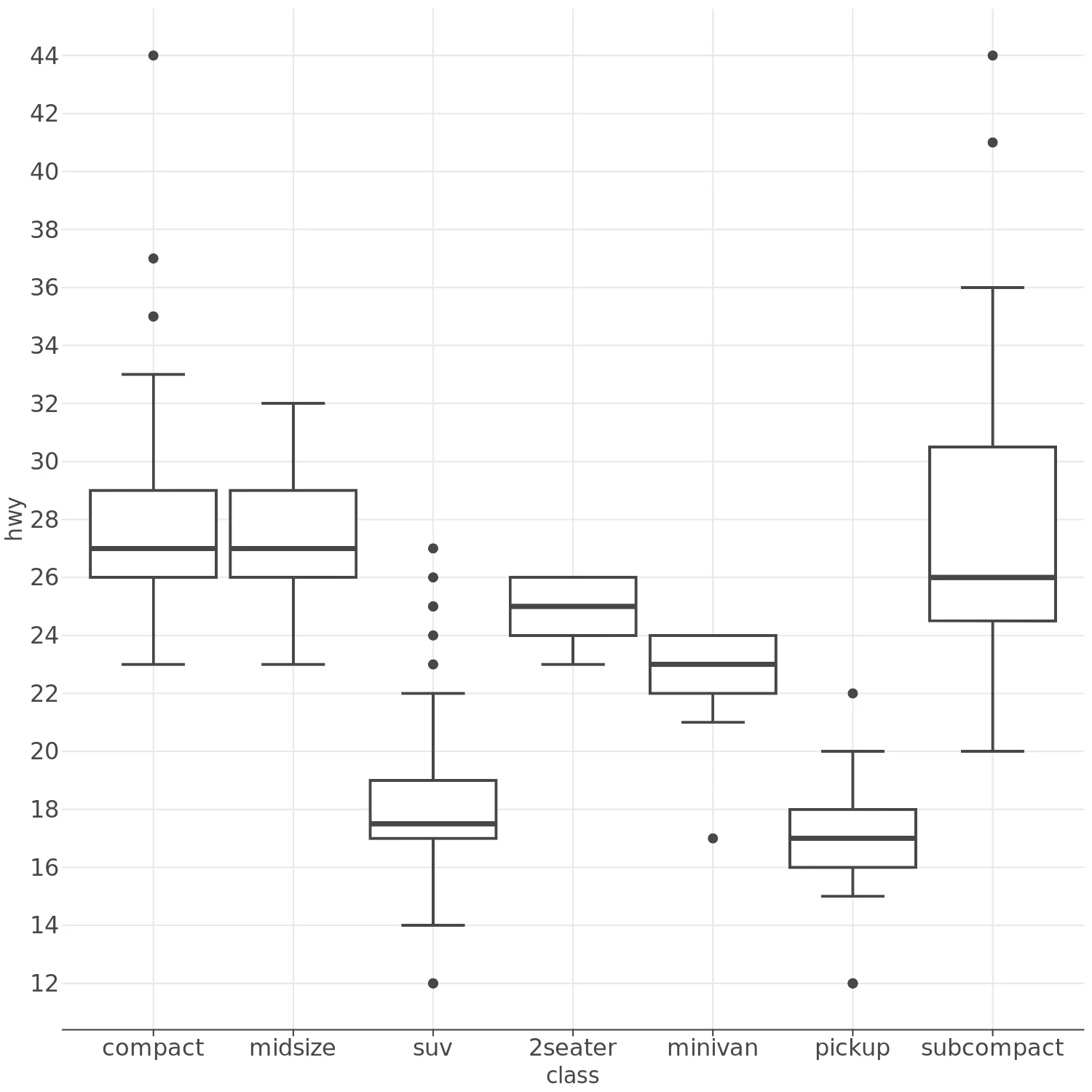
Code:
(lp.ggplot(mpg) +
    lp.aes(x='class', y='hwy') +
    lp.geom_boxplot())
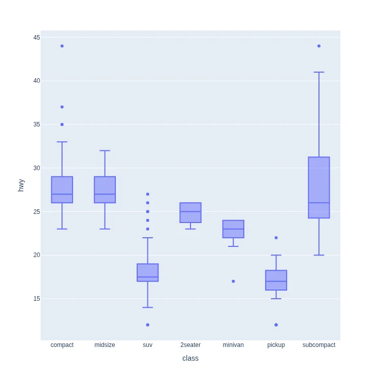
Code:
px.box(
    mpg, x='class', y='hwy'
)
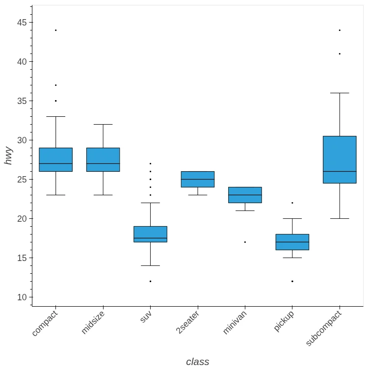
Code:
mpg.hvplot.box(y='hwy', by='class',
               rot=45)
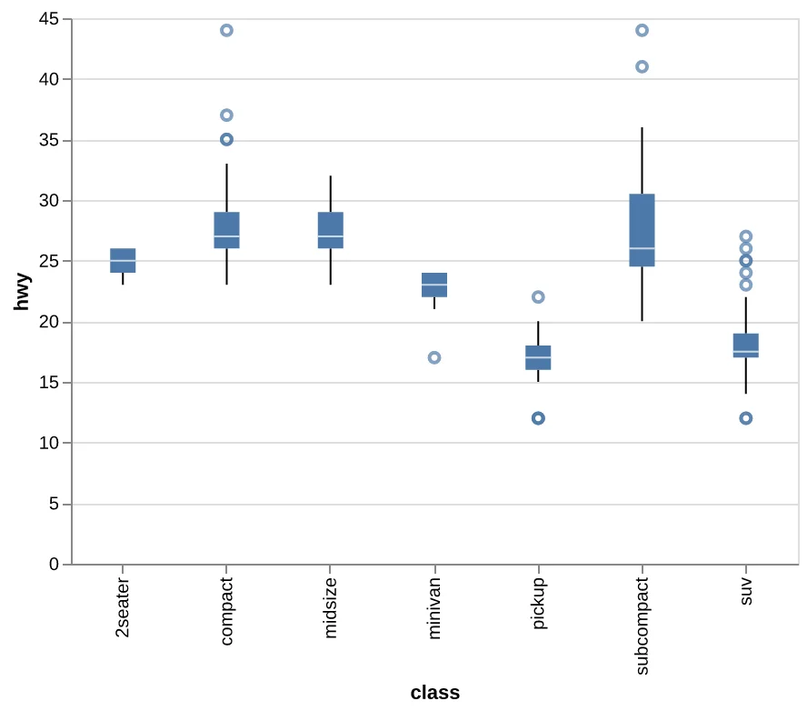
Code:
(
    alt.Chart(mpg)
    .mark_boxplot()
    .encode(x='class', y='hwy')
    .properties(width=400)
)
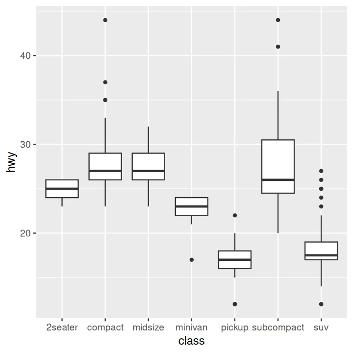
Code:
ggplot(data=mpg) +
    aes(x=class, y=hwy) +
    geom_boxplot()
Scatter Plot#
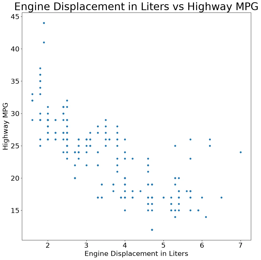
Code:
(mpg
 .plot
 .scatter(x='displ', y='hwy')
 .set(title='Engine Displacement in Liters vs Highway MPG',
      xlabel='Engine Displacement in Liters',
      ylabel='Highway MPG'))
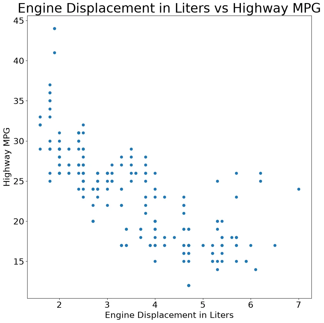
Code:
fig, ax = pyplot.subplots()
ax.scatter(mpg['displ'], mpg['hwy'])
ax.set_title('Engine Displacement in Liters '
             'vs Highway MPG')
ax.set_xlabel('Engine Displacement in Liters')
ax.set_ylabel('Highway MPG')
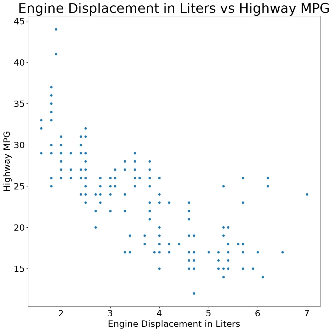
Code:
ax = sns.scatterplot(mpg, x='displ', y='hwy')
ax.set(
    title='Engine Displacement in Liters '
          'vs Highway MPG',
    xlabel='Engine Displacement in Liters',
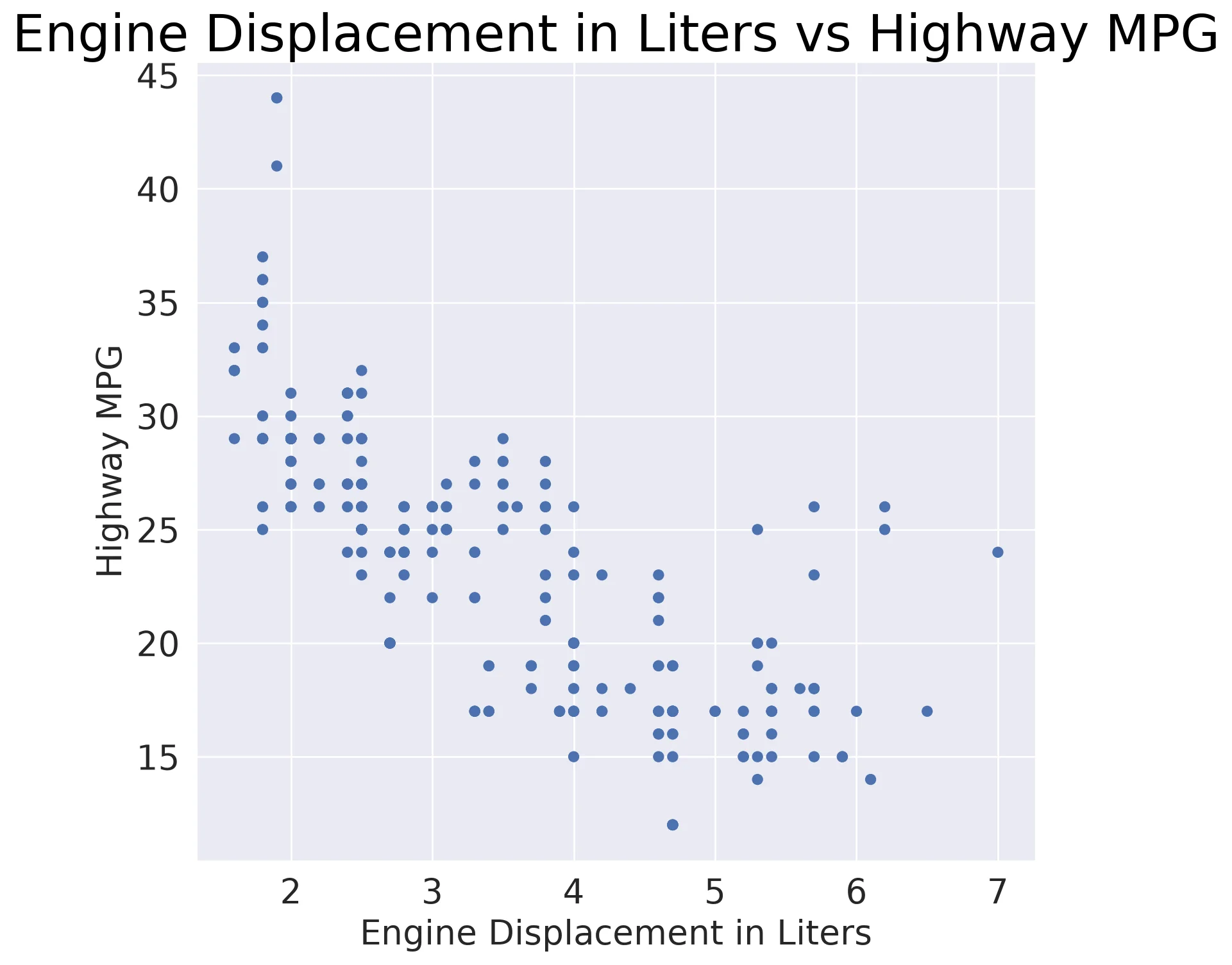
    ylabel='Highway MPG')
Code:
(so.Plot(mpg, x='displ', y='hwy')
 .add(so.Dot())
 .label(
    x='Engine Displacement in Liters',
    y='Highway MPG',
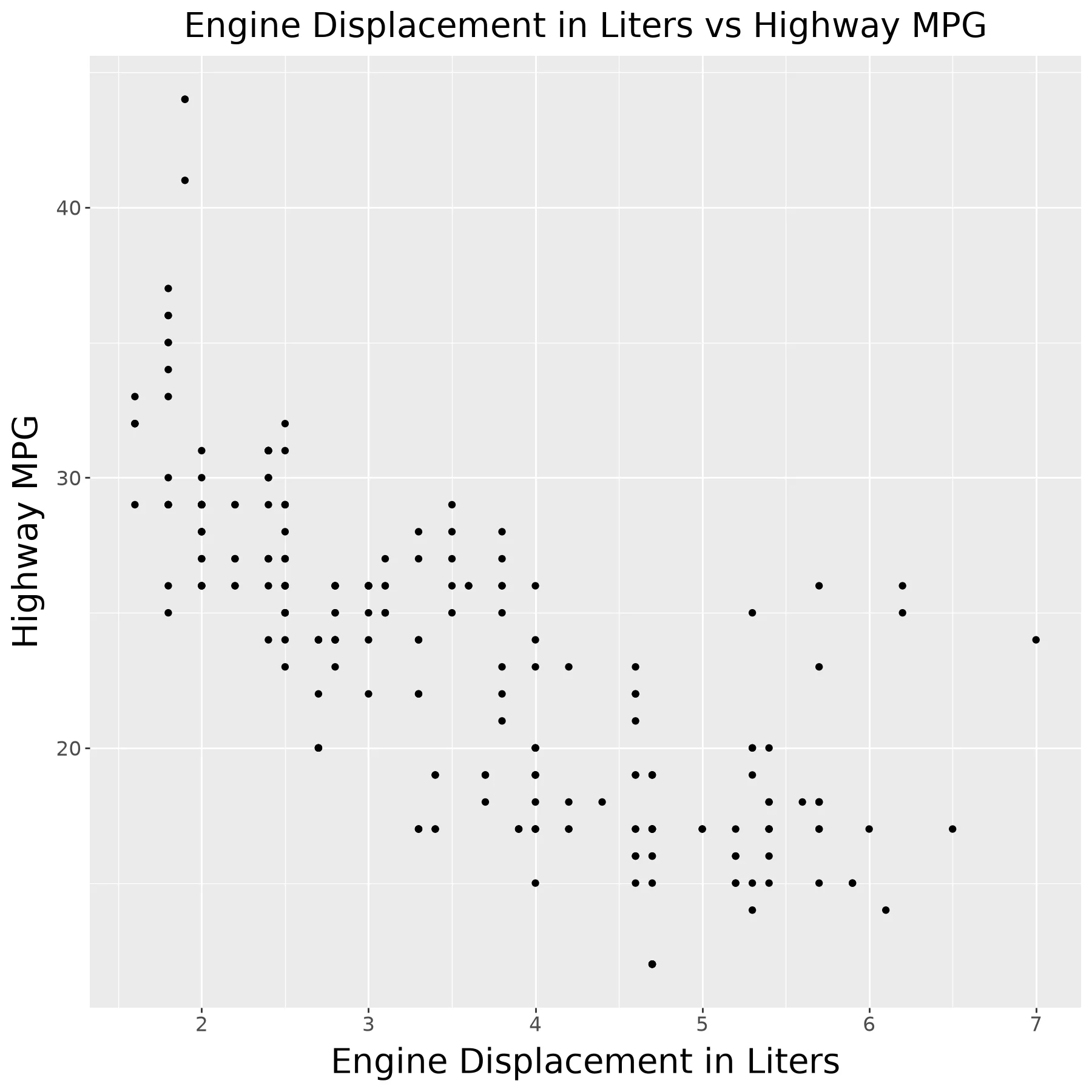
    title='Engine Displacement in Liters vs Highway MPG'))
Code:
(ggplot(mpg) +
    aes(x = 'displ', y = 'hwy') +
    geom_point() +
    ggtitle('Engine Displacement in Liters vs Highway MPG') +
    xlab('Engine Displacement in Liters') +
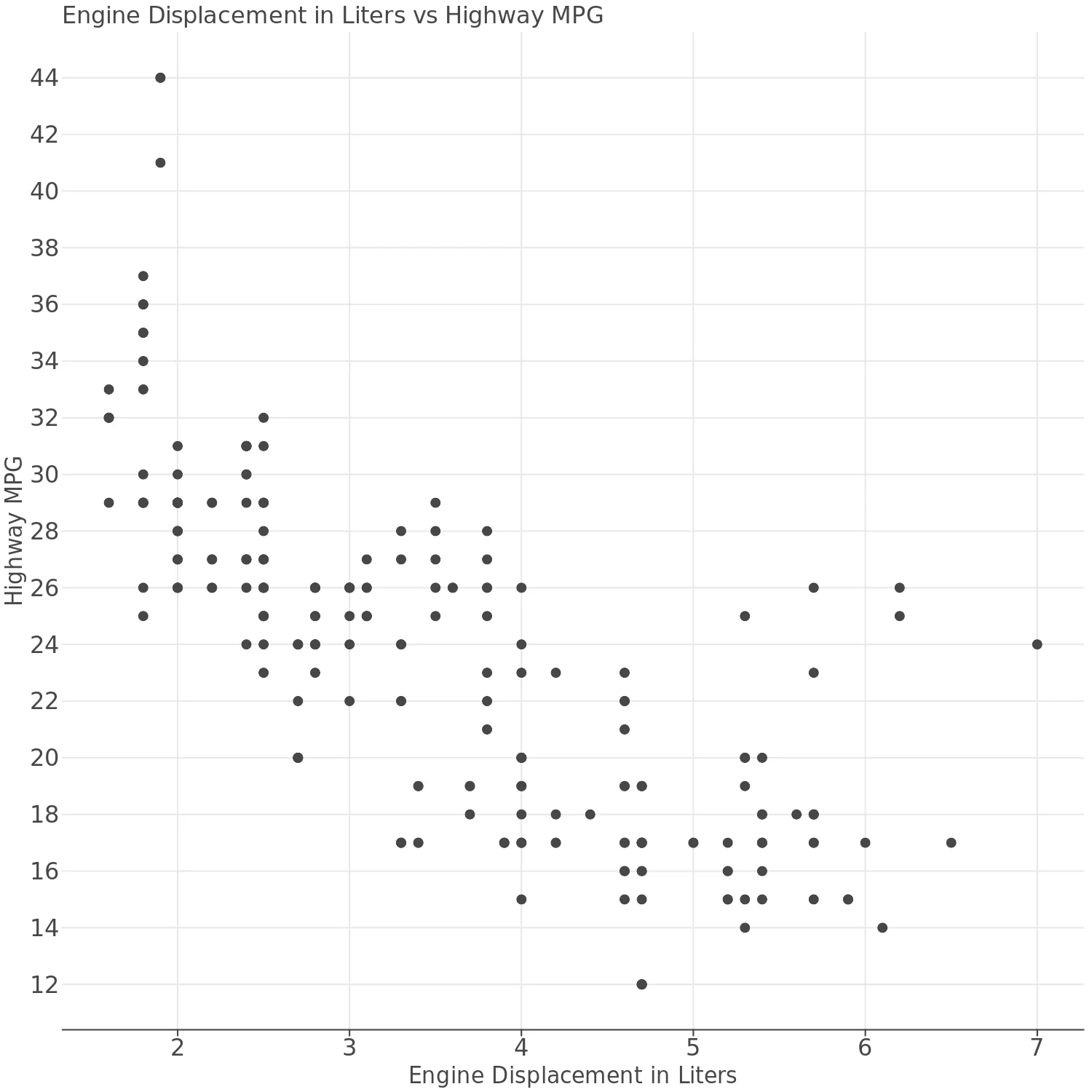
    ylab('Highway MPG'))
Code:
(lp.ggplot(mpg) +
    lp.aes(x='displ', y='hwy') +
    lp.geom_point() +
    lp.ggtitle('Engine Displacement in Liters vs Highway MPG') +
    lp.xlab('Engine Displacement in Liters') +
    lp.ylab('Highway MPG'))
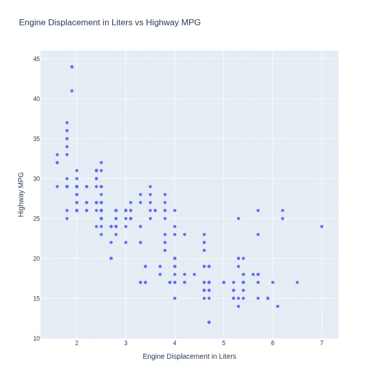
Code:
px.scatter(
    mpg, x='displ', y='hwy',
    title='Engine Displacement in Liters vs Highway MPG',
    labels=dict(
       displ='Engine Displacement in Liters',
       hwy='Highway MPG')
)
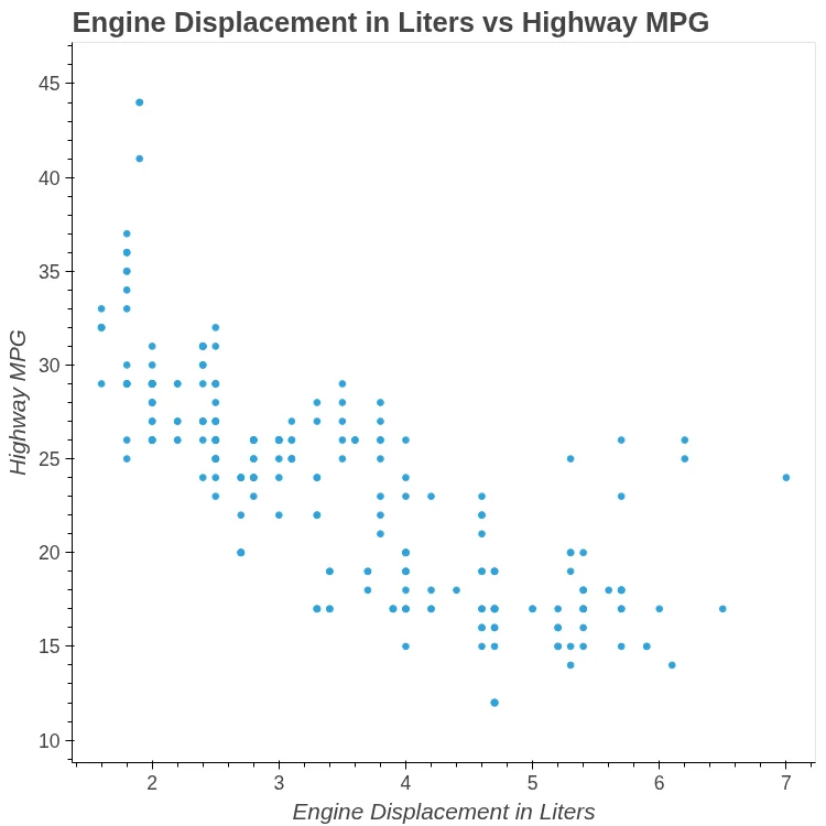
Code:
mpg.hvplot.scatter(
    x='displ', y='hwy',
    xlabel='Engine Displacement in Liters',
    ylabel='Highway MPG',
    title='Engine Displacement in Liters '
          'vs Highway MPG')
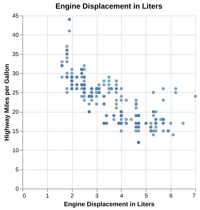
Code:
alt.Chart(mpg).mark_circle().encode(
    alt.X(
        'displ',
        title='Engine Displacement in Liters',
    ),
    alt.Y(
        'hwy',
        title='Highway Miles per Gallon',
    ),
).properties(
    title='Engine Displacement in Liters'
)
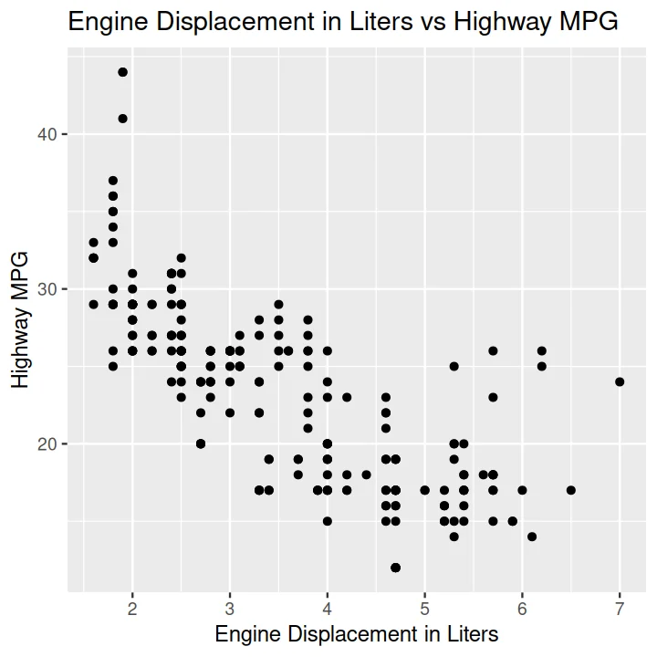
Code:
ggplot(data = mpg) +
    aes(x = displ, y = hwy) +
    geom_point() +
    ggtitle('Engine Displacement in Liters vs Highway MPG') +
    xlab('Engine Displacement in Liters') +
    ylab('Highway MPG')
Time Series#
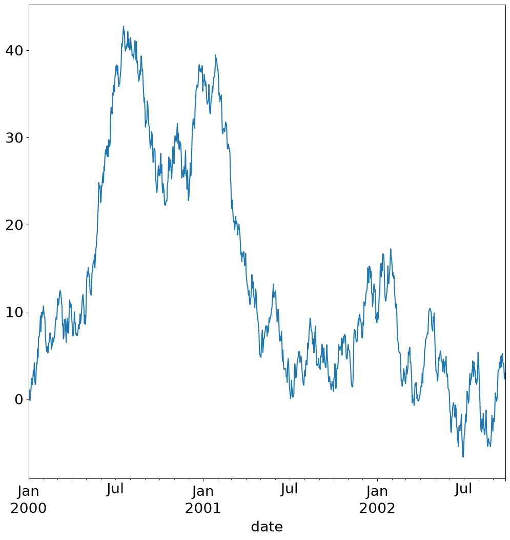
Code:
ts.set_index('date')['value'].plot()
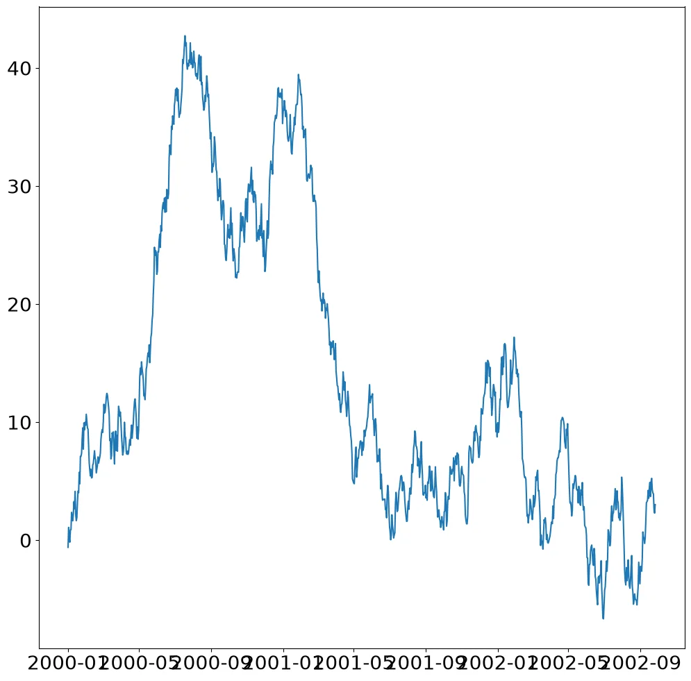
Code:
fig, ax = pyplot.subplots()
ax.plot(ts['date'], ts['value'])
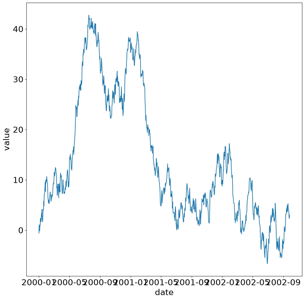
Code:
sns.lineplot(ts, x='date', y='value')
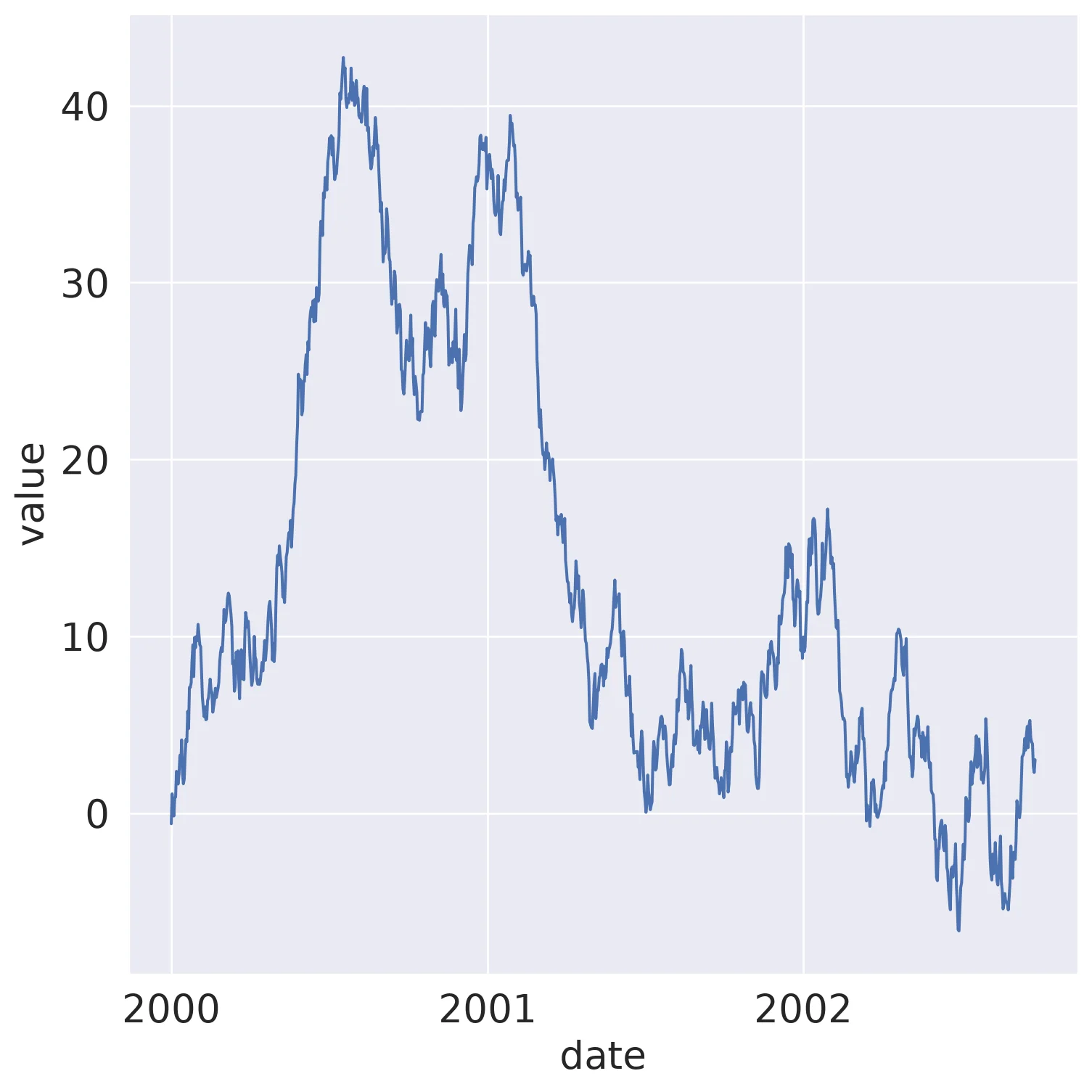
Code:
(so.Plot(ts, x='date', y='value')
 .add(so.Line()))
Code:
(ggplot(ts)
 + aes('date', 'value')
 + geom_line())
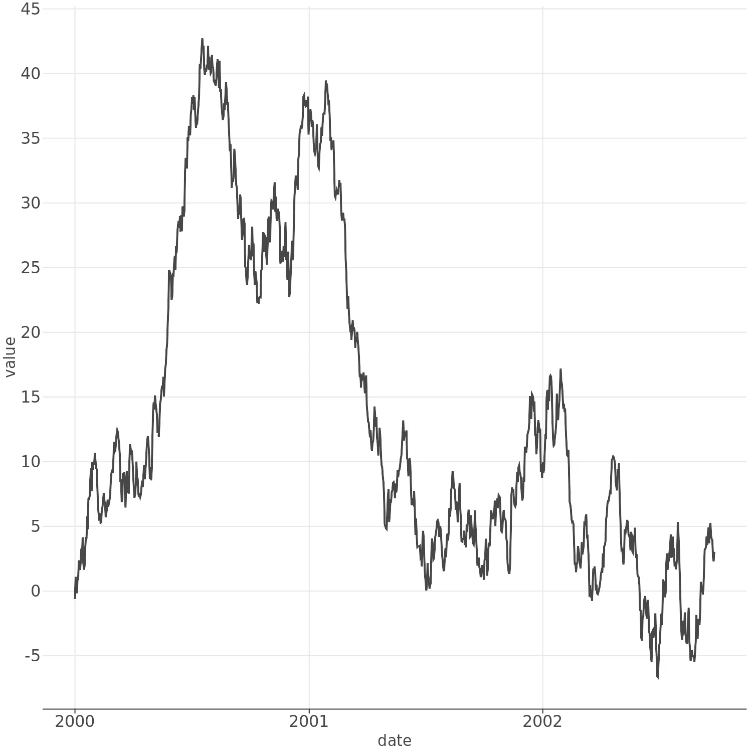
Code:
(lp.ggplot(ts)
 + lp.aes('date', 'value')
 + lp.geom_line())
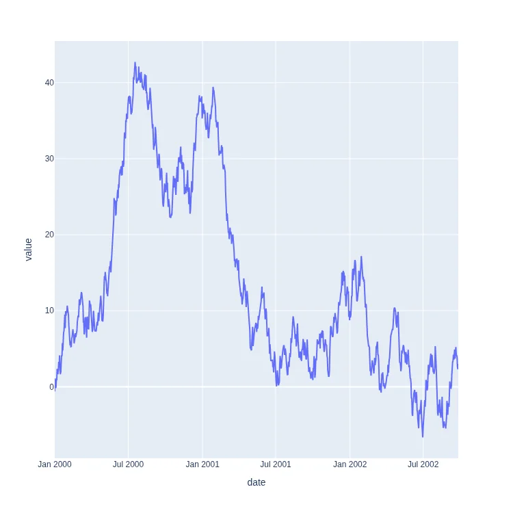
Code:
px.line(
    ts, x='date', y='value'
)
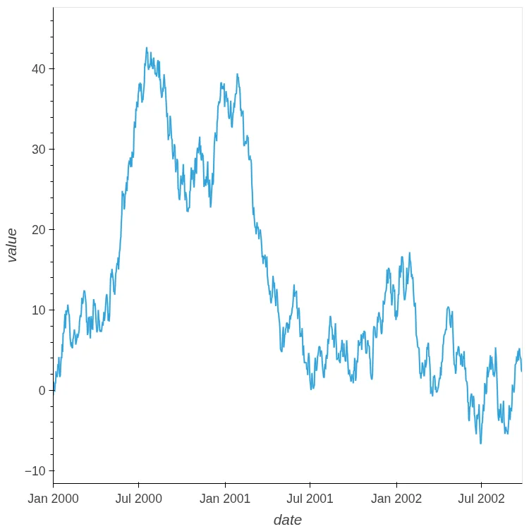
Code:
ts.hvplot.line(x='date', y='value')
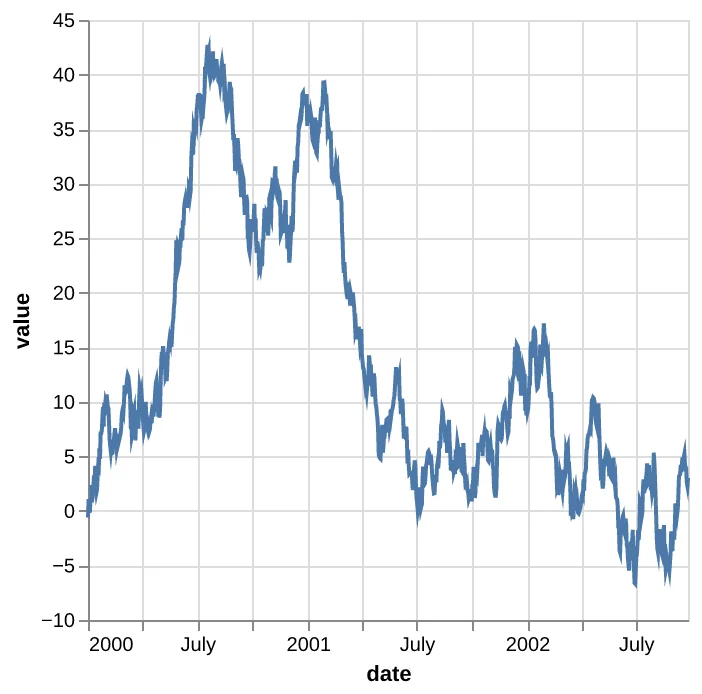
Code:
alt.Chart(ts).mark_line().encode(
    x='date', y='value'
)
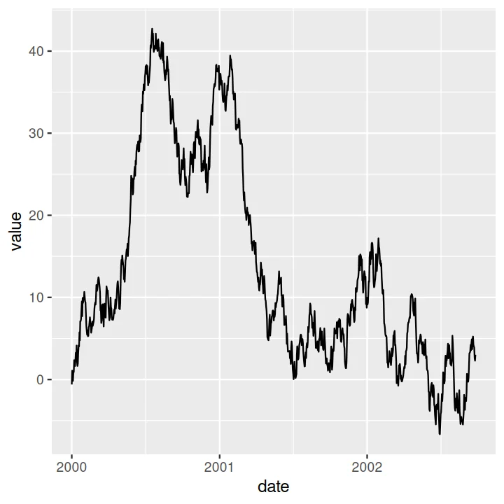
Code:
ggplot(ts) + aes(date, value) + geom_line()
Scatter Plot with Faceted with Color#
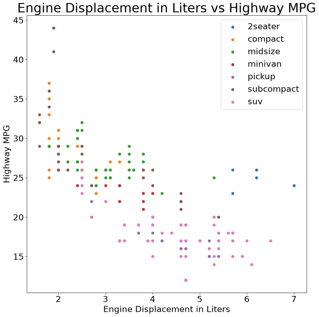
Code:
fig, ax = pyplot.subplots()
for c, df in mpg.groupby('class'):
    ax.scatter(df['displ'], df['hwy'], label=c)
ax.legend()
ax.set_title('Engine Displacement in Liters vs Highway MPG')
ax.set_xlabel('Engine Displacement in Liters')
ax.set_ylabel('Highway MPG')
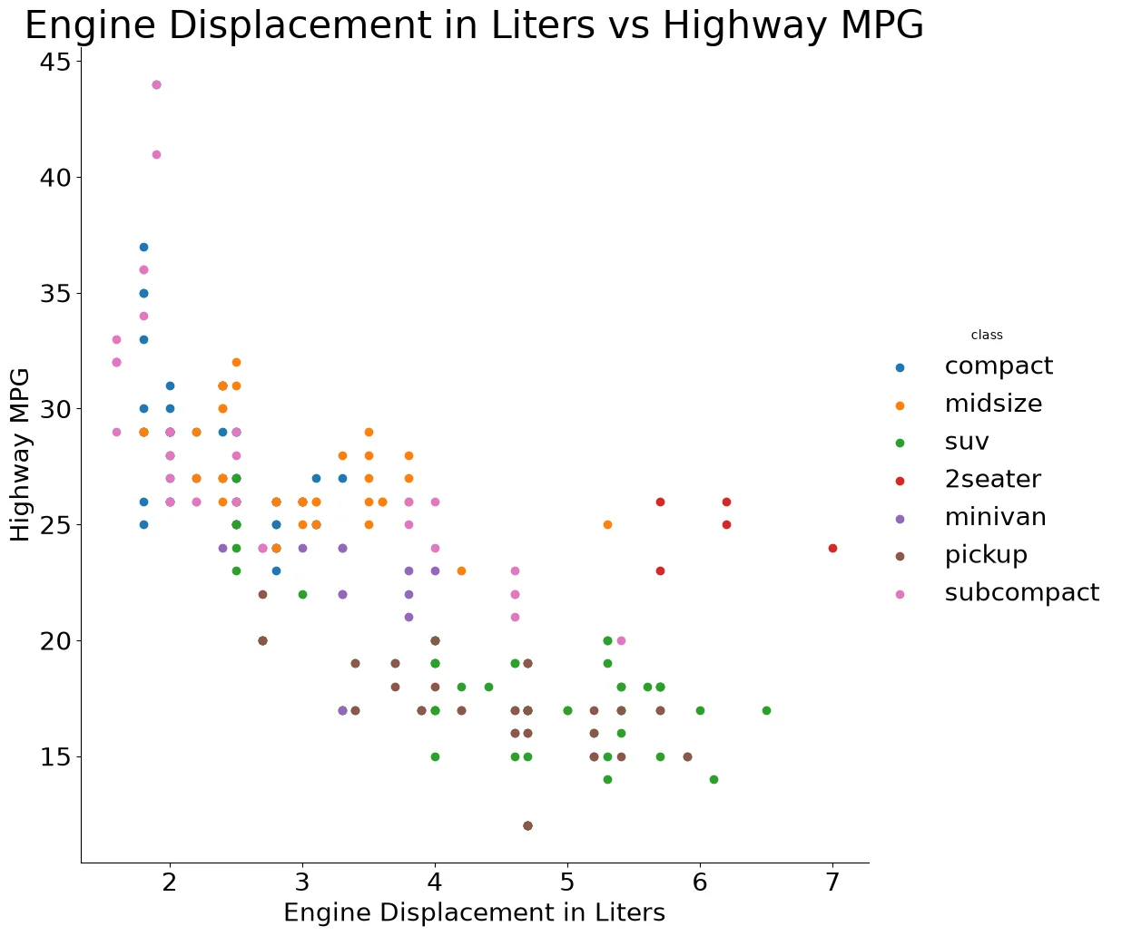
Code:
(sns
 .FacetGrid(mpg, hue='class', height=10)
 .map(pyplot.scatter, 'displ', 'hwy')
 .add_legend()
 .set(
    title='Engine Displacement in Liters vs Highway MPG',
    xlabel='Engine Displacement in Liters',
    ylabel='Highway MPG'
))
Note:
seaborn.FacetGrid overrides the rcParams['figure.figsize'] global parameter.
You have to set the size in the size withheight=inFacetGrid`
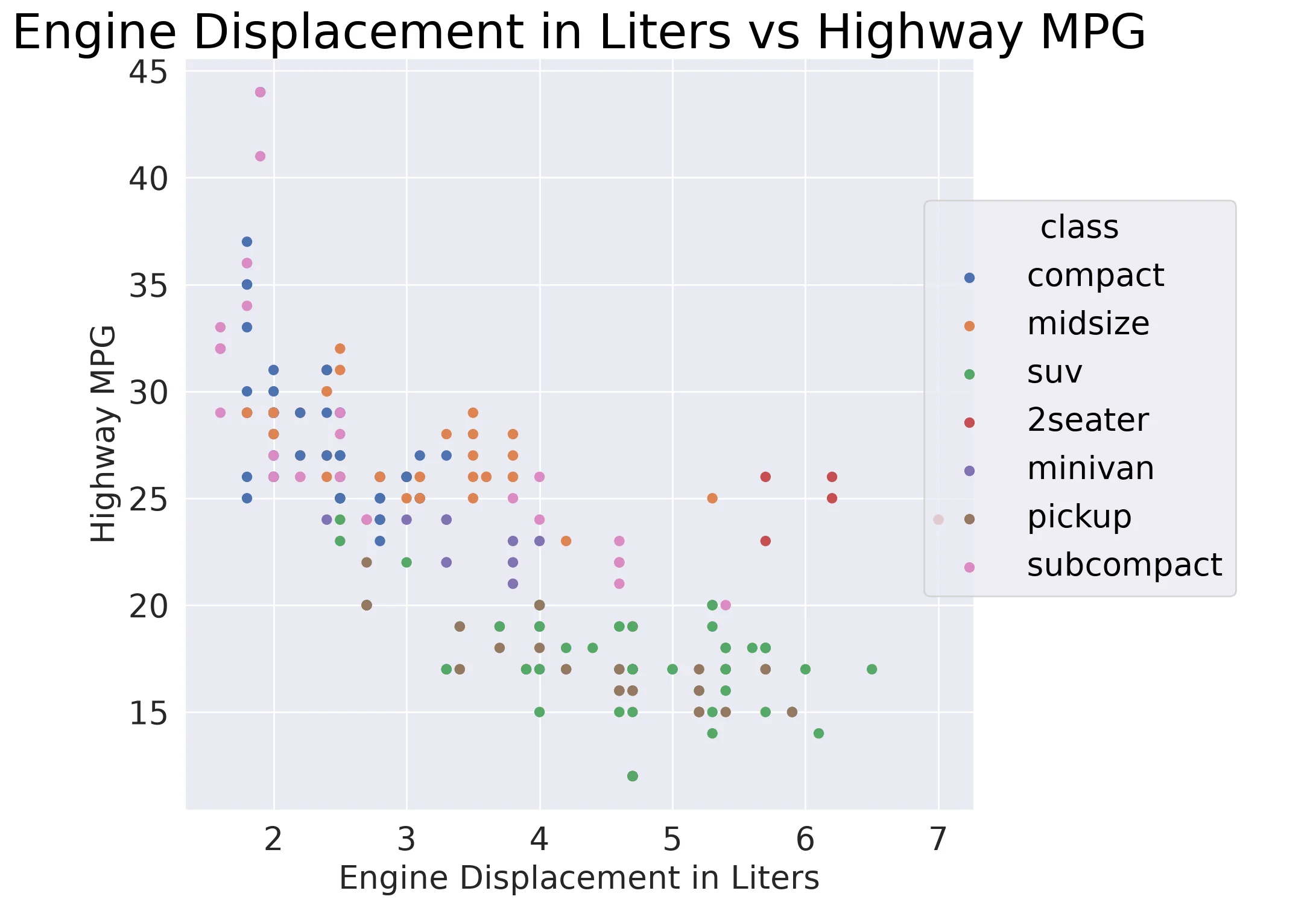
Code:
(so.Plot(mpg, x='displ', y='hwy',
         color='class')
 .add(so.Dot())
 .label(
    x='Engine Displacement in Liters',
    y='Highway MPG',
    title='Engine Displacement in Liters vs Highway MPG'))
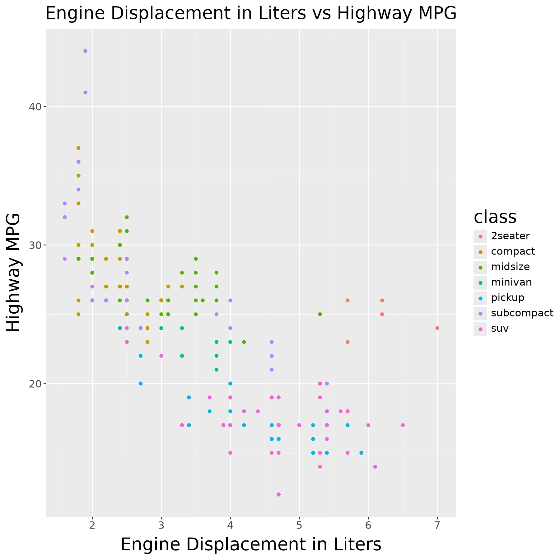
Code:
(ggplot(mpg) +
    aes(x = 'displ', y = 'hwy', color = 'class') +
    geom_point() +
    ggtitle('Engine Displacement in Liters vs Highway MPG') +
    xlab('Engine Displacement in Liters') +
    ylab('Highway MPG'))
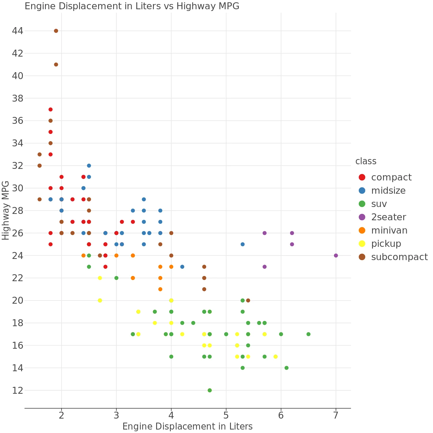
Code:
(lp.ggplot(mpg) +
    lp.aes(x='displ', y='hwy', color='class') +
    lp.geom_point() +
    lp.ggtitle('Engine Displacement in Liters vs Highway MPG') +
    lp.xlab('Engine Displacement in Liters') +
    lp.ylab('Highway MPG'))
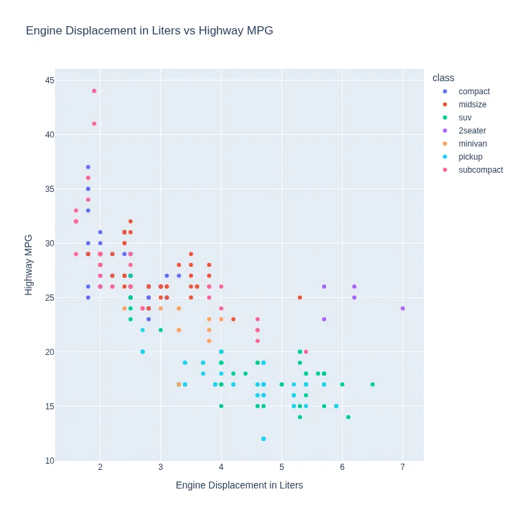
Code:
px.scatter(
    mpg, x='displ', y='hwy', color='class',
    title='Engine Displacement in Liters vs Highway MPG',
    labels=dict(
       displ='Engine Displacement in Liters',
       hwy='Highway MPG')
)
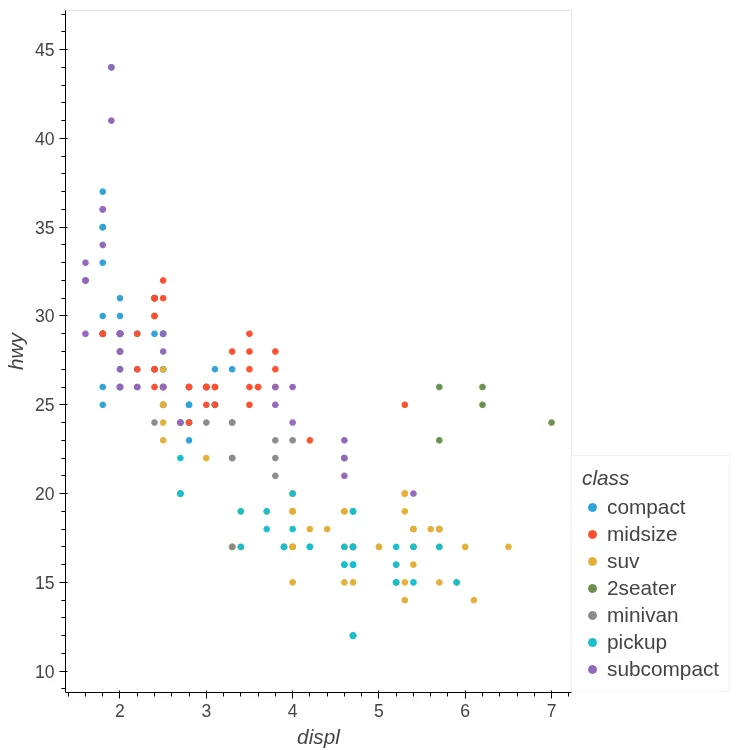
Code:
mpg.hvplot.scatter(
    x='displ', y='hwy', by='class')
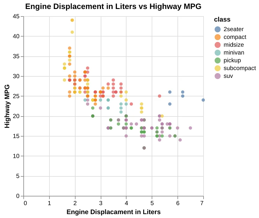
Code:
(
    alt.Chart(
        mpg,
        title='Engine Displacement in Liters vs Highway MPG',
    )
    .mark_circle()
    .encode(
        alt.X(
            'displ',
            title='Engine Displacament in Liters',
        ),
        alt.Y('hwy', title='Highway MPG'),
        color='class',
    )
)
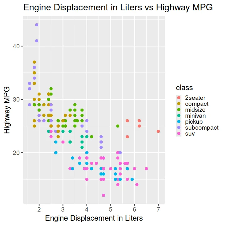
Code:
ggplot(data = mpg) +
    aes(x = displ, y = hwy, color = class) +
    geom_point() +
    ggtitle('Engine Displacement in Liters vs Highway MPG') +
    xlab('Engine Displacement in Liters') +
    ylab('Highway MPG')
Scatter Plot with Points Sized by Continuous Value#
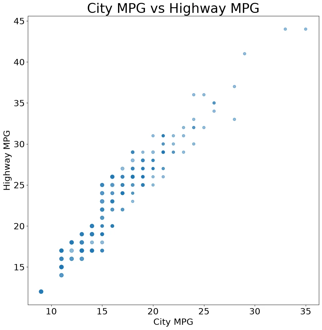
Code:
ax = (mpg
    .plot
    .scatter(x='cty',
             y='hwy',
             s=10*mpg['cyl'],
             alpha=.5))
ax.set_title('City MPG vs Highway MPG')
ax.set_xlabel('City MPG')
ax.set_ylabel('Highway MPG')
Code:
fig, ax = pyplot.subplots()
ax.scatter(mpg['cty'], mpg['hwy'],
           s=10 * mpg['cyl'], alpha=.5)
ax.set_title('City MPG vs Highway MPG')
ax.set_xlabel('City MPG')
ax.set_ylabel('Highway MPG')
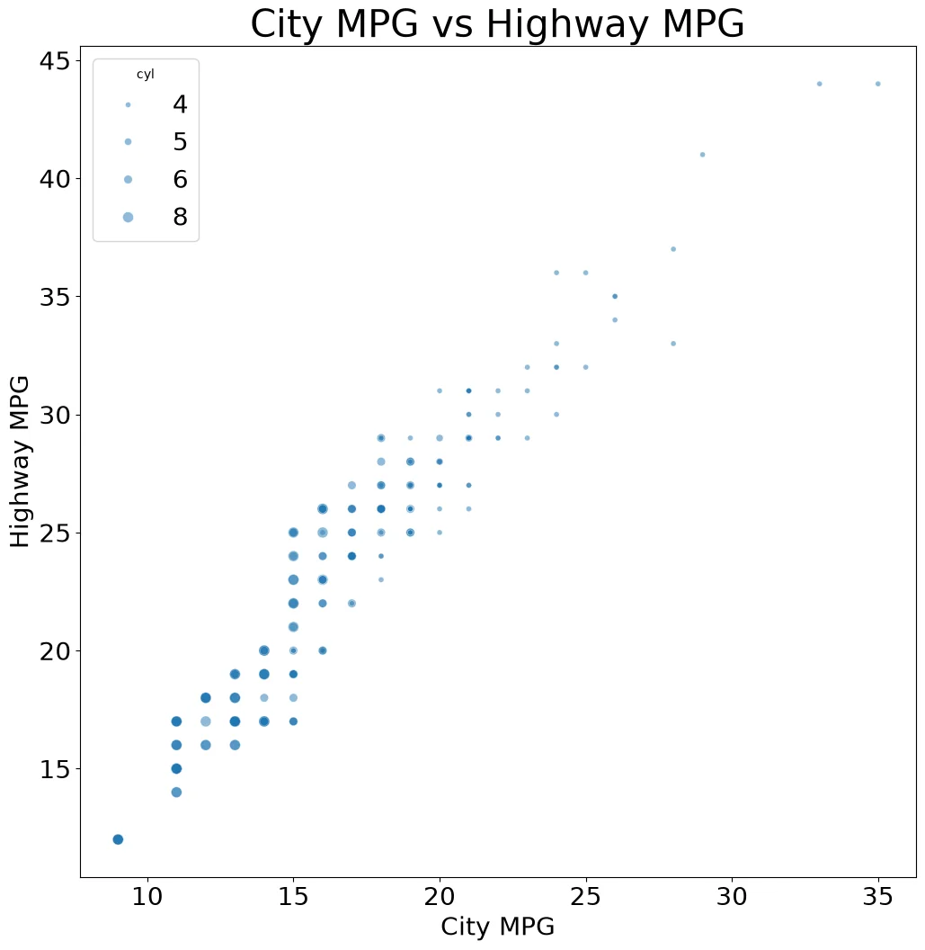
Code:
ax = sns.scatterplot(mpg, x='cty', y='hwy',
                     size='cyl', alpha=.5)
ax.set(title='City MPG vs Highway MPG',
       xlabel='City MPG',
       ylabel='Highway MPG')
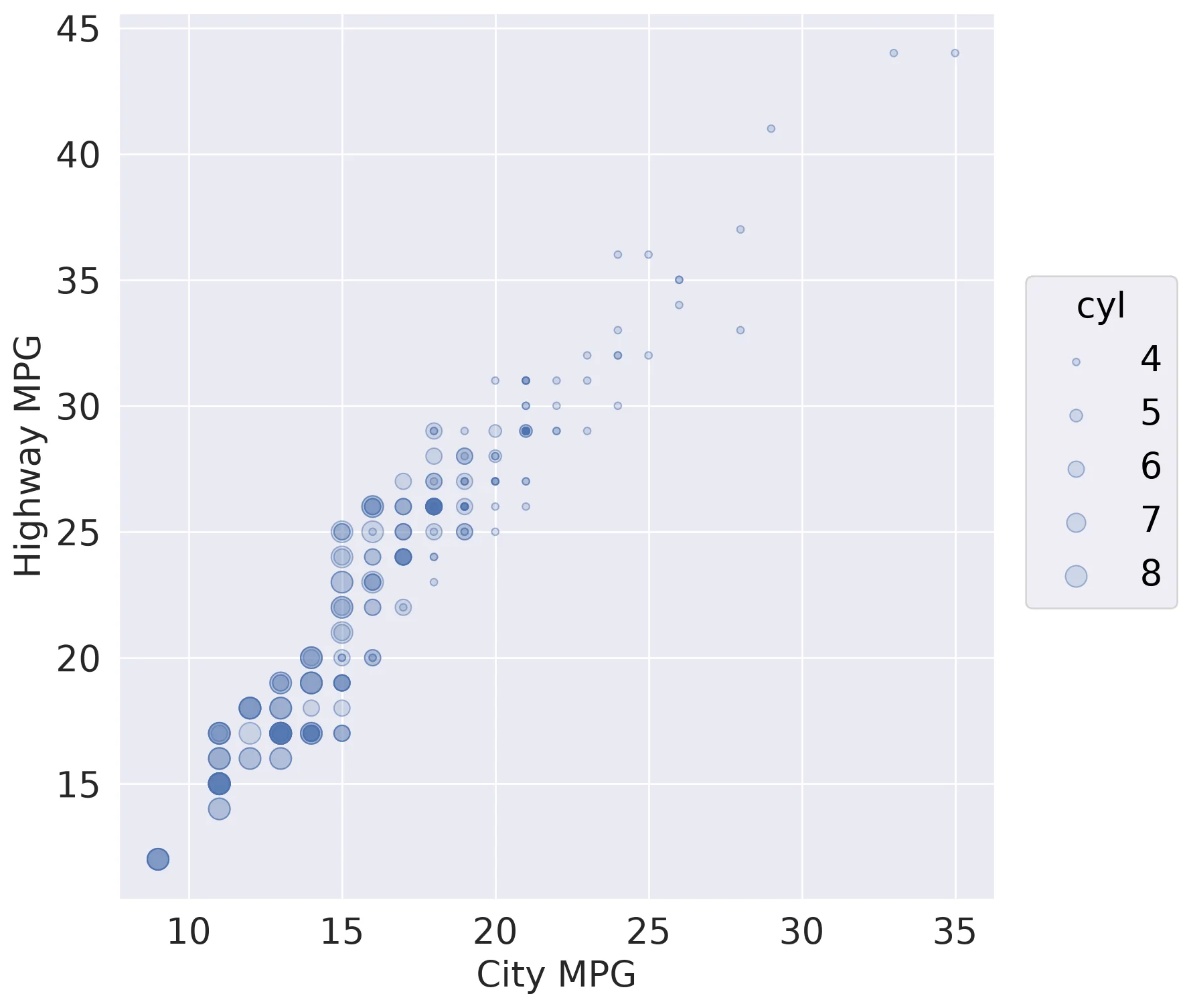
Code:
(so.Plot(mpg, x='cty', y='hwy',
         pointsize='cyl')
 .add(so.Dots(alpha=.5))
 .scale(pointsize=(4, 12))
 .label(x='City MPG', y='Highway MPG'))
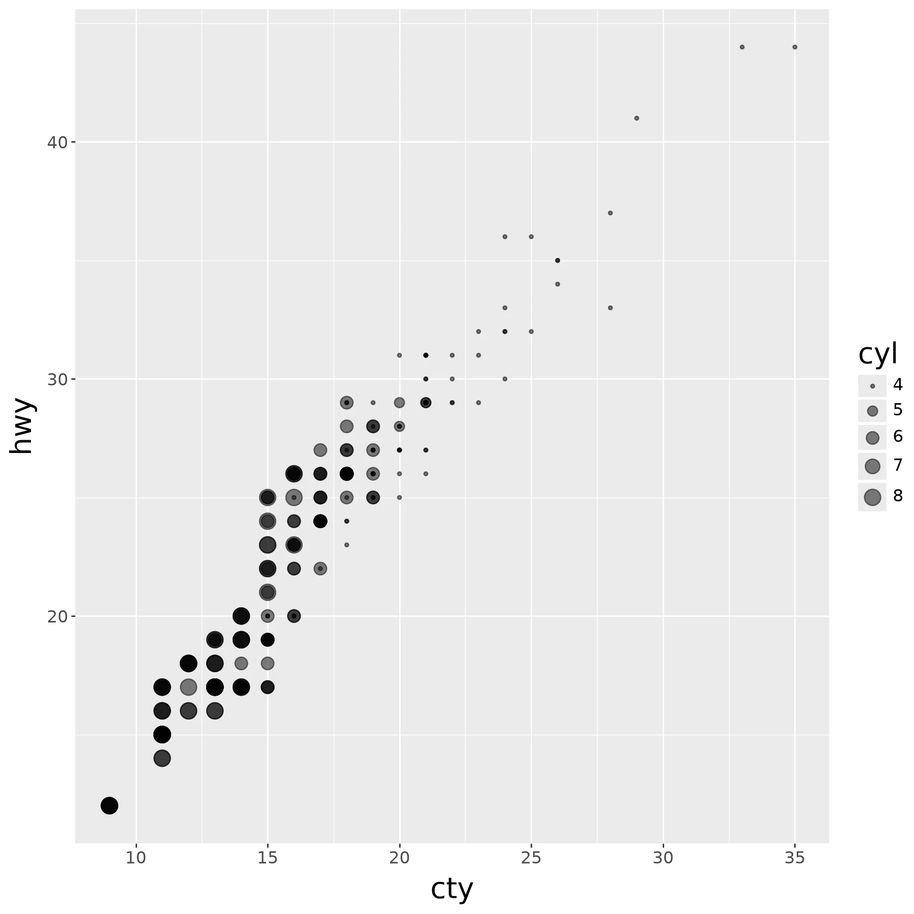
Code:
(ggplot(mpg) +
    aes(x='cty', y='hwy', size='cyl') +
    geom_point(alpha=.5))
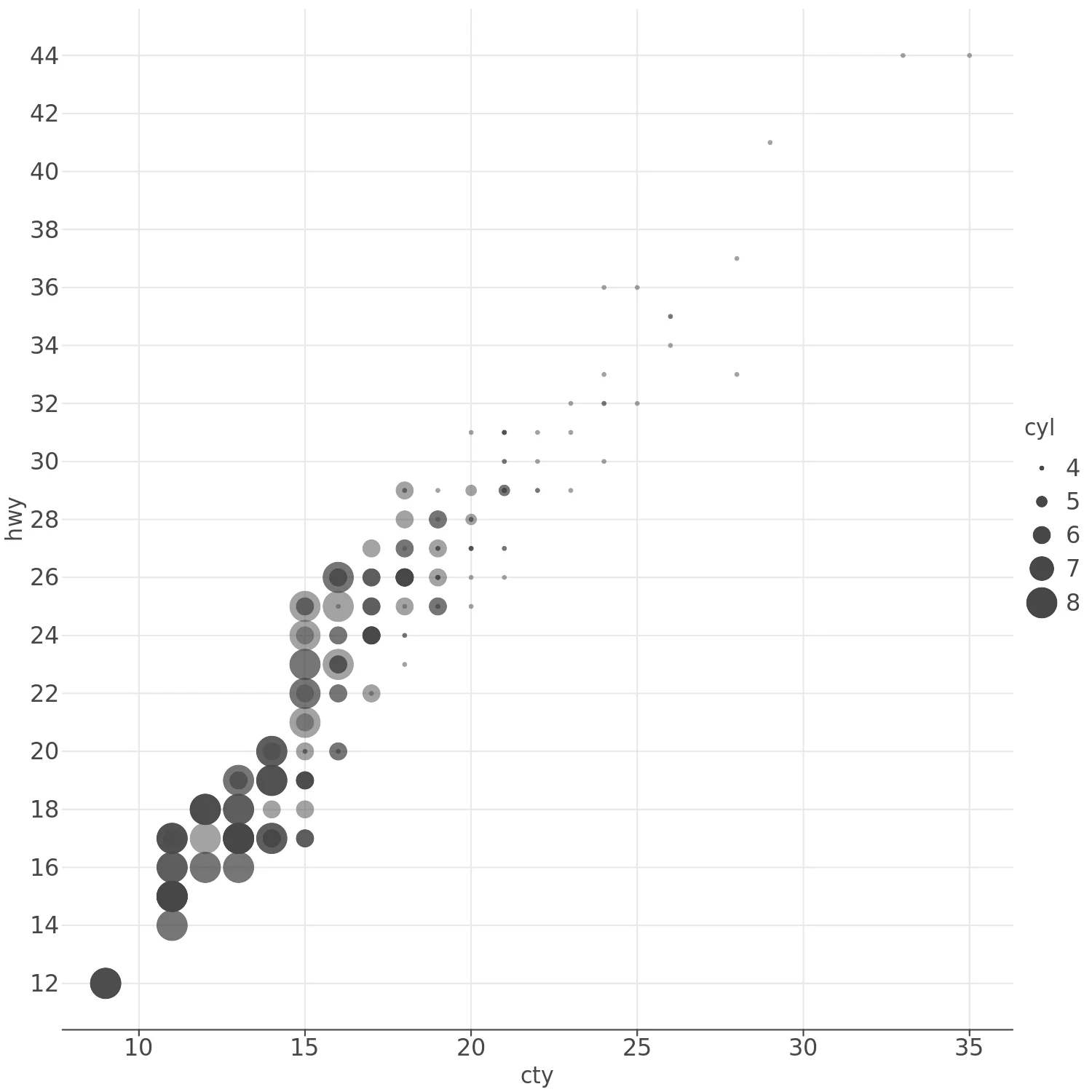
Code:
(lp.ggplot(mpg) +
    lp.aes(x='cty', y='hwy', size='cyl') +
    lp.geom_point(alpha=.5))
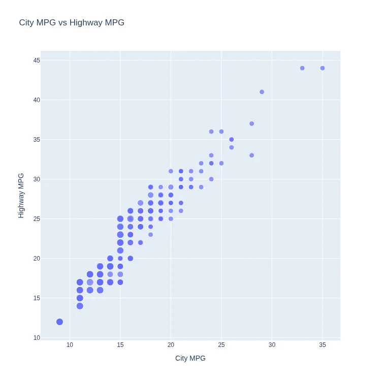
Code:
px.scatter(
    mpg, x='cty', y='hwy',
    size='cyl', size_max=10,
    title='City MPG vs Highway MPG',
    labels=dict(cty='City MPG', hwy='Highway MPG')
)
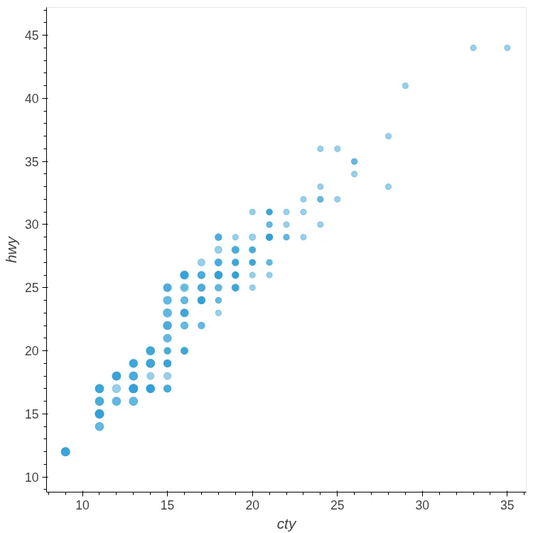
Code:
mpg.hvplot.scatter(
    x='cty', y='hwy',
    s='cyl', scale=4, alpha=0.5)
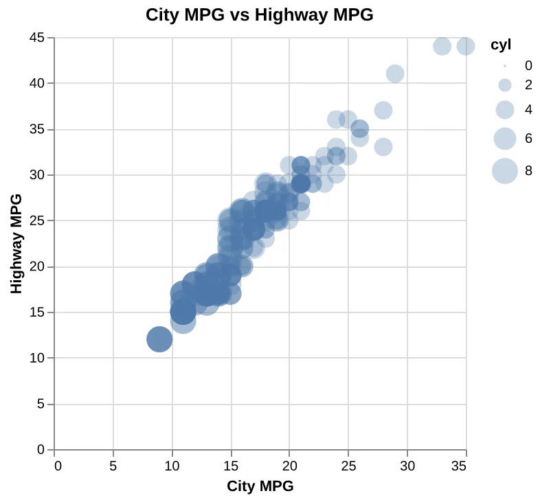
Code:
(
    alt.Chart(
        mpg,
        title='City MPG vs Highway MPG',
    )
    .mark_circle(opacity=0.3)
    .encode(
        x=alt.X(
            'cty',
            axis=alt.Axis(title='City MPG'),
        ),
        y=alt.Y(
            'hwy',
            axis=alt.Axis(
                title='Highway MPG'
            ),
        ),
        size='cyl',
    )
)
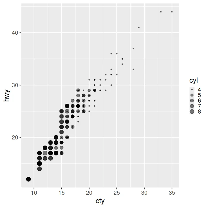
Code:
ggplot(data = mpg) +
    aes(x = cty, y = hwy, size = cyl) +
    geom_point(alpha=.5)
Scatter Plot Faceted on One Variable#
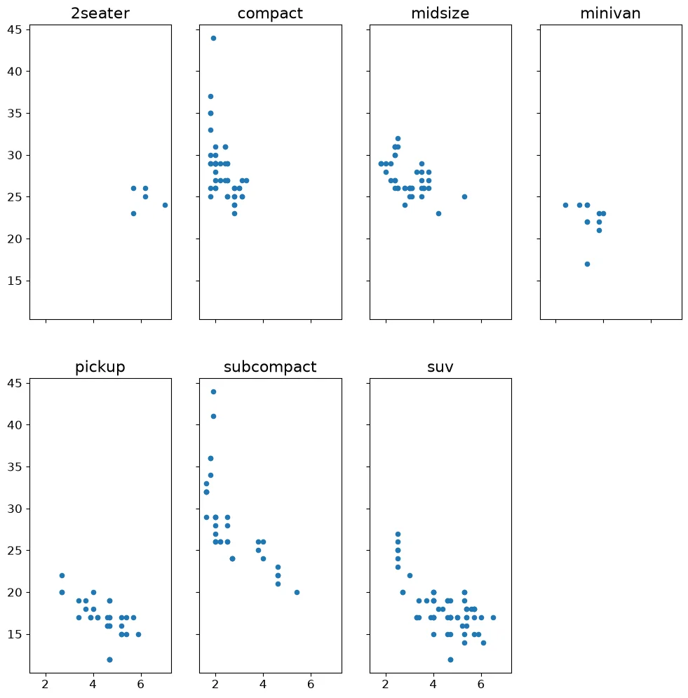
Code:
classes = sorted(mpg['class'].unique())
fig, axes = pyplot.subplots(
    2, 4, sharex=True, sharey=True)
for ax, c in zip(axes.flat, classes):
    d = mpg[mpg['class'] == c]
    ax.scatter(d['displ'], d['hwy'], s=20)
    ax.set_title(c, fontsize=16)
    ax.tick_params(labelsize=12)
for ax in axes.flat[len(classes):]:
    ax.remove()
Note:
Matplotlib has no faceting. subplots makes
the grid splitting the data, titling each panel
and hiding the leftover axes is manual.
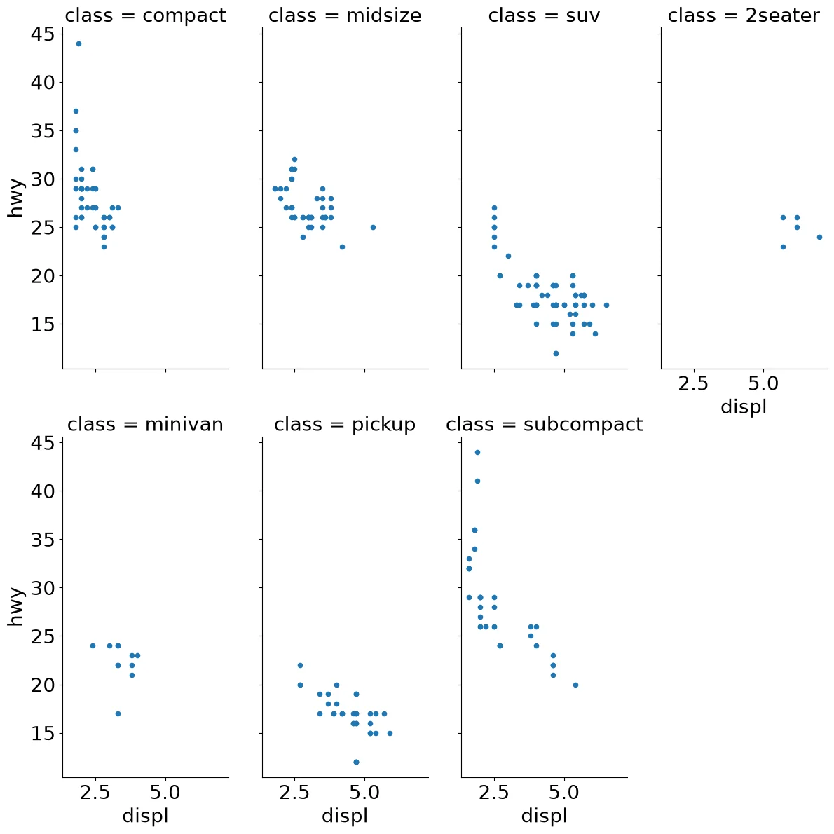
Code:
(mpg
 .pipe(sns.FacetGrid,
       col='class',
       col_wrap=4,
       aspect=.5,
       height=6)
 .map(pyplot.scatter, 'displ', 'hwy', s=20)
 .fig.subplots_adjust(wspace=.2, hspace=.2)
)
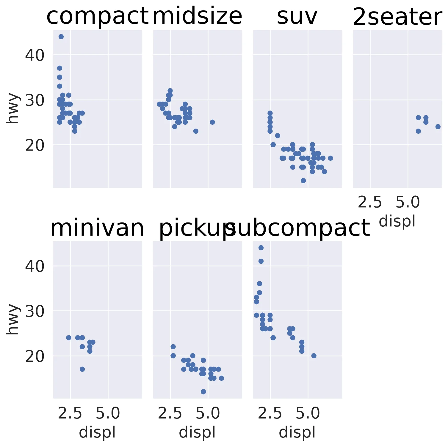
Code:
(so.Plot(mpg, x='displ', y='hwy')
 .add(so.Dot())
 .facet('class', wrap=4))
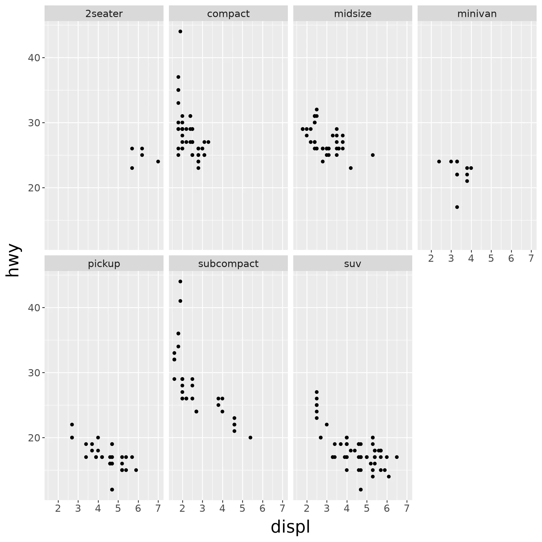
Code:
(ggplot(mpg.assign(c=mpg['class'])) +
  aes(x='displ', y='hwy') +
  geom_point() +
  facet_wrap(' ~ c', nrow = 2))
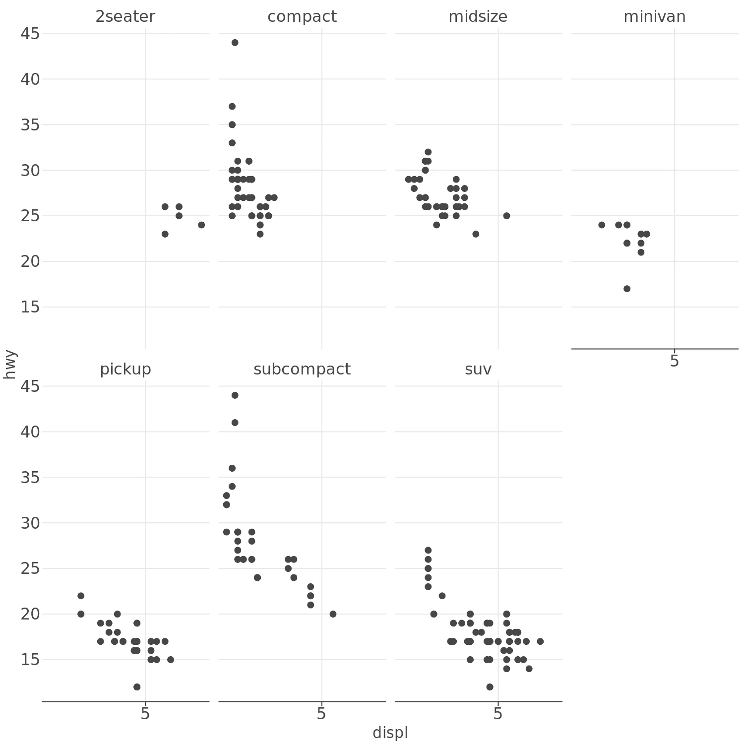
Code:
(lp.ggplot(mpg) +
  lp.aes(x='displ', y='hwy') +
  lp.geom_point() +
  lp.facet_wrap(facets='class', nrow=2))
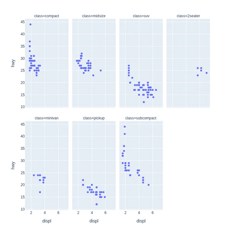
Code:
px.scatter(
    mpg, x='displ', y='hwy',
    facet_col='class', facet_col_wrap=4
)
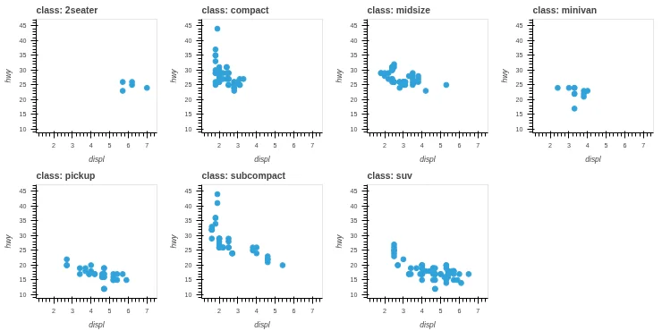
Code:
(mpg.hvplot.scatter(
    x='displ', y='hwy', by='class',
    subplots=True, fontscale=0.65,
    width=185, height=185)
 .cols(4))
Code:
alt.Chart(mpg).mark_circle().encode(
    x=alt.X('displ'),
    y=alt.Y('hwy'),
    facet=alt.Facet('class:O', columns=4),
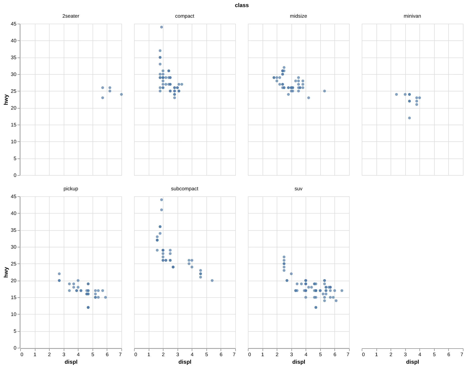
).properties(width=200, height=300)
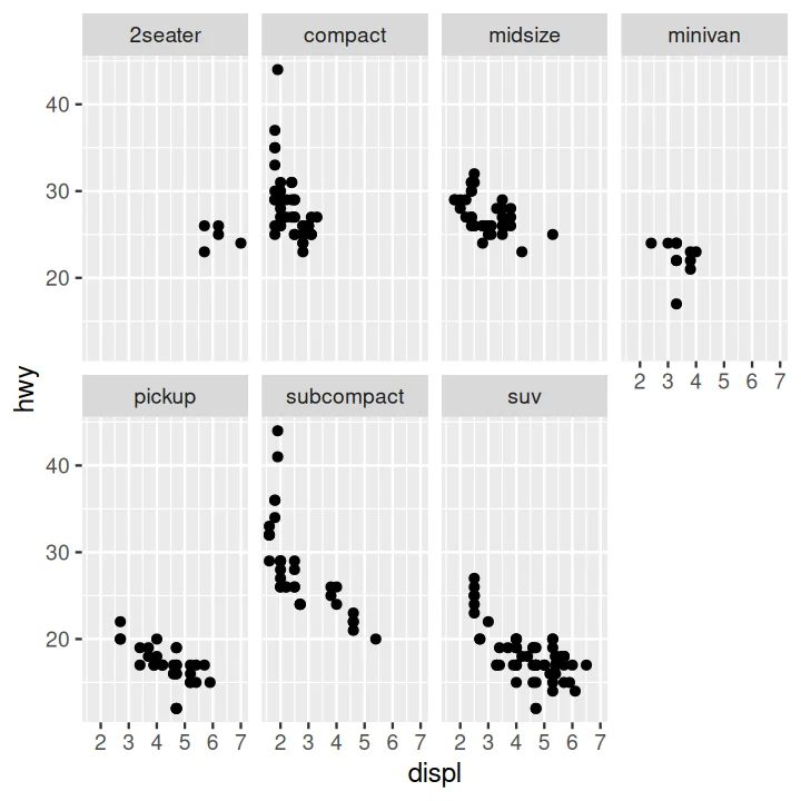
Code:
ggplot(data = mpg) +
  aes(x=displ, y=hwy) +
  geom_point() +
  facet_wrap(~ class, nrow = 2)
Scatter Plot Faceted on Two Variables#
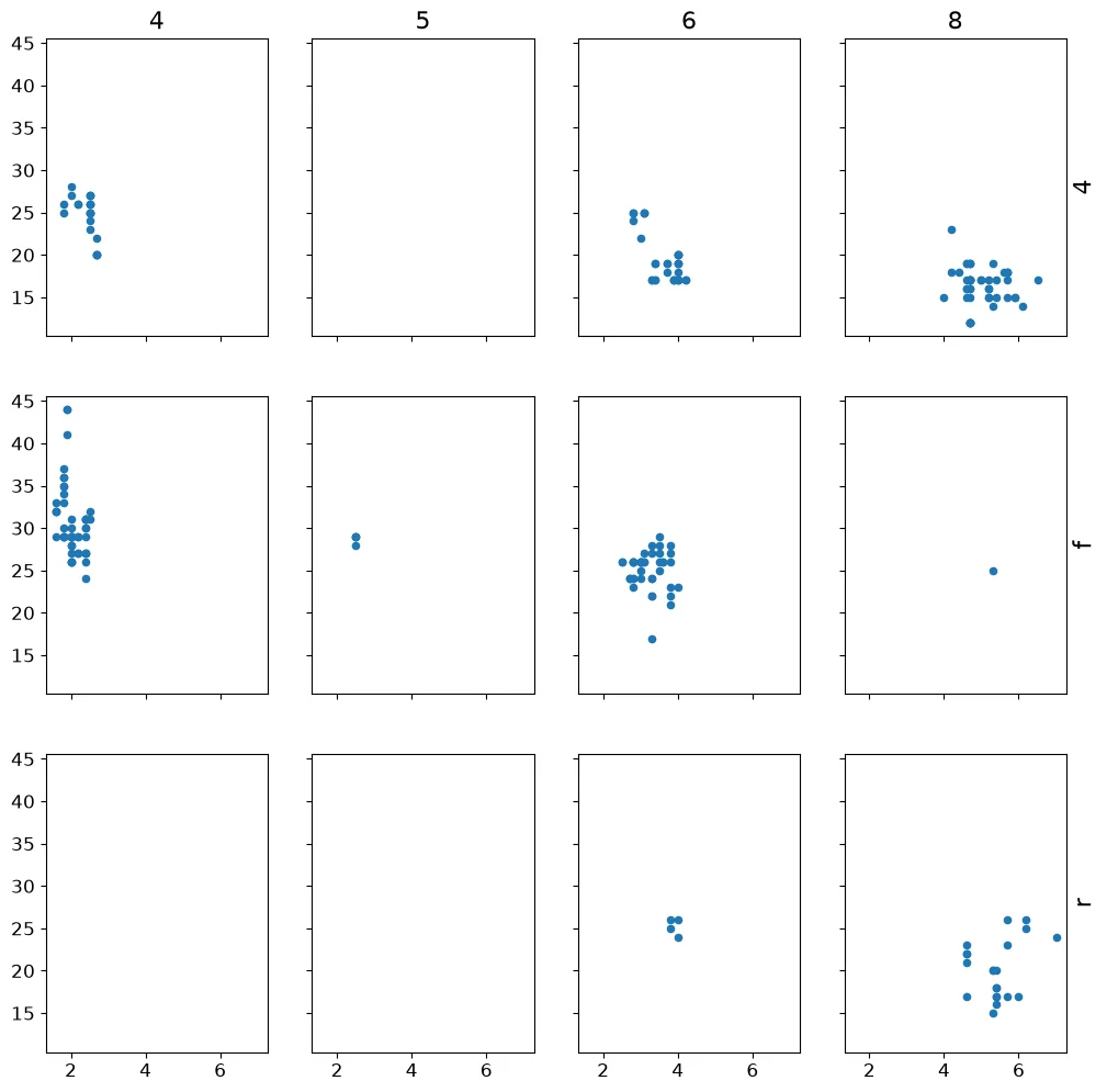
Code:
drvs = sorted(mpg['drv'].unique())
cyls = sorted(mpg['cyl'].unique())
fig, axes = pyplot.subplots(
    len(drvs), len(cyls),
    sharex=True, sharey=True)
for i, drv in enumerate(drvs):
    for j, cyl in enumerate(cyls):
        d = mpg[(mpg['drv'] == drv)
                & (mpg['cyl'] == cyl)]
        ax = axes[i, j]
        ax.scatter(d['displ'], d['hwy'], s=20)
        ax.tick_params(labelsize=12)
for j, cyl in enumerate(cyls):
    axes[0, j].set_title(cyl, fontsize=16)
for i, drv in enumerate(drvs):
    ax = axes[i, -1]
    ax.set_ylabel(drv, fontsize=16)
    ax.yaxis.set_label_position('right')
Note:
The drv by cyl grid is indexed by hand.
The strip labels are axis titles on the top row
and the right column.
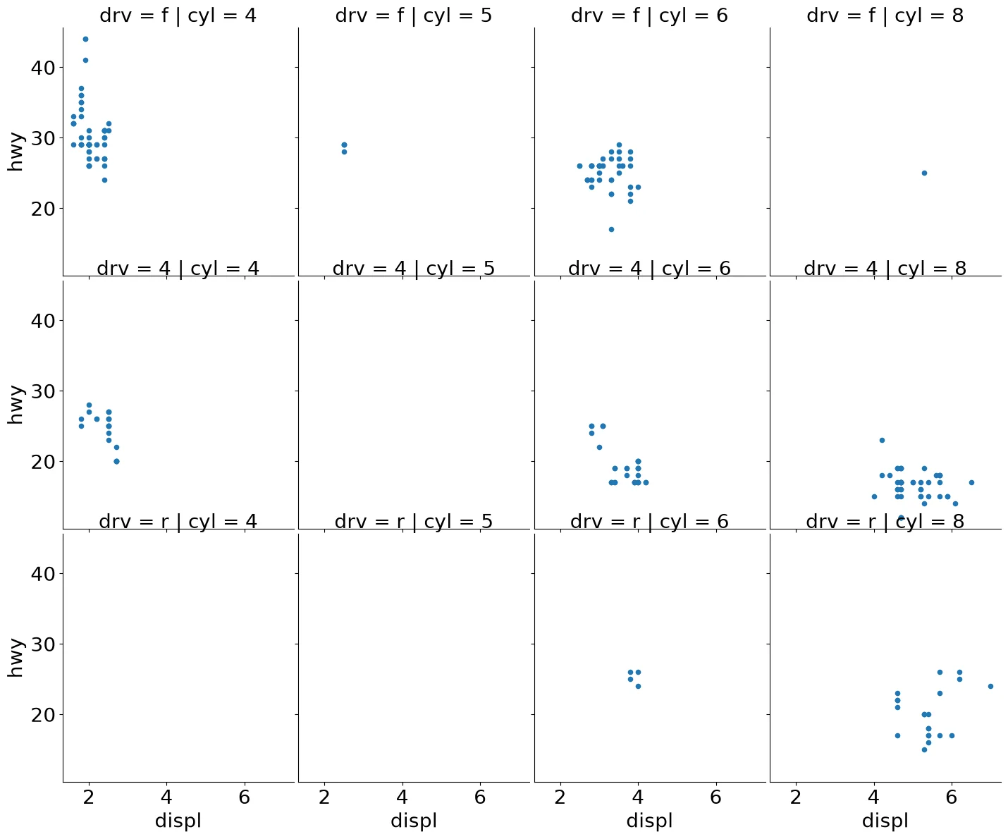
Code:
(mpg
 .pipe(sns.FacetGrid,
       col='cyl',
       row='drv',
       aspect=.9,
       height=4)
 .map(pyplot.scatter, 'displ', 'hwy', s=20)
 .fig.subplots_adjust(wspace=.02, hspace=.02)
)
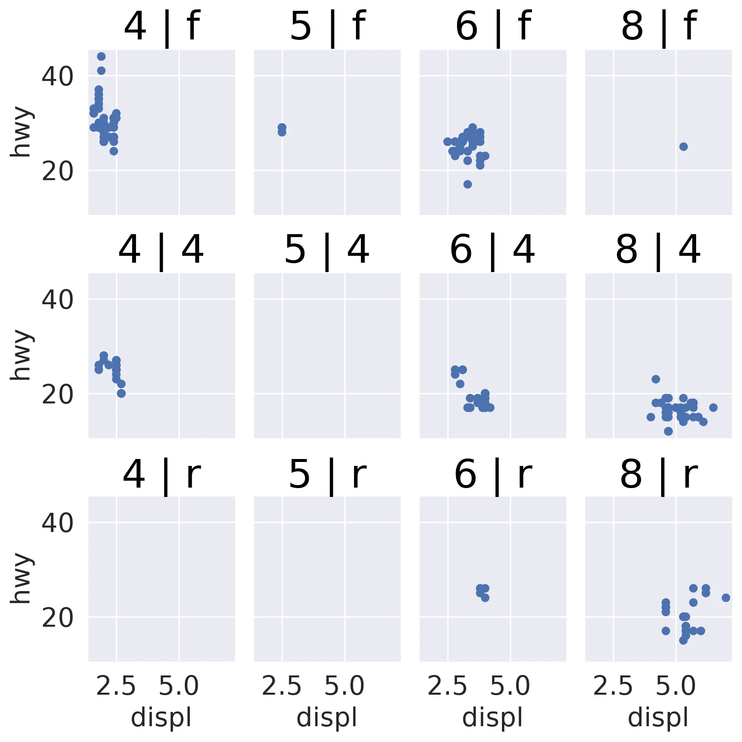
Code:
(so.Plot(mpg, x='displ', y='hwy')
 .add(so.Dot())
 .facet(col='cyl', row='drv'))
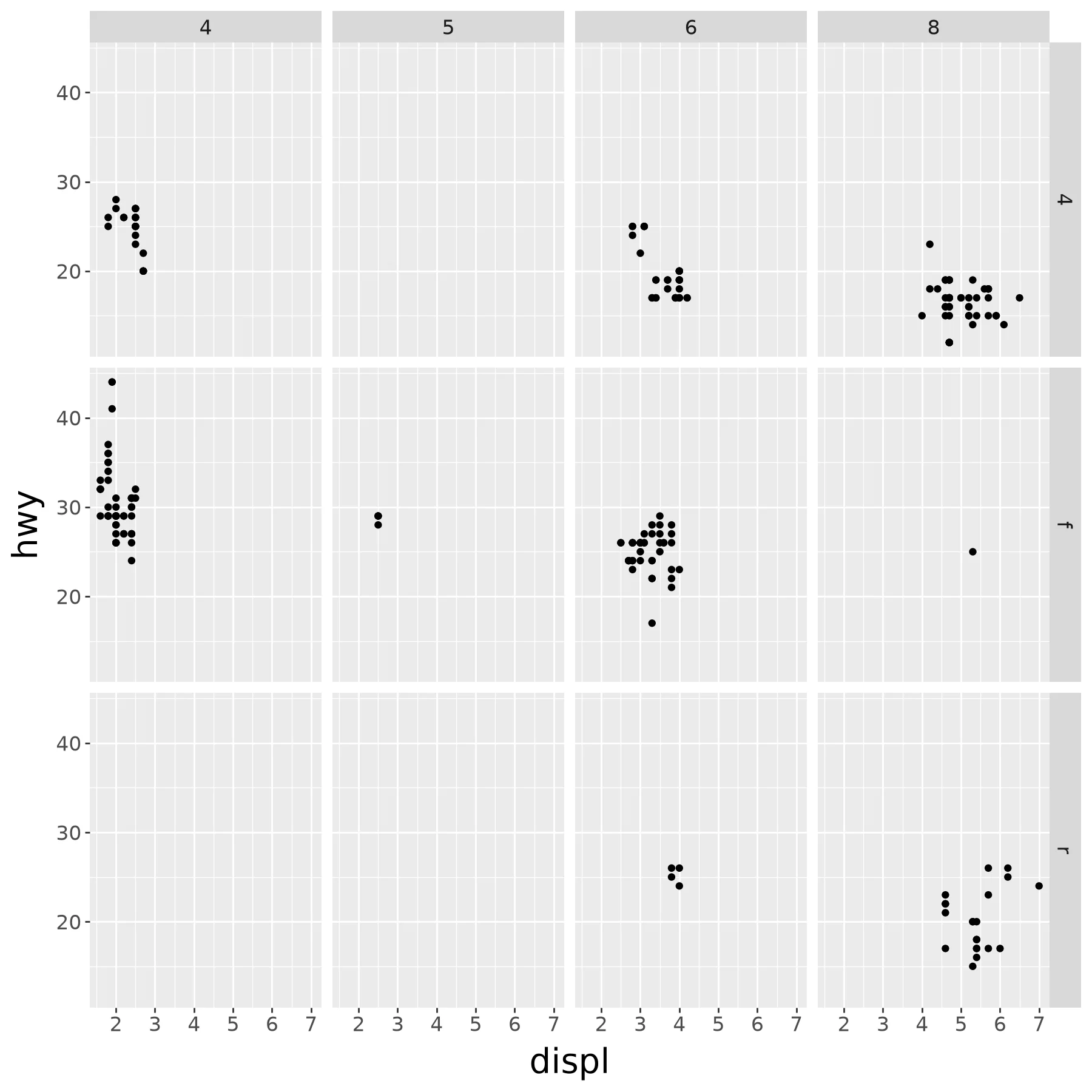
Code:
(ggplot(mpg) +
  aes(x='displ', y='hwy') +
  geom_point() +
  facet_grid('drv ~ cyl'))
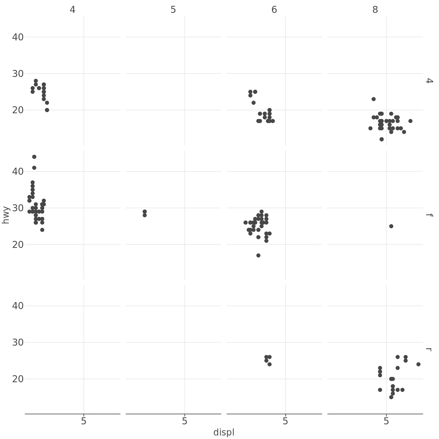
Code:
(lp.ggplot(mpg) +
  lp.aes(x='displ', y='hwy') +
  lp.geom_point() +
  lp.facet_grid(x='cyl', y='drv'))
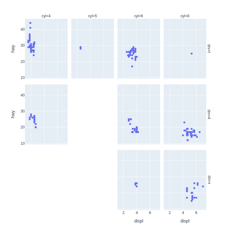
Code:
px.scatter(
    mpg, x='displ', y='hwy',
    facet_col='cyl', facet_row='drv',
    category_orders=dict(cyl=[4,5,6,8])
)
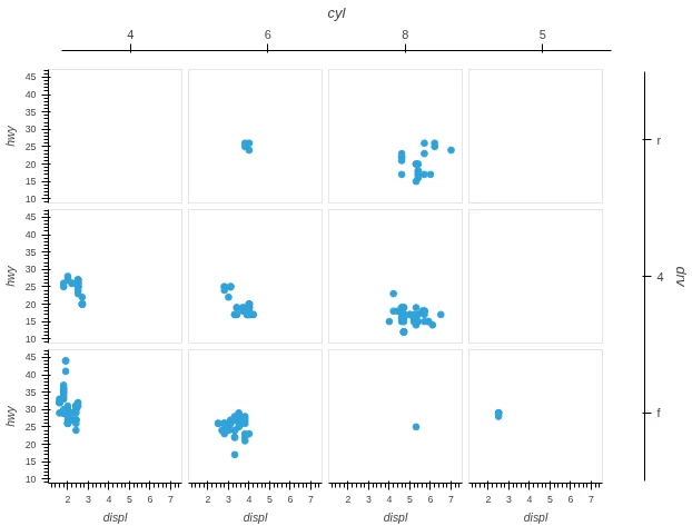
Code:
mpg.hvplot.scatter(
    x='displ', y='hwy',
    row='cyl', col='drv', subplots=True,
    fontscale=0.8, width=230, height=180)
Note:
row and col build a HoloViews GridSpace,
which sorts its panels by the facet values.
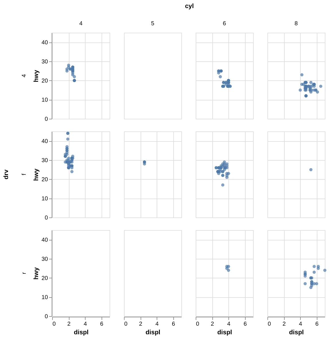
Code:
(alt
 .Chart(mpg)
 .mark_circle()
 .encode(x='displ', y='hwy',)
 .properties(
    width=100, height=150
  )
 .facet(column='cyl', row='drv')
)
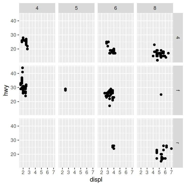
Code:
ggplot(data = mpg) +
  aes(x = displ, y = hwy) +
  geom_point() +
  facet_grid(drv ~ cyl)
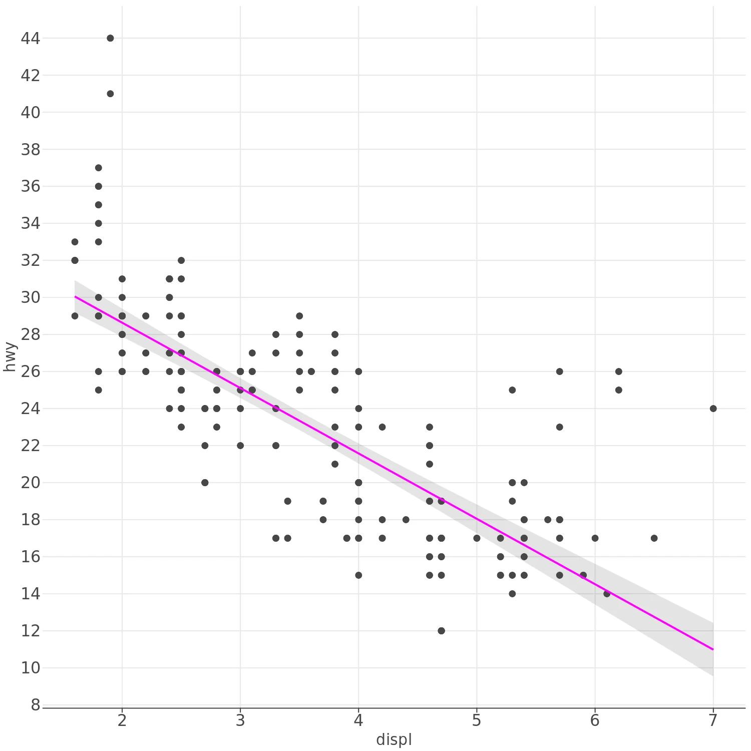
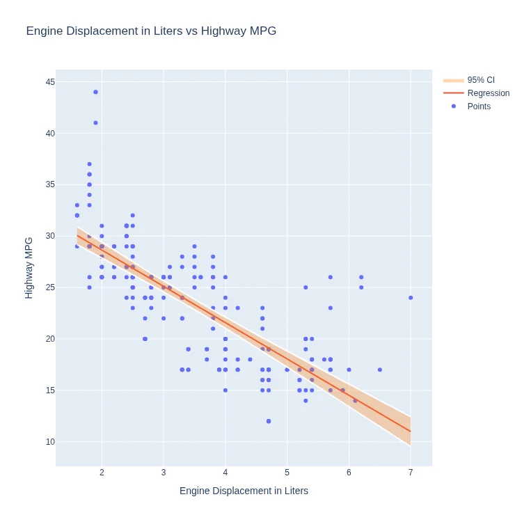
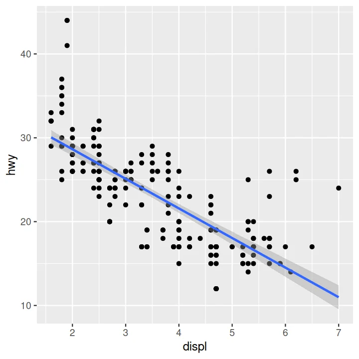
Scatter Plot and Regression Line with 95% Confidence Interval Layered#
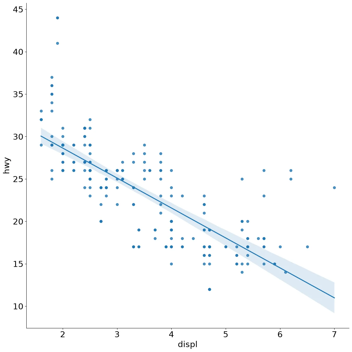
Code:
sns.lmplot(x='displ', y='hwy',
           data=mpg, height=12)
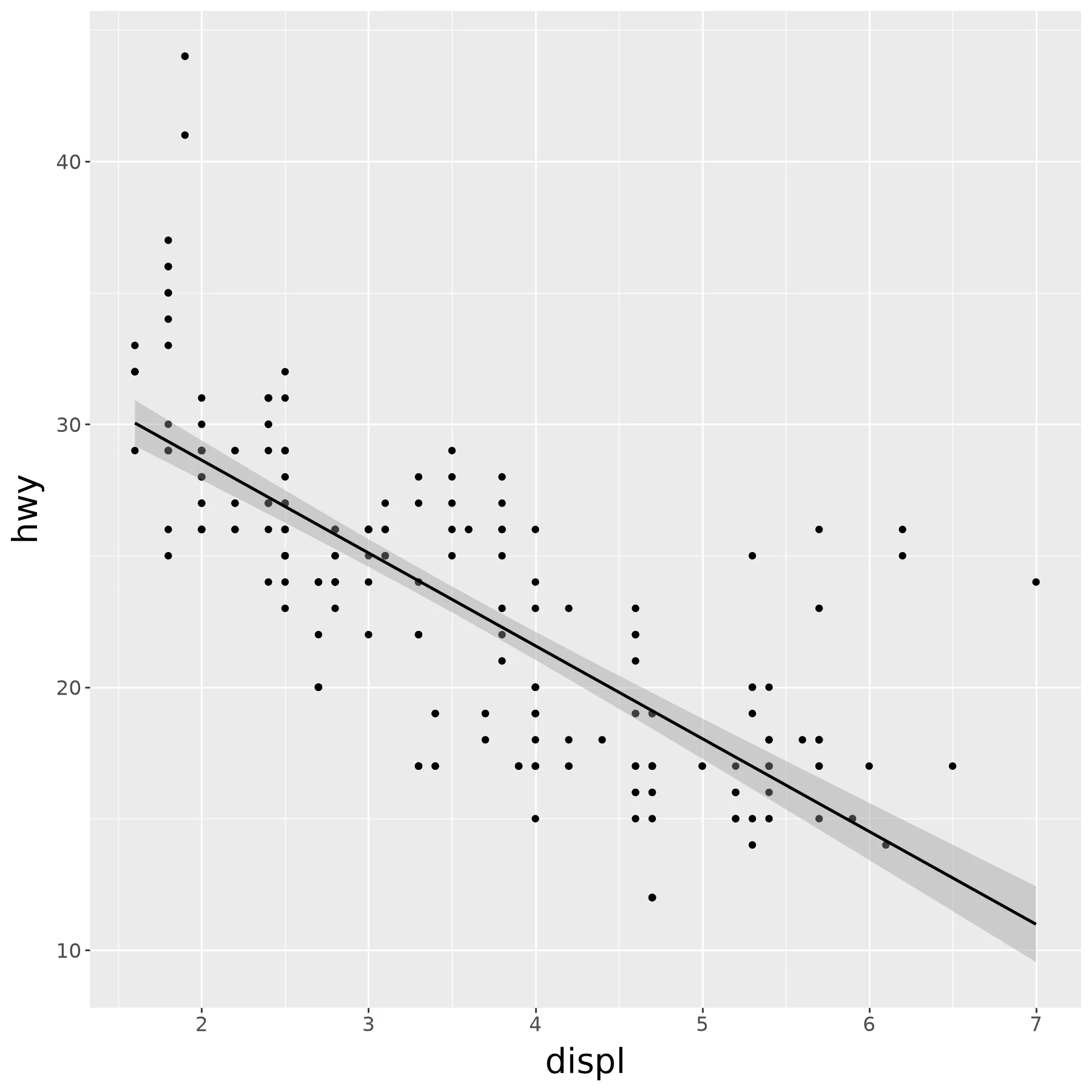
Code:
(ggplot(mpg) +
    aes('displ', 'hwy') +
    geom_point() +
    geom_smooth(method='lm'))
Code:
(lp.ggplot(mpg) +
    lp.aes('displ', 'hwy') +
    lp.geom_point() +
    lp.geom_smooth(method='lm'))
Code:
import statsmodels.api as sm
from statsmodels.stats.outliers_influence import summary_table

y=mpg.hwy
x=mpg.displ
X = sm.add_constant(x)
res = sm.OLS(y, X).fit()

st, data, ss2 = summary_table(res, alpha=0.05)
preds = pd.DataFrame.from_records(data, columns=[s.replace('\n', ' ') for s in ss2])
preds['displ'] = mpg.displ
preds = preds.sort_values(by='displ')

fig = graph_objects.Figure(layout={
    'title' : 'Engine Displacement in Liters vs Highway MPG',
    'xaxis' : {
        'title' : 'Engine Displacement in Liters'
    },
    'yaxis' : {
        'title' : 'Highway MPG'
    }
})
p1 = graph_objects.Scatter(**{
    'mode' : 'markers',
    'x' : mpg.displ,
    'y' : mpg.hwy,
    'name' : 'Points'
})
p2 = graph_objects.Scatter({
    'mode' : 'lines',
    'x' : preds['displ'],
    'y' : preds['Predicted Value'],
    'name' : 'Regression',
})
#Add a lower bound for the confidence interval, white
p3 = graph_objects.Scatter({
    'mode' : 'lines',
    'x' : preds['displ'],
    'y' : preds['Mean ci 95% low'],
    'name' : 'Lower 95% CI',
    'showlegend' : False,
    'line' : {
        'color' : 'white'
    }
})
# Upper bound for the confidence band, transparent but with fill
p4 = graph_objects.Scatter( {
    'type' : 'scatter',
    'mode' : 'lines',
    'x' : preds['displ'],
    'y' : preds['Mean ci 95% upp'],
    'name' : '95% CI',
    'fill' : 'tonexty',
    'line' : {
        'color' : 'white'
    },
    'fillcolor' : 'rgba(255, 127, 14, 0.3)'
})
fig.add_trace(p1)
fig.add_trace(p2)
fig.add_trace(p3)
fig.add_trace(p4)
Note:
No built in method to calculate and display confidence intervals. Must calculate manually and utilise existing features to build the confidence band.
Code:
ggplot(data = mpg) +
    aes(x = displ, y = hwy) +
    geom_point() +
    geom_smooth(method=lm)
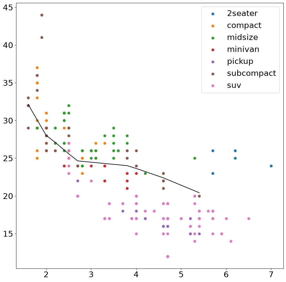
Smoothed Line Plot and Scatter Plot Layered#
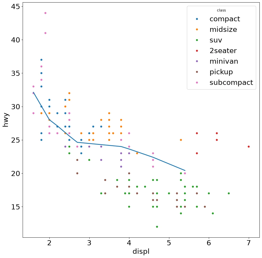
Code:
import statsmodels.api as sm

fig, ax = pyplot.subplots()
for c, d in mpg.groupby('class'):
    ax.scatter(d['displ'], d['hwy'], label=c)
sub = mpg[mpg['class'] == 'subcompact']
fit = sm.nonparametric.lowess(sub['hwy'],
                              sub['displ'])
ax.plot(fit[:, 0], fit[:, 1], color='black')
ax.legend()
Note:
Matplotlib has no smoother, so the loess fit comes from statsmodels.
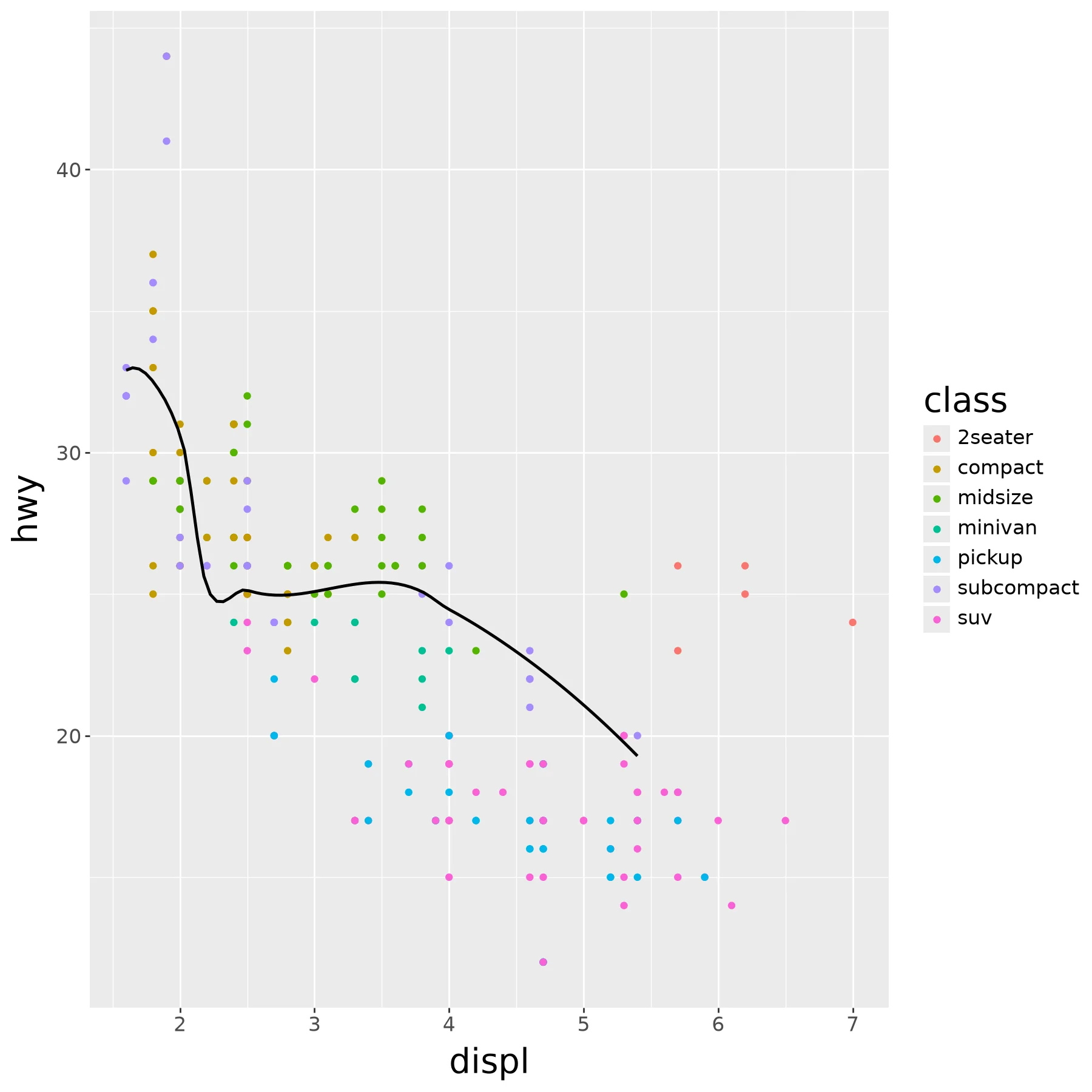
Code:
ax = sns.scatterplot(mpg, x='displ', y='hwy',
                     hue='class')
sns.regplot(mpg[mpg['class'] == 'subcompact'],
            x='displ', y='hwy', lowess=True,
            scatter=False, ax=ax)
Note:
lowess=True fits the loess curve. Seaborn
draws no confidence band around it.
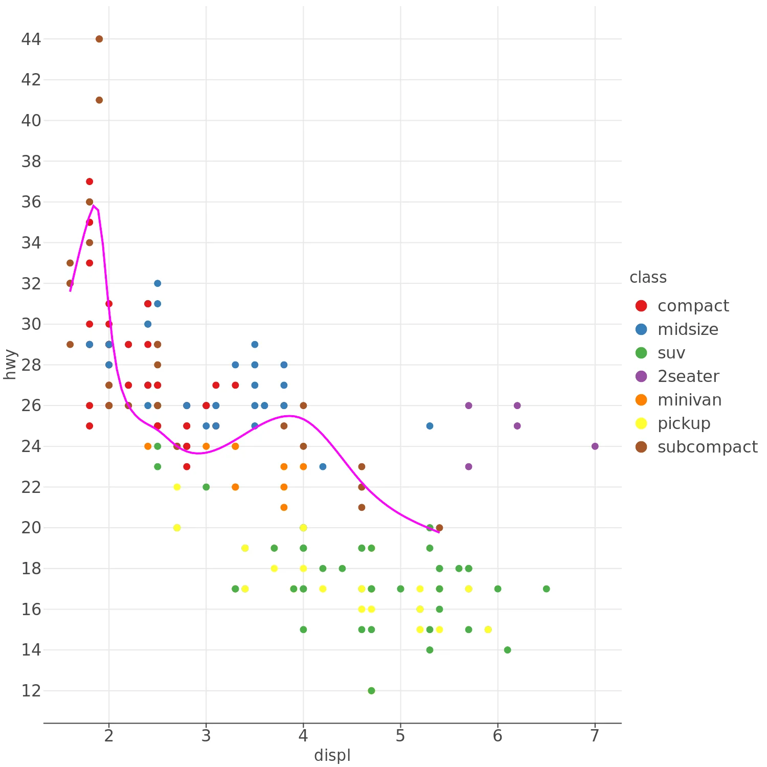
Code:
(ggplot(data=mpg,
        mapping=aes(x='displ', y='hwy')) +
  geom_point(mapping=aes(color = 'class')) +
  geom_smooth(data=mpg[mpg['class'] == 'subcompact'],
              se=False,
              method = 'loess'
             ))
Note:
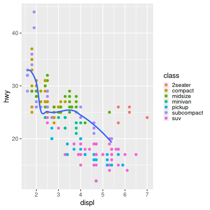
Notice the smoothed line isn't as smooth as it is in ggplot2.
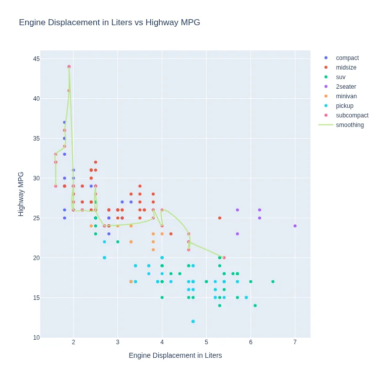
Code:
(lp.ggplot(mpg) +
  lp.aes(x='displ', y='hwy') +
  lp.geom_point(lp.aes(color='class')) +
  lp.geom_smooth(data=mpg[mpg['class'] == 'subcompact'],
                 se=False,
                 method='loess'))
Code:
traces = []
for cls in mpg['class'].unique():
    traces.append(graph_objects.Scatter({
        'mode' : 'markers',
        'x' : mpg.displ[mpg['class'] == cls],
        'y' : mpg.hwy[mpg['class'] == cls],
        'name' : cls
    }))


subcompact = mpg[mpg['class'] == 'subcompact'].sort_values(by='displ')

traces.append(graph_objects.Scatter({
    'mode' : 'lines',
    'x' : subcompact.displ,
    'y' : subcompact.hwy,
    'name' : 'smoothing',
    'line' : {
        'shape' : 'spline',
        'smoothing' : 1.3
    }
}))

fig = graph_objects.Figure(**{
    'data' : traces,
    'layout' : {
        'title' : 'Engine Displacement in Liters vs Highway MPG',
        'xaxis' : {
            'title' : 'Engine Displacement in Liters',
        },
        'yaxis' : {
            'title' : 'Highway MPG'
        }
    }
})
Note:
Plotly's builtin smoothing function is very weak
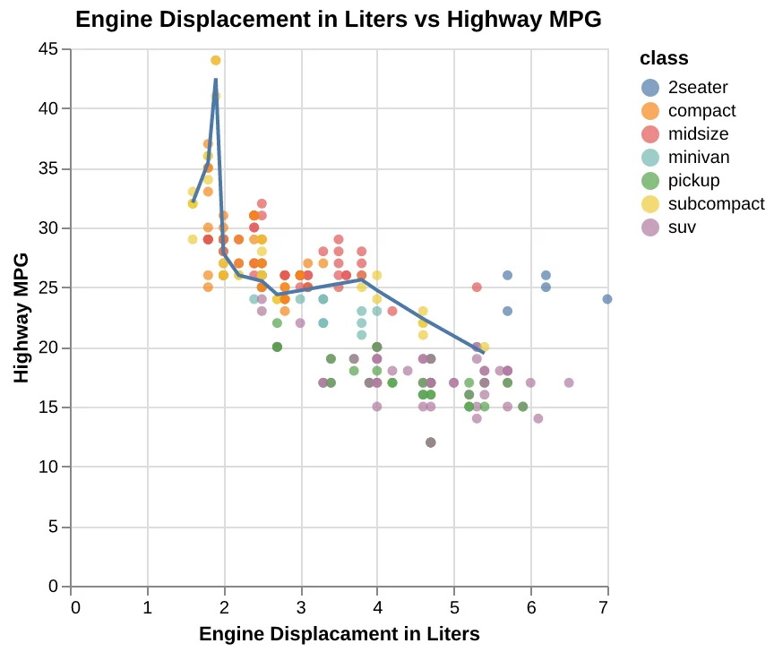
Code:
scatter = (
    alt.Chart(
        mpg,
        title='Engine Displacement in Liters vs Highway MPG',
    )
    .mark_circle()
    .encode(
        x=alt.X(
            'displ',
            axis=alt.Axis(
                title='Engine Displacament in Liters'
            ),
        ),
        y=alt.Y(
            'hwy',
            axis=alt.Axis(
                title='Highway MPG'
            ),
        ),
        color='class',
    )
)

line = (
    alt.Chart(
        mpg[mpg['class'] == 'subcompact']
    )
    .transform_loess('displ', 'hwy')
    .mark_line()
    .encode(x=alt.X('displ'), y=alt.Y('hwy'))
)

scatter + line
Code:
subcompact = mpg[mpg$`class` == 'subcompact', ]
ggplot(data = mpg,
       mapping = aes(x = displ, y = hwy)) +
  geom_point(mapping = aes(color = class)) +
  geom_smooth(data = subcompact,
              se = FALSE,
              method = 'loess')
Stacked Bar Chart#
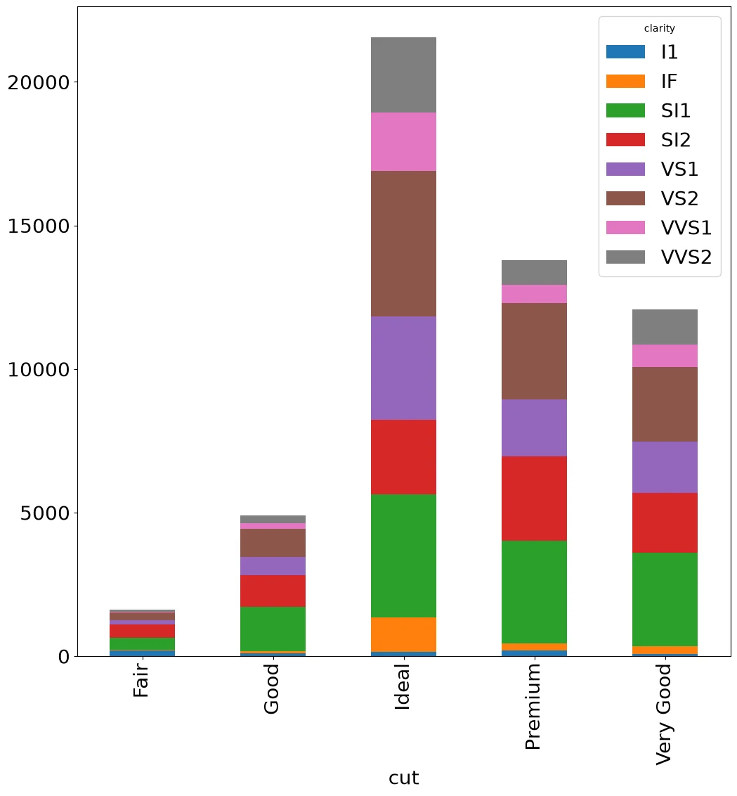
Code:
(diamonds
 .groupby(['cut', 'clarity'])
 .size()
 .unstack()
 .plot.bar(stacked=True)
)
Code:
counts = (diamonds
          .groupby(['cut', 'clarity'])
          .size()
          .unstack())
fig, ax = pyplot.subplots()
bottom = np.zeros(len(counts))
for clarity in counts.columns:
    ax.bar(counts.index, counts[clarity],
           bottom=bottom, label=clarity)
    bottom += counts[clarity].values
ax.legend()
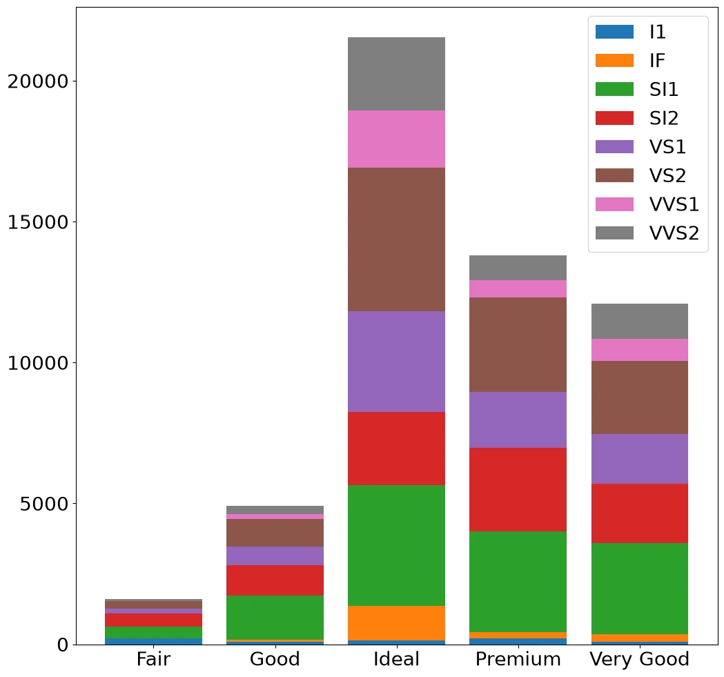
Note:
Matplotlib stacks bars by carrying the running
total of each series in bottom.
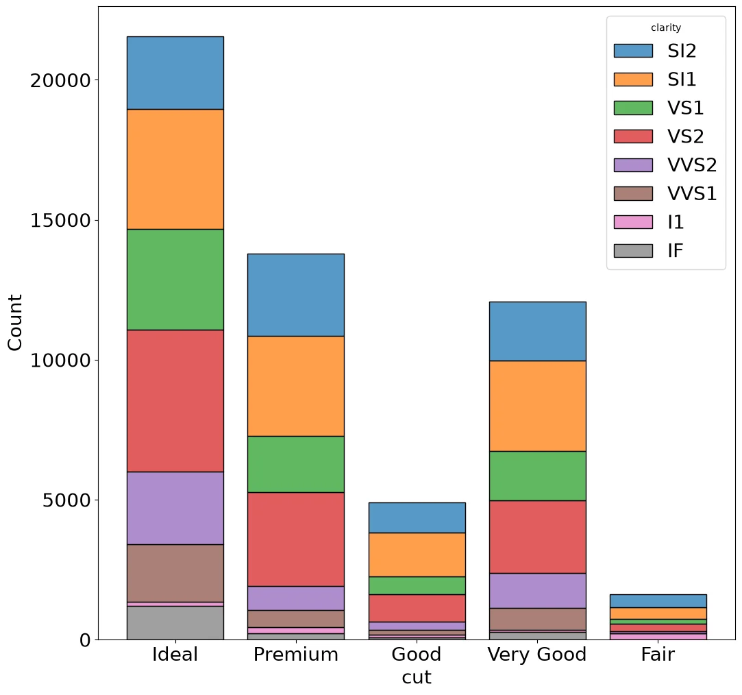
Code:
sns.histplot(diamonds, x='cut',
             hue='clarity',
             multiple='stack', shrink=.8)
Note:
Classic seaborn has no bar-stacking function.
histplot counts the categories and stacks the
hue levels.
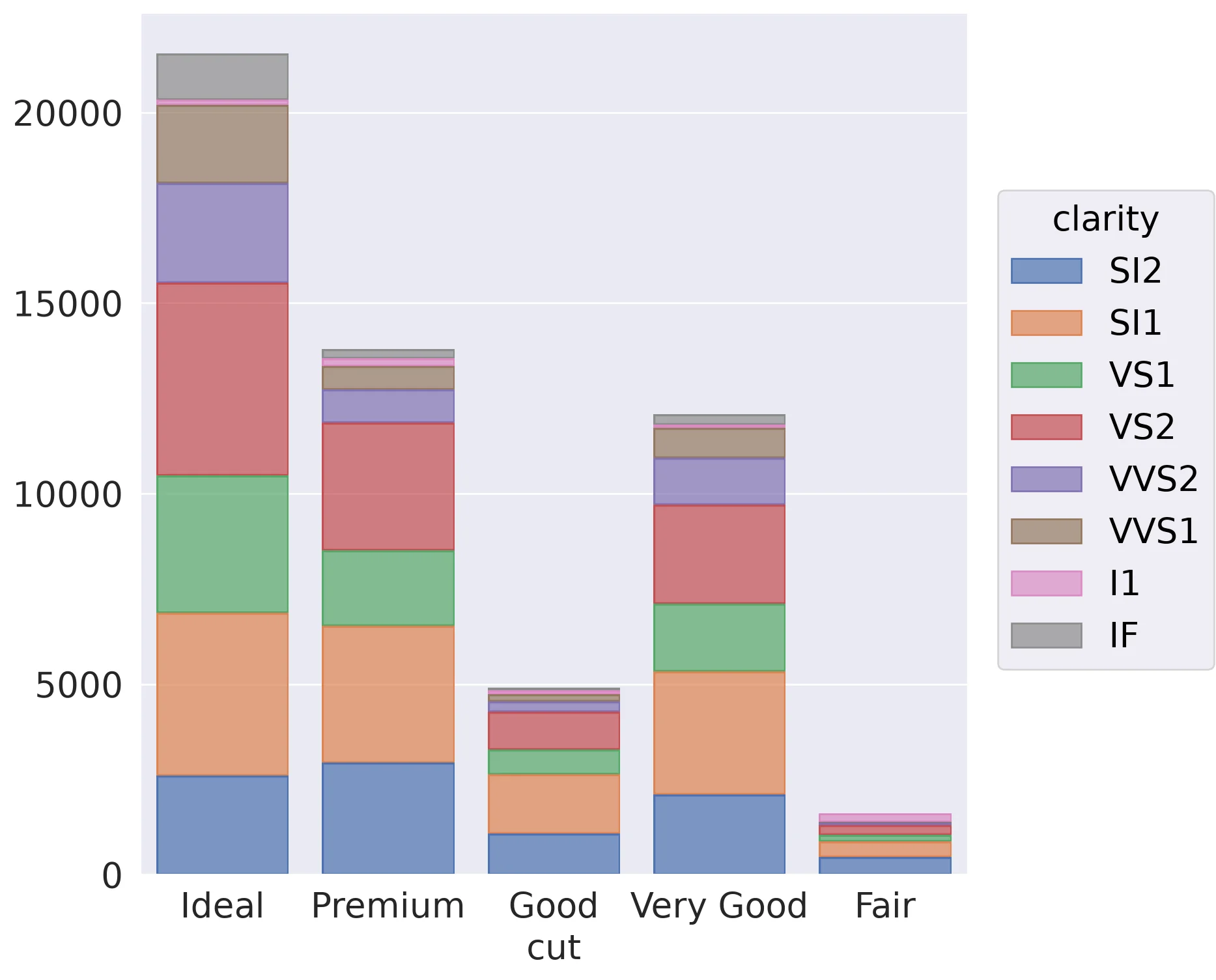
Code:
(so.Plot(diamonds, x='cut', color='clarity')
 .add(so.Bar(), so.Count(), so.Stack()))
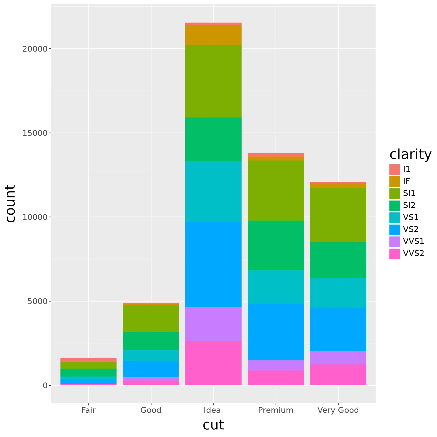
Code:
(ggplot(diamonds) +
  aes(x='cut', fill='clarity') +
  geom_bar())
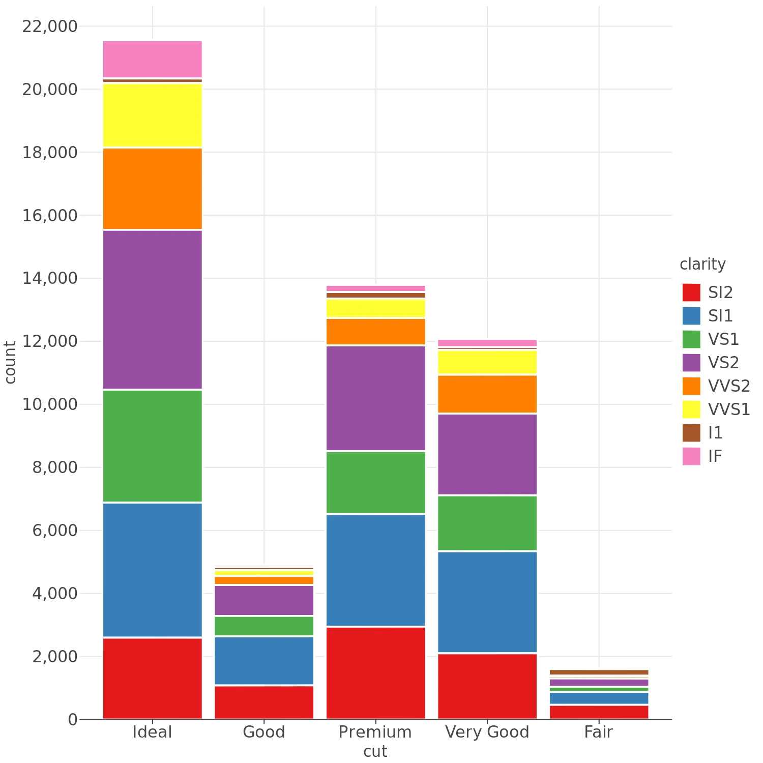
Code:
(lp.ggplot(diamonds) +
  lp.aes(x='cut', fill='clarity') +
  lp.geom_bar())
Code:
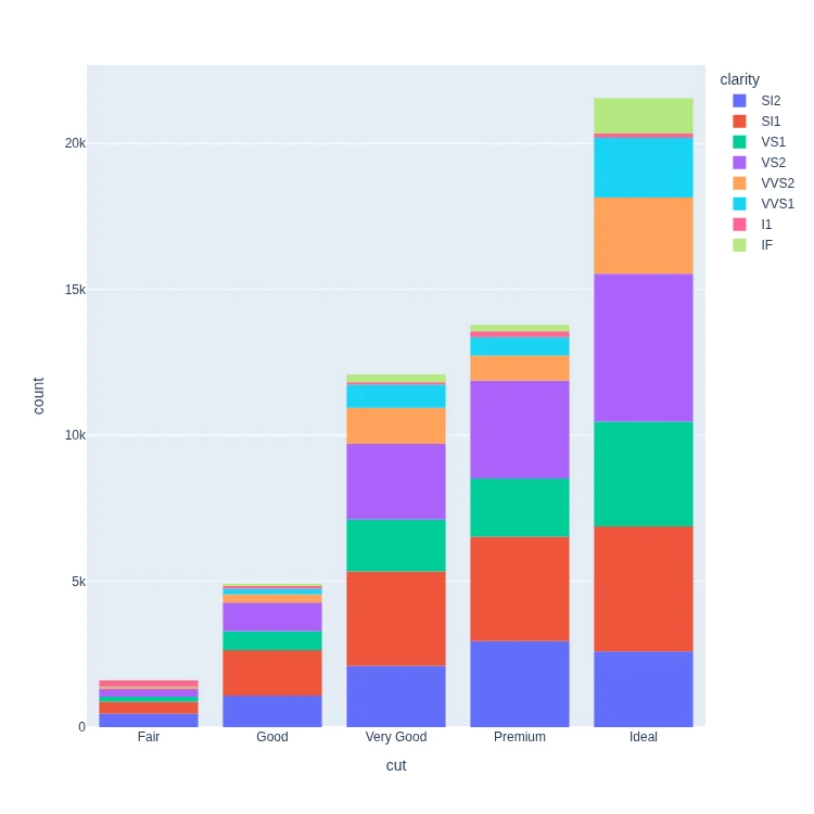
px.histogram(
    diamonds, x='cut', color='clarity',
    category_orders=dict(cut=[
     'Fair', 'Good',  'Very Good',
     'Premium', 'Ideal'])
)
Code:
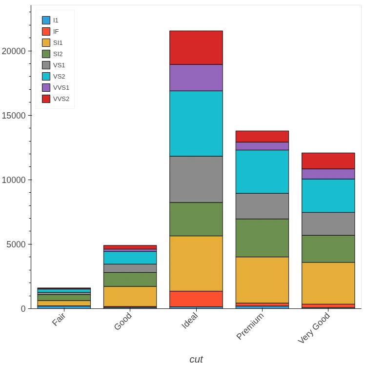
(diamonds
 .groupby(['cut', 'clarity'])
 .size()
 .unstack()
 .hvplot.bar(stacked=True, rot=45,
             legend='top_left'))
Code:
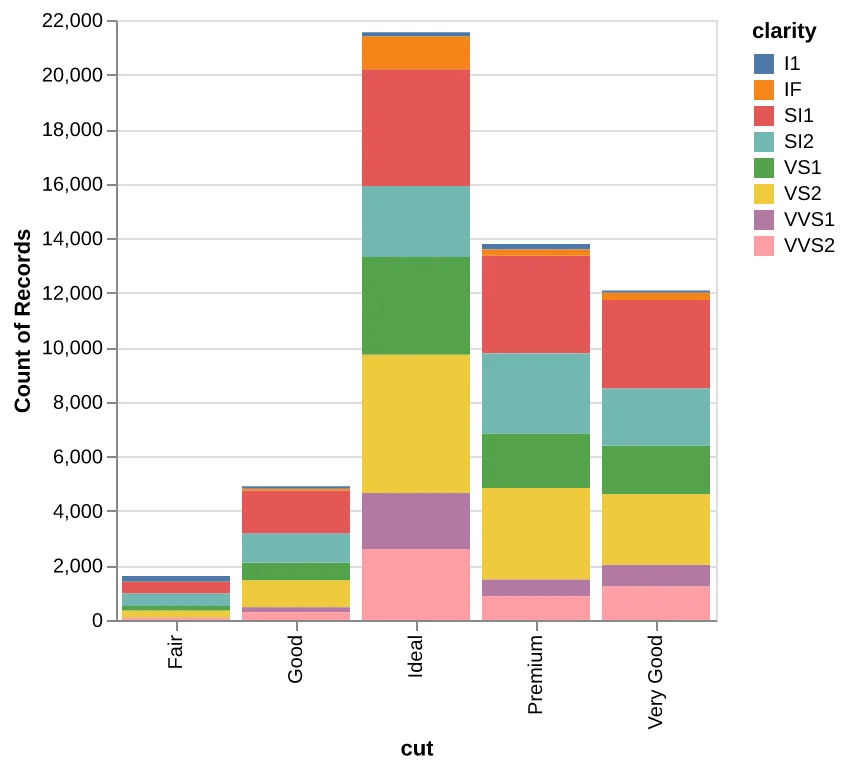
alt.data_transformers.disable_max_rows()
alt.Chart(diamonds).mark_bar().encode(
    x='cut', y='count(cut)', color='clarity'
).properties(width=300)
Code:
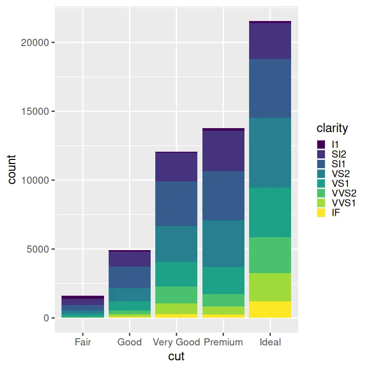
ggplot(data = diamonds) +
  aes(x = cut, fill = clarity) +
  geom_bar()
Dodged Bar Chart#
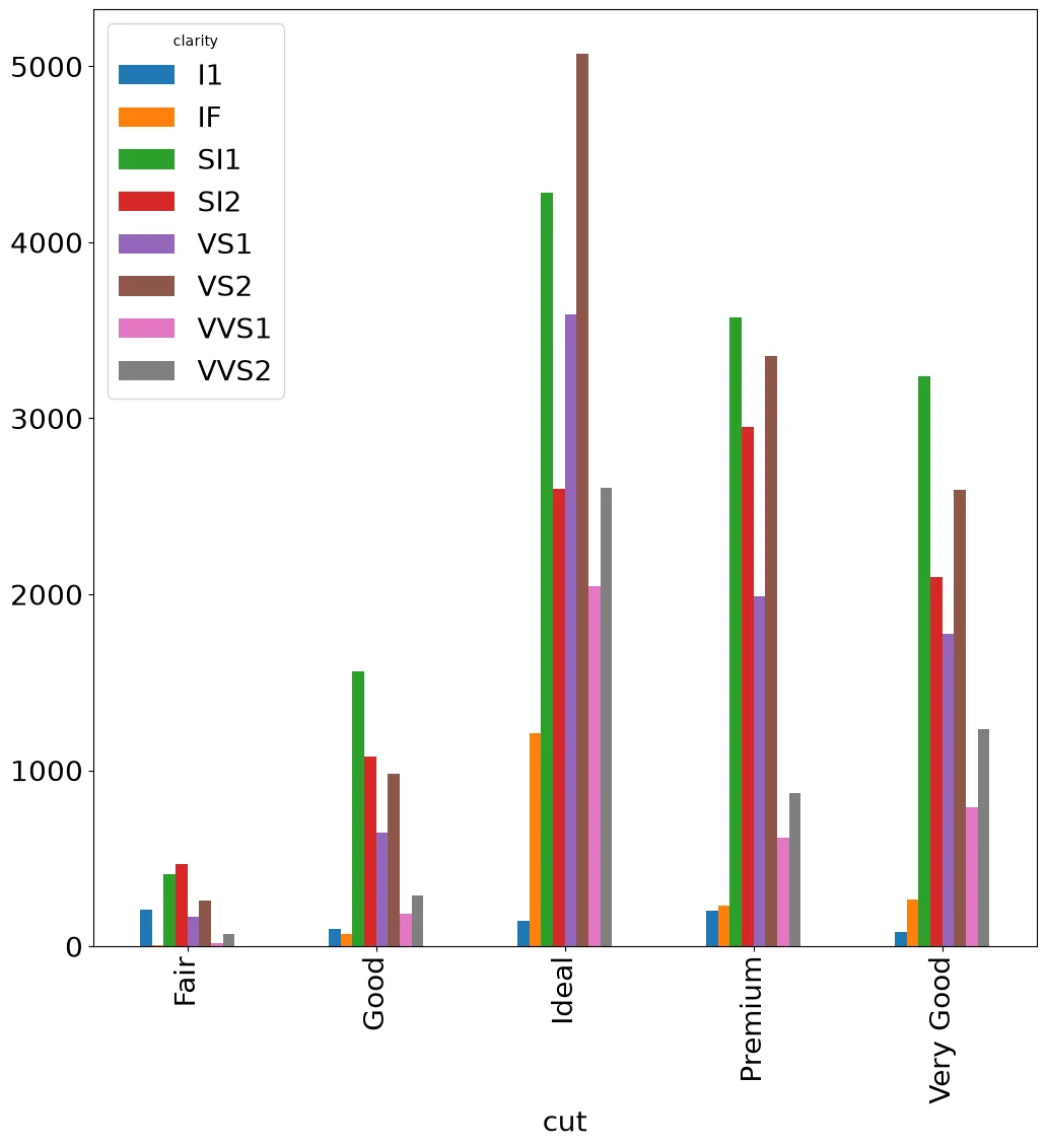
Code:
(diamonds
 .groupby(['cut', 'clarity'])
 .size()
 .unstack()
 .plot.bar()
)
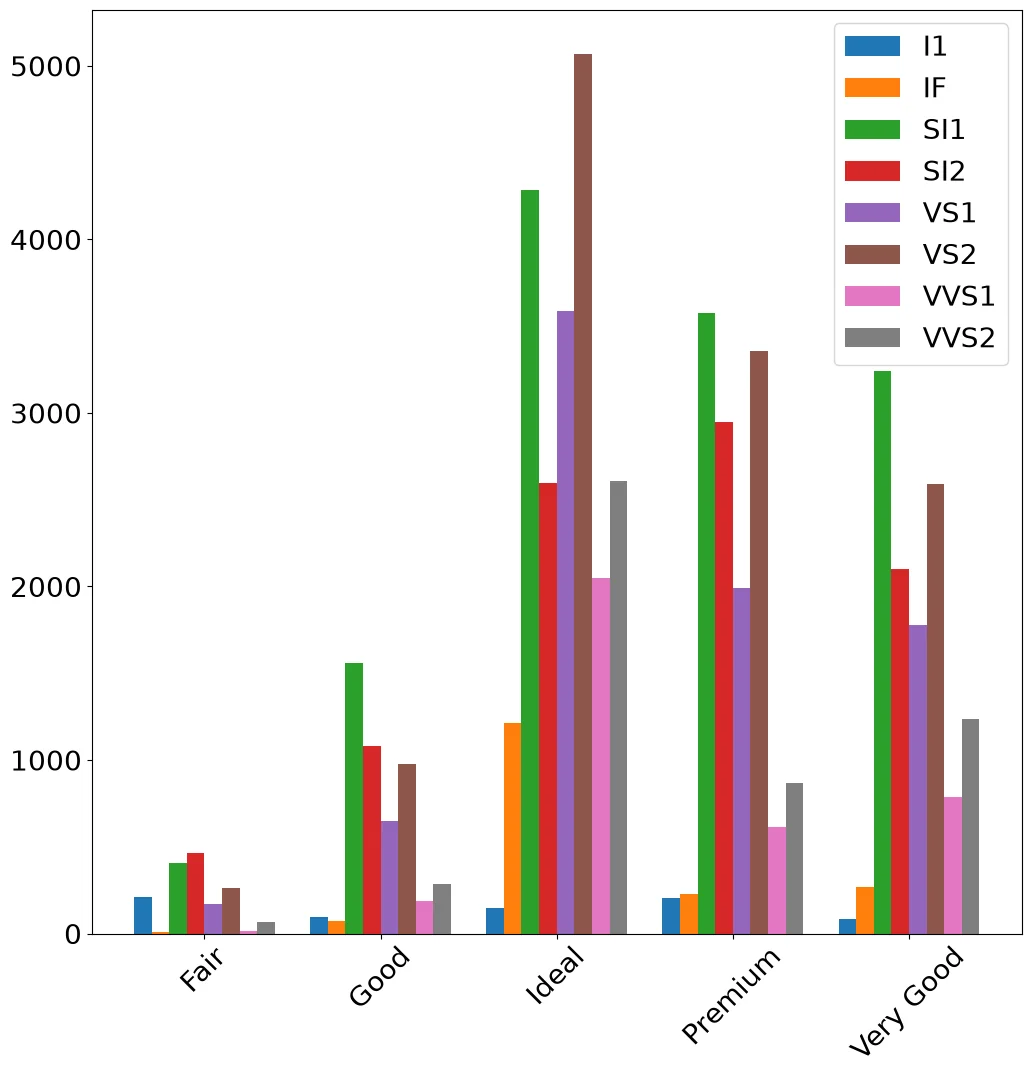
Code:
counts = (diamonds
          .groupby(['cut', 'clarity'])
          .size()
          .unstack())
x = np.arange(len(counts))
width = .8 / len(counts.columns)
fig, ax = pyplot.subplots()
for i, clarity in enumerate(counts.columns):
    ax.bar(x + i * width, counts[clarity],
           width=width, label=clarity)
ax.set_xticks(x + .4 - width / 2)
ax.set_xticklabels(counts.index, rotation=45)
ax.legend()
Note:
Dodging is manual: shift each series by its own offset and move the ticks back to the group centers.
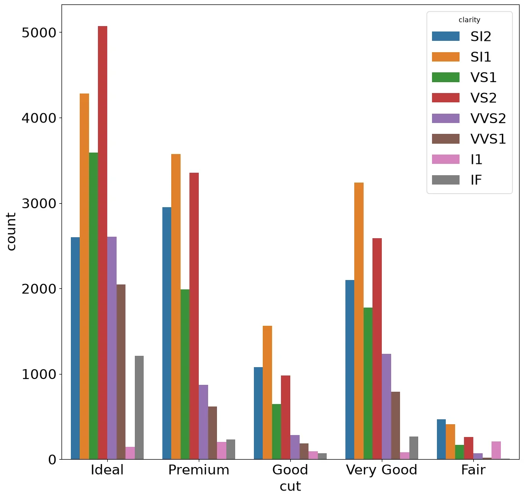
Code:
sns.countplot(diamonds, x='cut',
              hue='clarity')
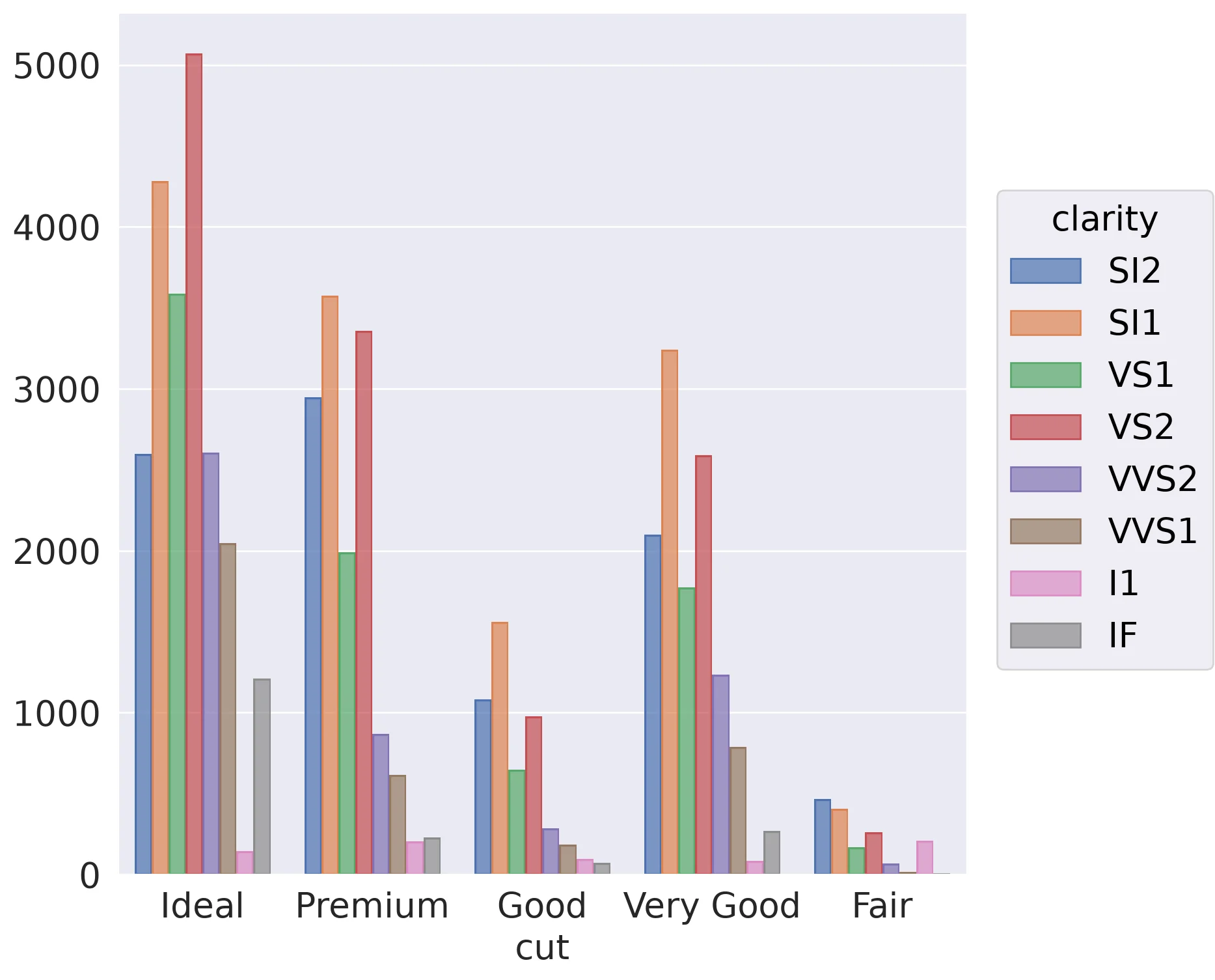
Code:
(so.Plot(diamonds, x='cut', color='clarity')
 .add(so.Bar(), so.Count(), so.Dodge()))
Code:
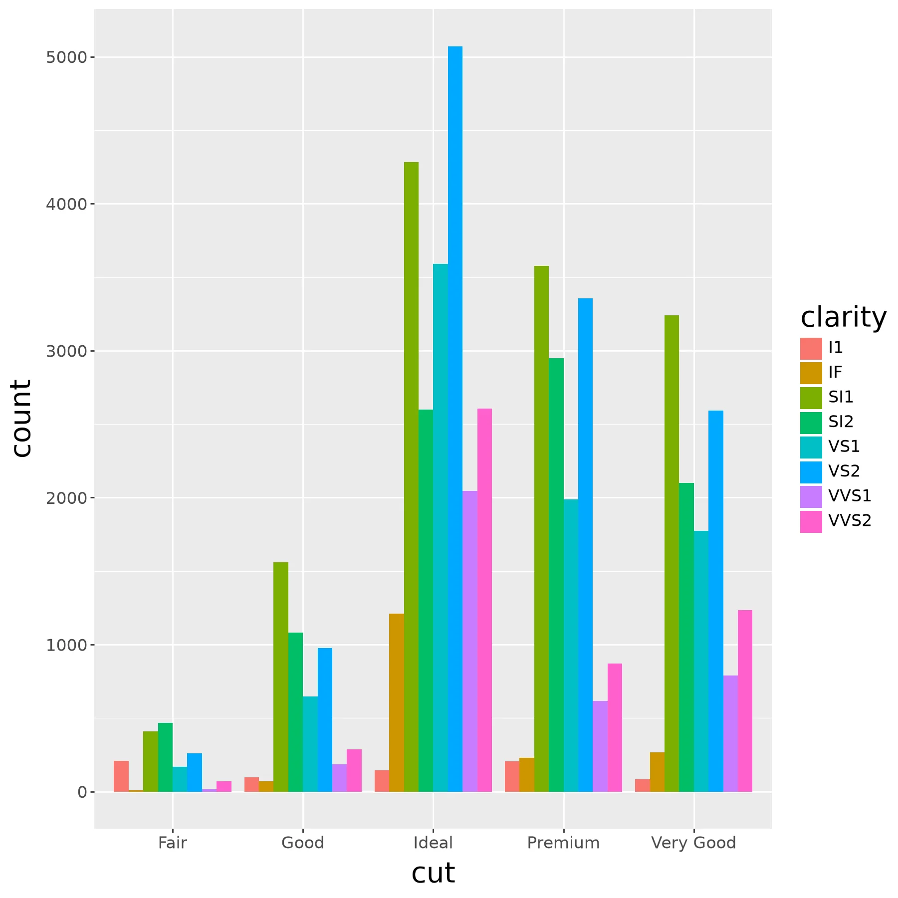
(ggplot(diamonds) +
  aes(x='cut', fill='clarity') +
  geom_bar(position = 'dodge'))
Code:
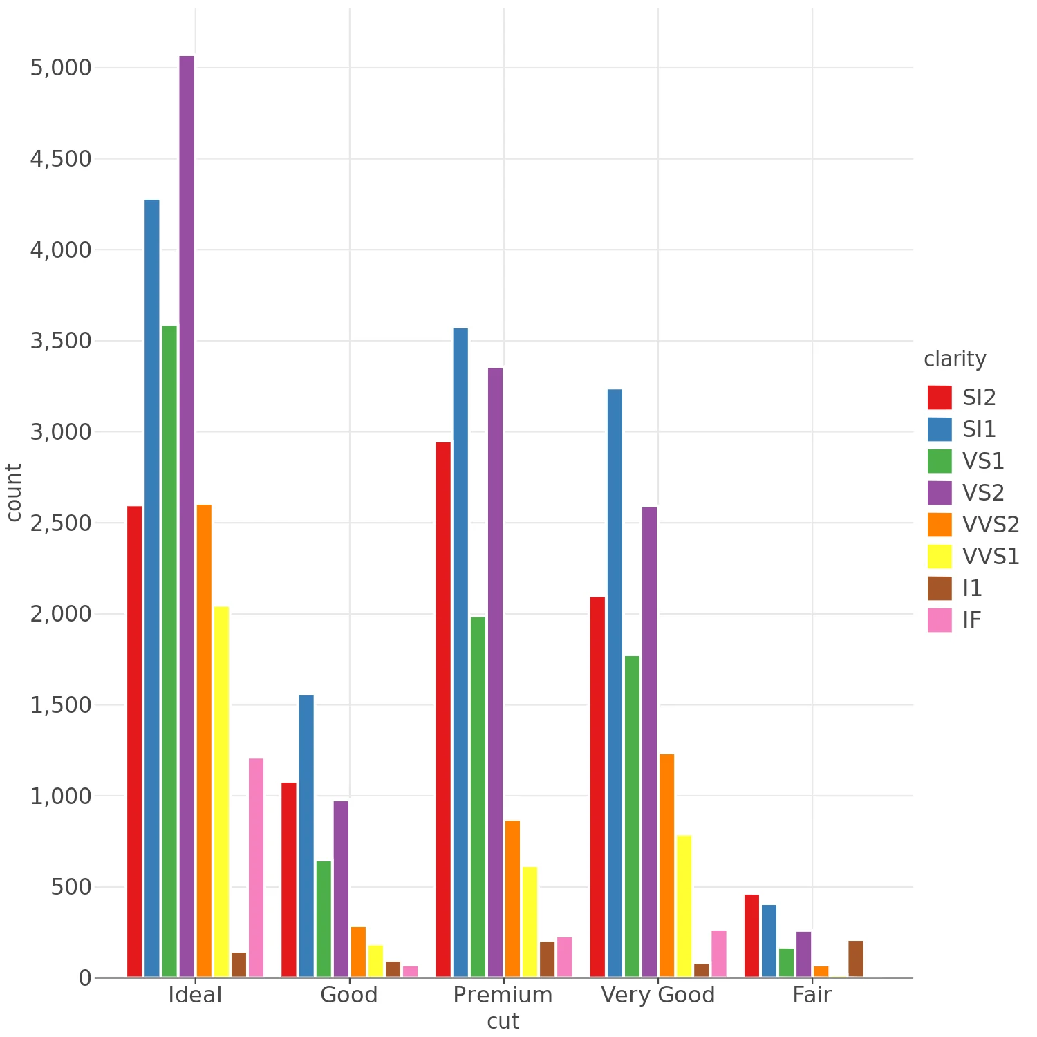
(lp.ggplot(diamonds) +
  lp.aes(x='cut', fill='clarity') +
  lp.geom_bar(position='dodge'))
Code:
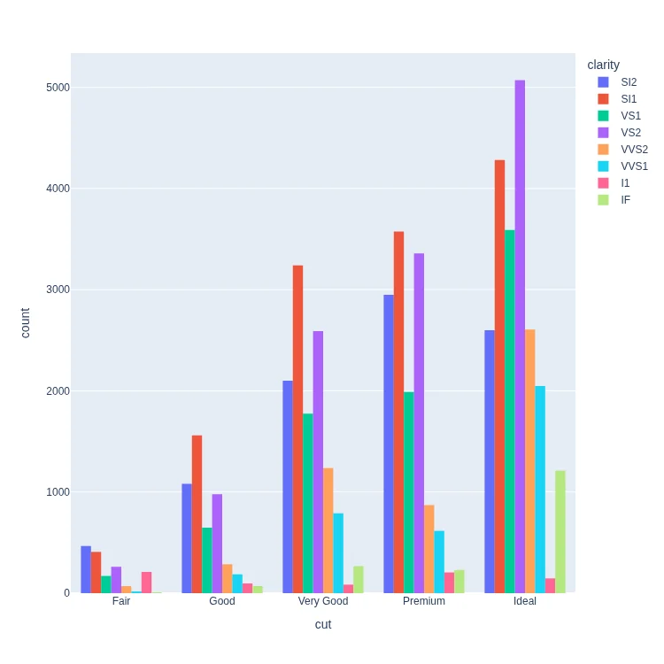
px.histogram(
    diamonds, x='cut', color='clarity', barmode='group',
    category_orders=dict(cut=[
     'Fair', 'Good',  'Very Good',
     'Premium', 'Ideal'])
)
Code:
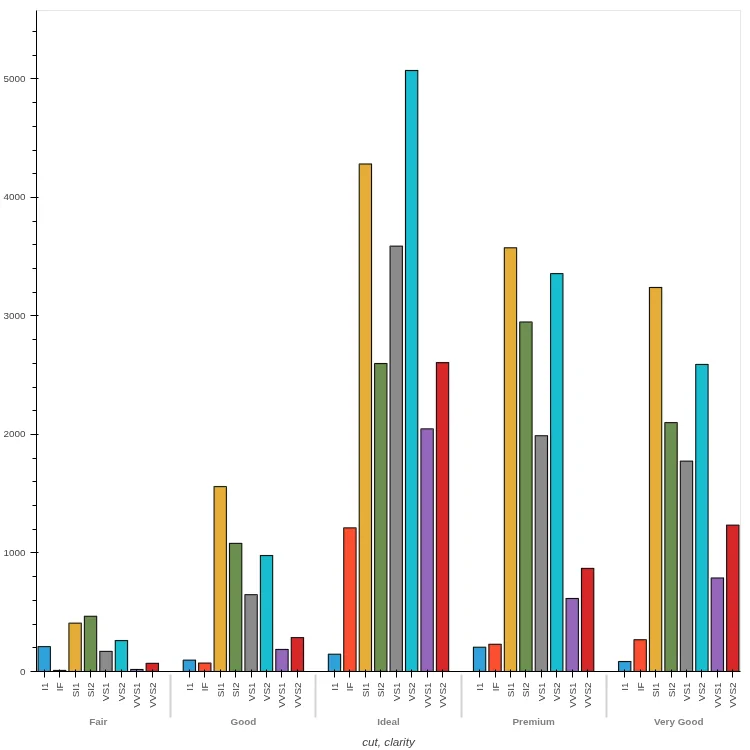
(diamonds
 .groupby(['cut', 'clarity'])
 .size()
 .unstack()
 .hvplot.bar(stacked=False, rot=90,
             fontscale=0.9))
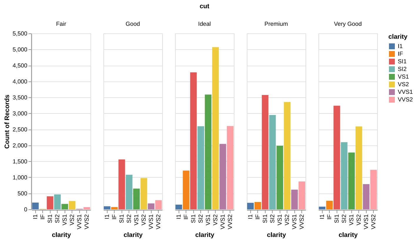
Code:
alt.data_transformers.disable_max_rows()
alt.Chart(diamonds).mark_bar().encode(
    x='clarity',
    y='count(cut)',
    color='clarity',
    column='cut',
).properties(width=100)
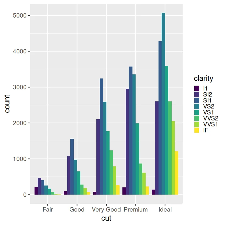
Code:
ggplot(data = diamonds) +
  aes(x = cut, fill = clarity) +
  geom_bar(position = 'dodge')
Stacked KDE Plot#
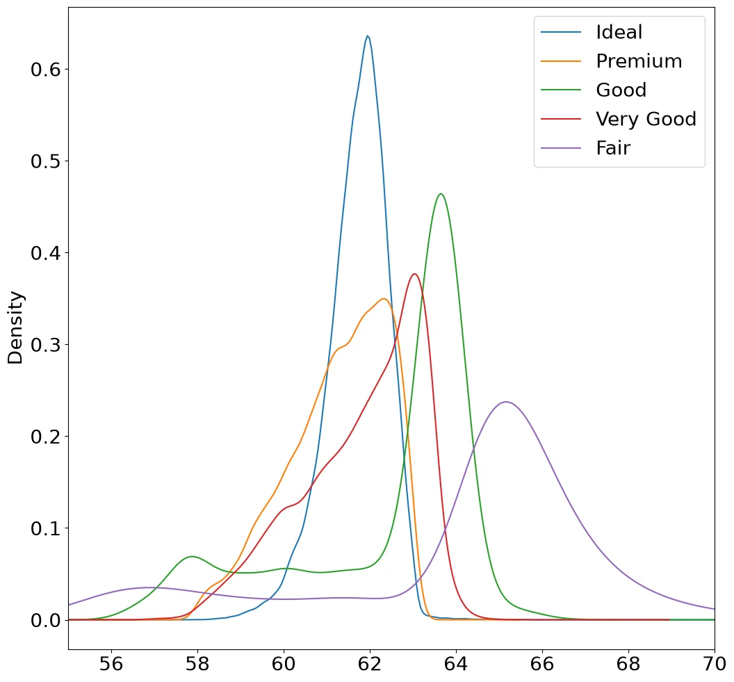
Code:
fig, ax = pyplot.subplots()
ax.set_xlim(55, 70)
for cut in diamonds['cut'].unique():
    s = diamonds[diamonds['cut'] == cut]['depth']
    s.plot.kde(ax=ax, label=cut)
ax.legend()
Note:
I don't know whether Pandas can fill a KDE curve.
This requires using some Matplotlib to get them to stack and to have a legend.
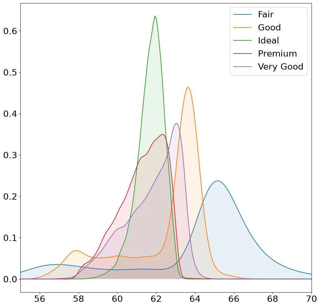
Code:
from scipy.stats import gaussian_kde

grid = np.linspace(55, 70, 200)
fig, ax = pyplot.subplots()
for cut, d in diamonds.groupby('cut')['depth']:
    density = gaussian_kde(d)(grid)
    ax.fill_between(grid, density, alpha=.1)
    ax.plot(grid, density, label=cut)
ax.set_xlim(55, 70)
ax.legend()
Note:
Matplotlib has no density estimator, so the
KDE comes from scipy. set_xlim clips the axis
ggplot2's xlim() drops rows first.
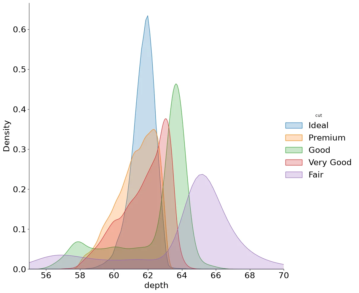
Code:
(sns
  .FacetGrid(diamonds,
             hue='cut',
             height=10,
             xlim=(55, 70))
  .map(sns.kdeplot, 'depth', fill=True)
 .add_legend()
)
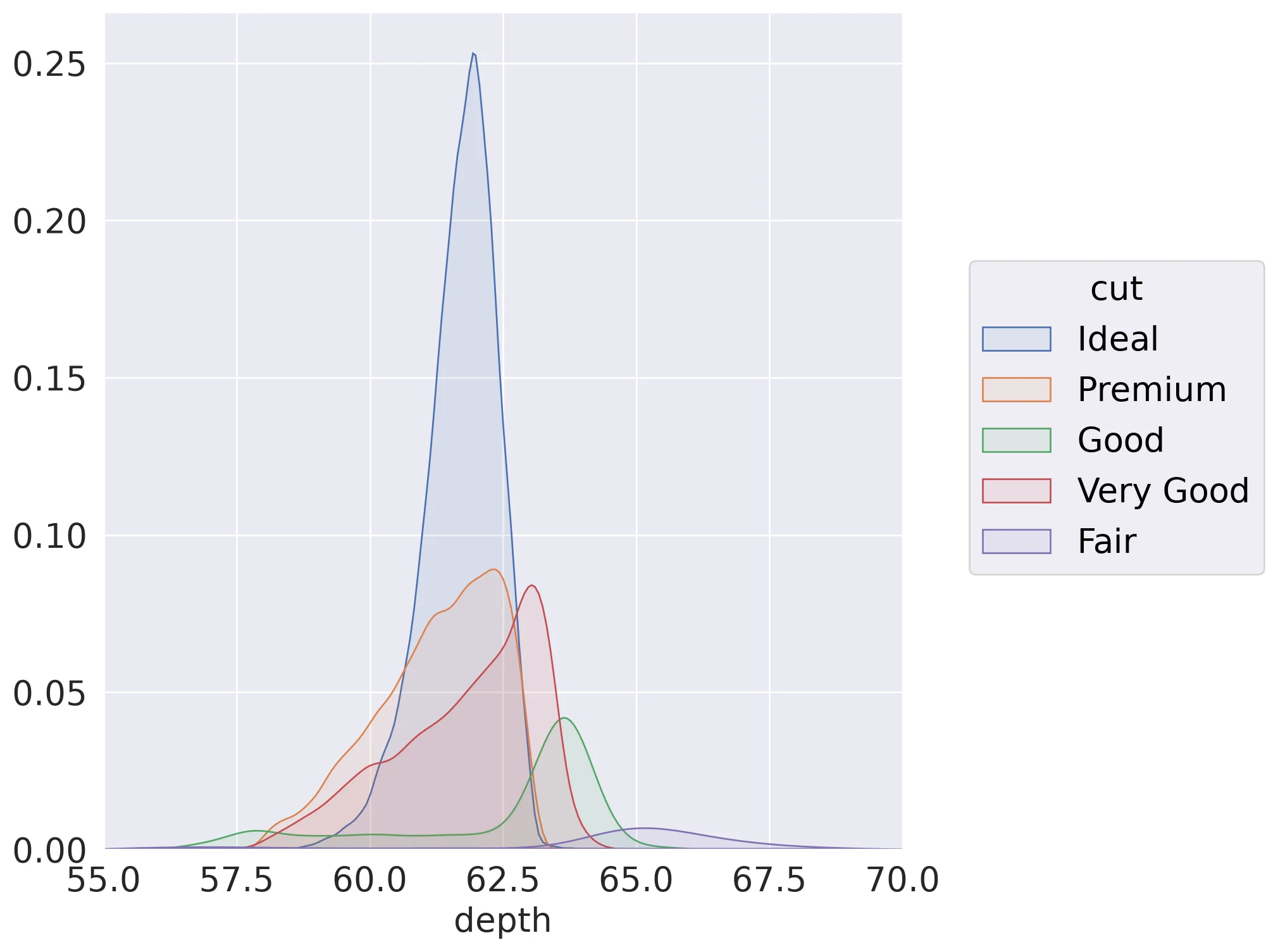
Code:
(so.Plot(diamonds, x='depth', color='cut')
 .add(so.Area(alpha=.1), so.KDE(gridsize=500))
 .limit(x=(55, 70)))
Note:
.limit() only clips the axis unlike ggplot2's
xlim() it does not drop rows before the density is
estimated.
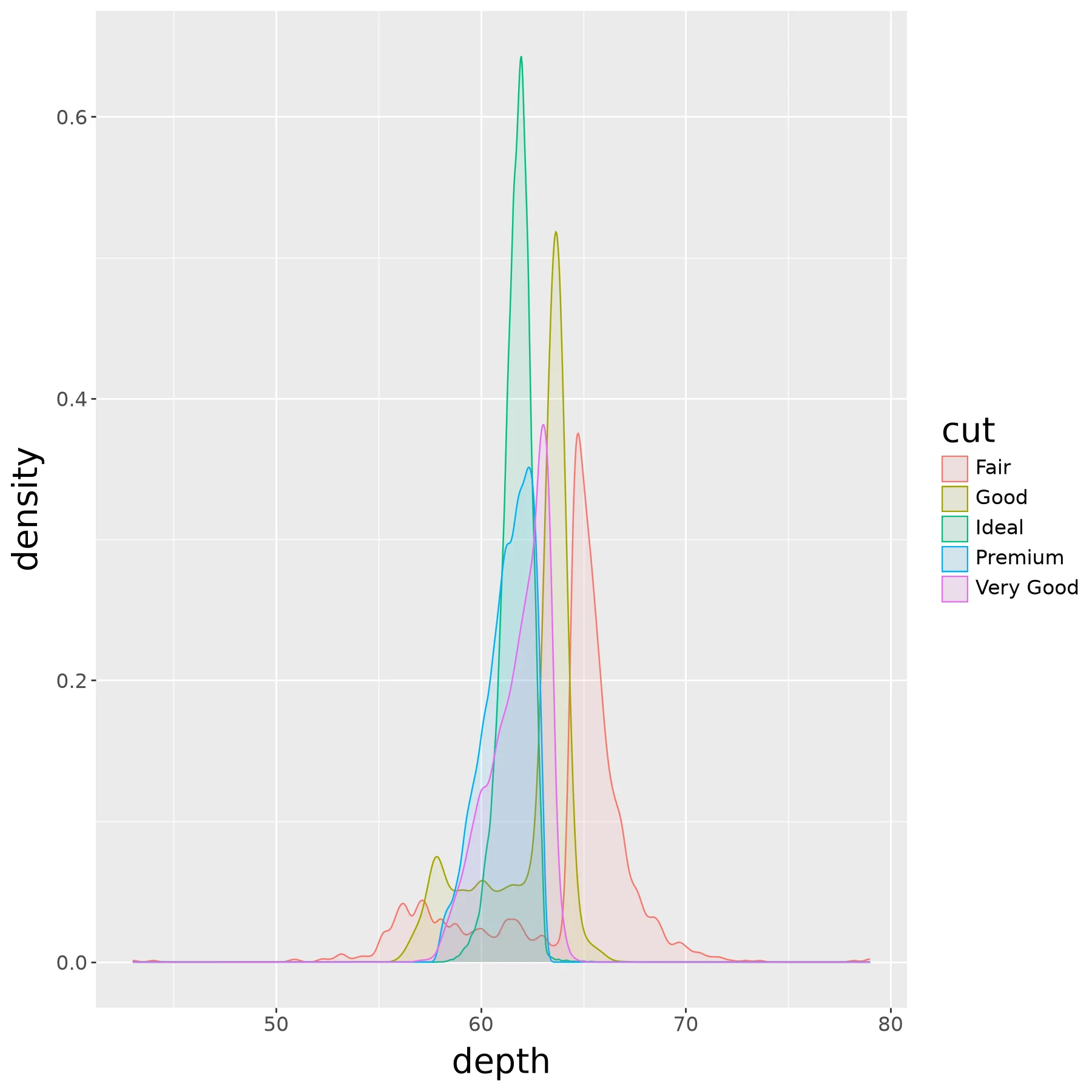
Code:
(ggplot(diamonds) +
  aes('depth', fill='cut', color='cut') +
  geom_density(alpha=0.1))
Note:
+ xlim(55, 70) results in an error.
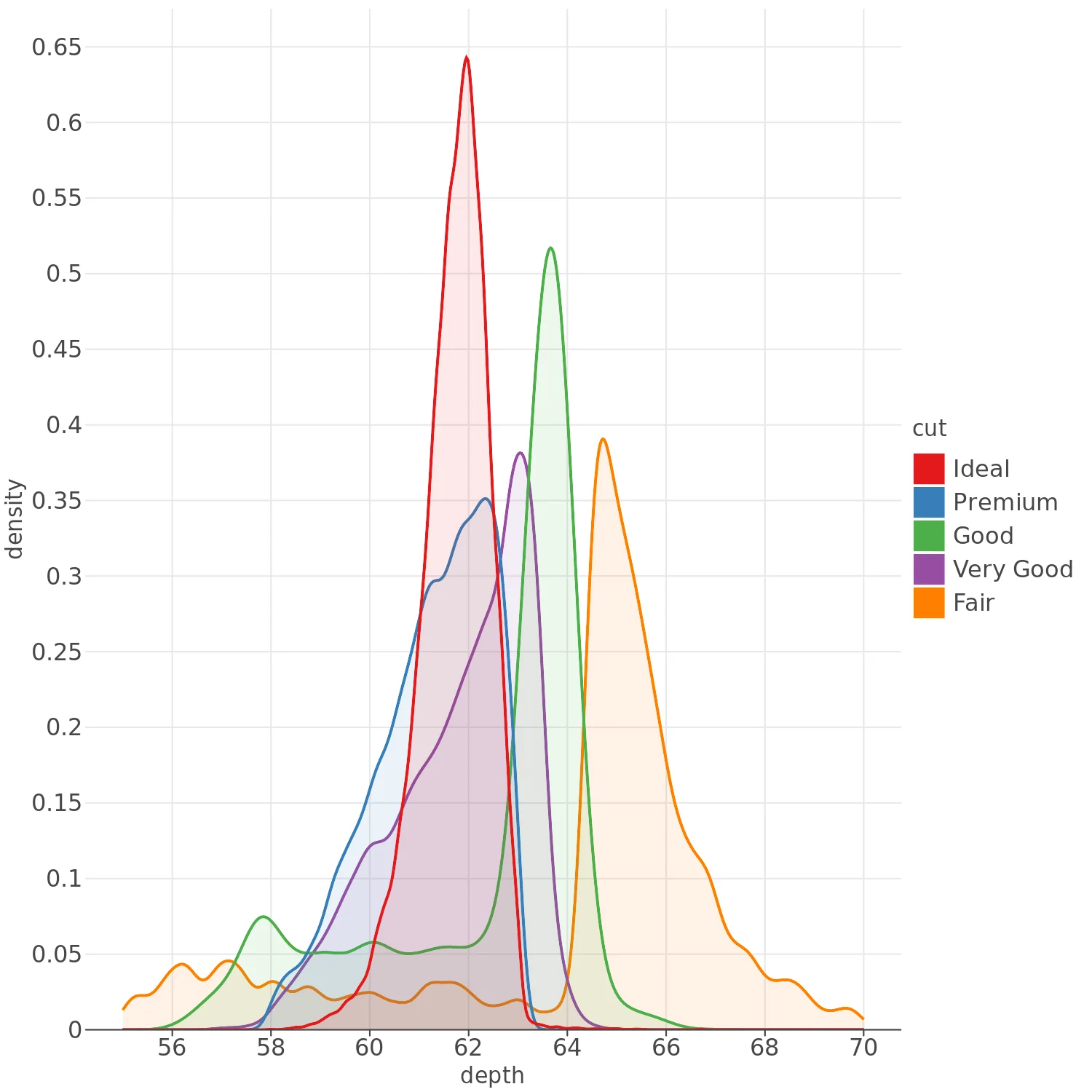
Code:
(lp.ggplot(diamonds) +
  lp.aes('depth', fill='cut', color='cut') +
  lp.geom_density(alpha=0.1) +
  lp.xlim(55, 70))
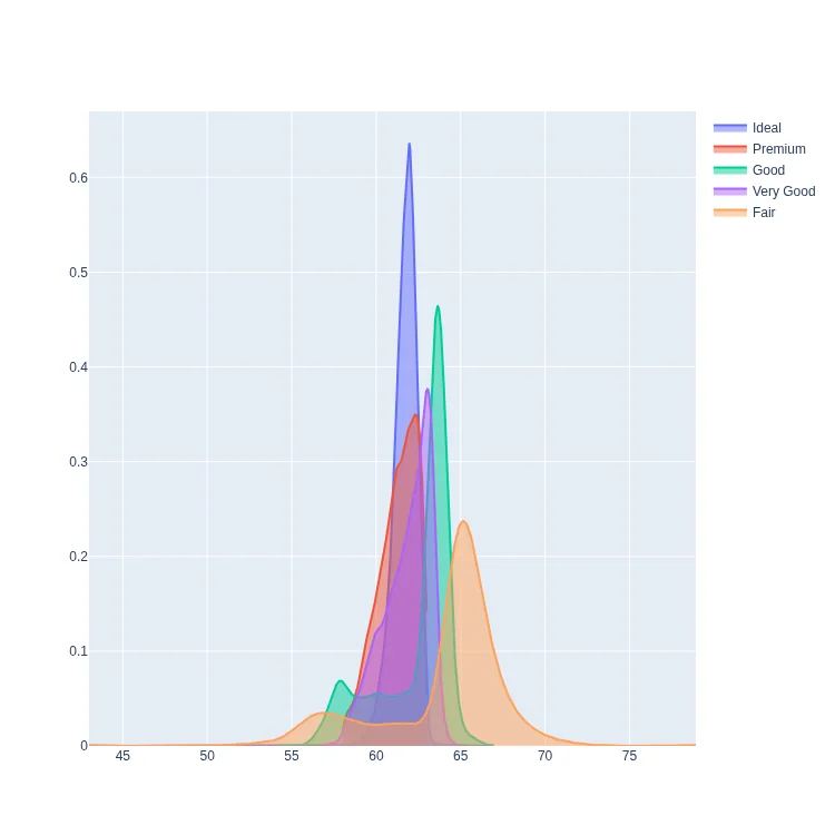
Code:
from scipy.stats import gaussian_kde

fig = graph_objects.Figure()
for cut in diamonds['cut'].unique():
    depth = diamonds.loc[
        diamonds['cut'] == cut, 'depth']
    grid = np.linspace(
        depth.min(), depth.max(),
        500, endpoint=False)
    fig.add_trace(graph_objects.Scatter(
        x=grid, y=gaussian_kde(depth)(grid),
        mode='lines', fill='tozeroy',
        name=cut))
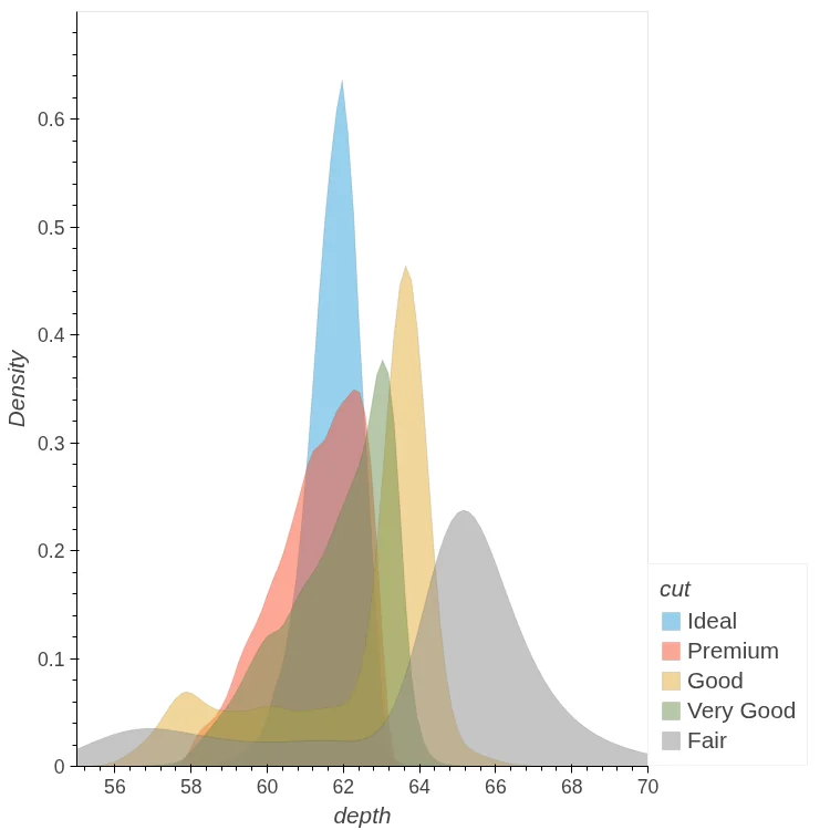
Code:
diamonds.hvplot.kde(
    y='depth', by='cut',
    alpha=0.1, xlim=(55, 70))
Note:
xlim only clips the axis. Unlike ggplot2's
xlim() it doesn't drop rows before the
densities are estimated.
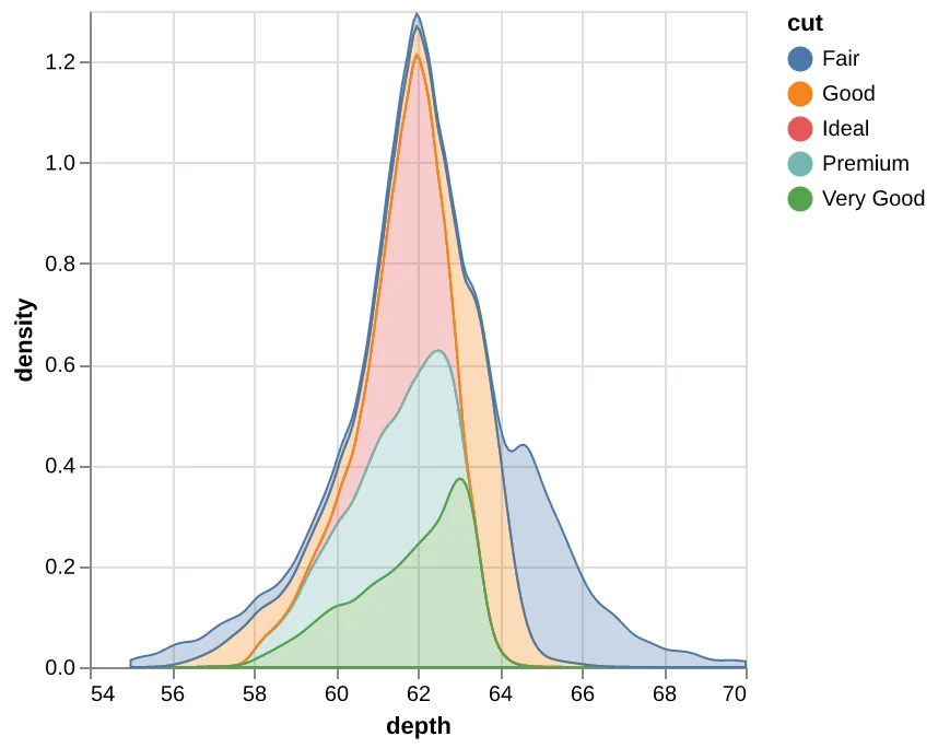
Code:
alt.data_transformers.disable_max_rows()
alt.Chart(diamonds).transform_density(
    'depth',
    as_=['depth', 'density'],
    groupby=['cut'],
    extent=[55, 70],
).mark_area(fillOpacity=0.3,).encode(
    x='depth',
    y='density:Q',
    color='cut',
    stroke='cut',
)
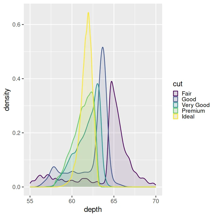
Code:
ggplot(diamonds) +
  aes(depth, fill = cut, colour = cut) +
  geom_density(alpha = 0.1) +
  xlim(55, 70)
Heatmap#
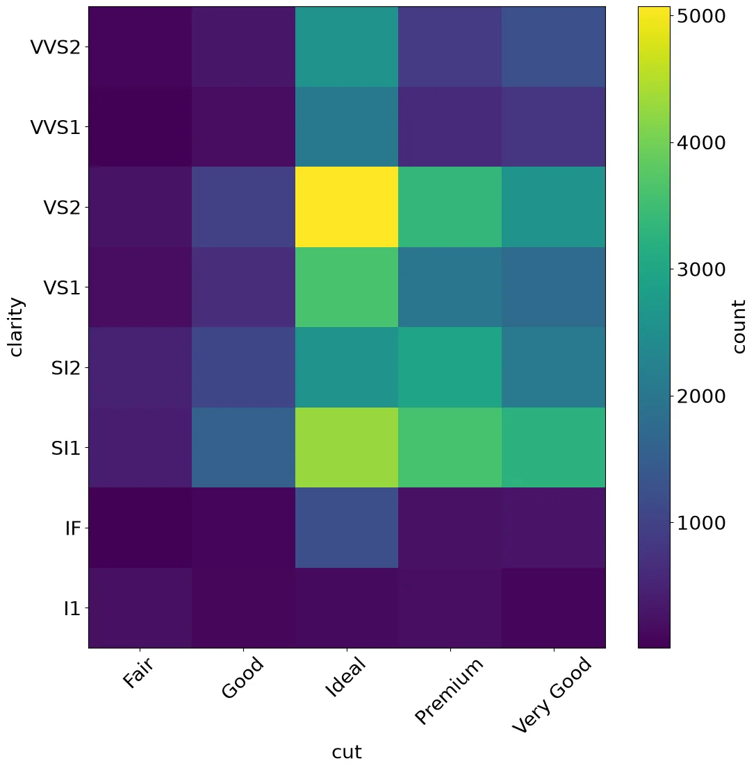
Code:
counts = (diamonds
          .groupby(['clarity', 'cut'])
          .size()
          .unstack())
fig, ax = pyplot.subplots()
mesh = ax.pcolormesh(counts.values)
ax.set_xticks(
    np.arange(len(counts.columns)) + .5,
    counts.columns, rotation=45)
ax.set_yticks(
    np.arange(len(counts.index)) + .5,
    counts.index)
ax.set_xlabel('cut')
ax.set_ylabel('clarity')
fig.colorbar(mesh, label='count')
Note:
Matplotlib has no heatmap function, so the
counts are pivoted and drawn with pcolormesh.
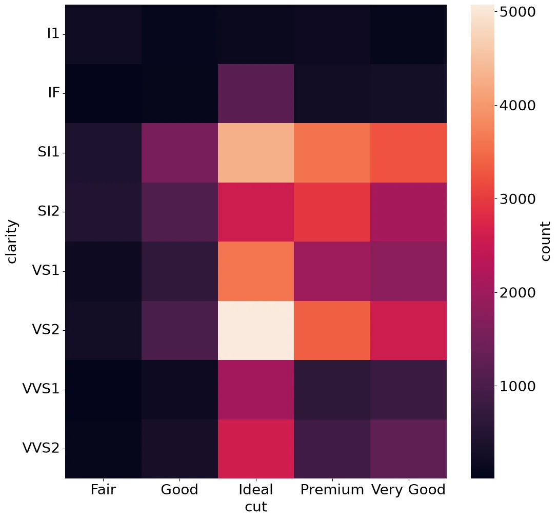
Code:
counts = (diamonds
          .groupby(['clarity', 'cut'])
          .size()
          .unstack())
ax = sns.heatmap(
    counts, cbar_kws=dict(label='count'))
ax.tick_params(axis='y', rotation=0)
Note:
heatmap colors a matrix, so the counts are
pivoted into one first.
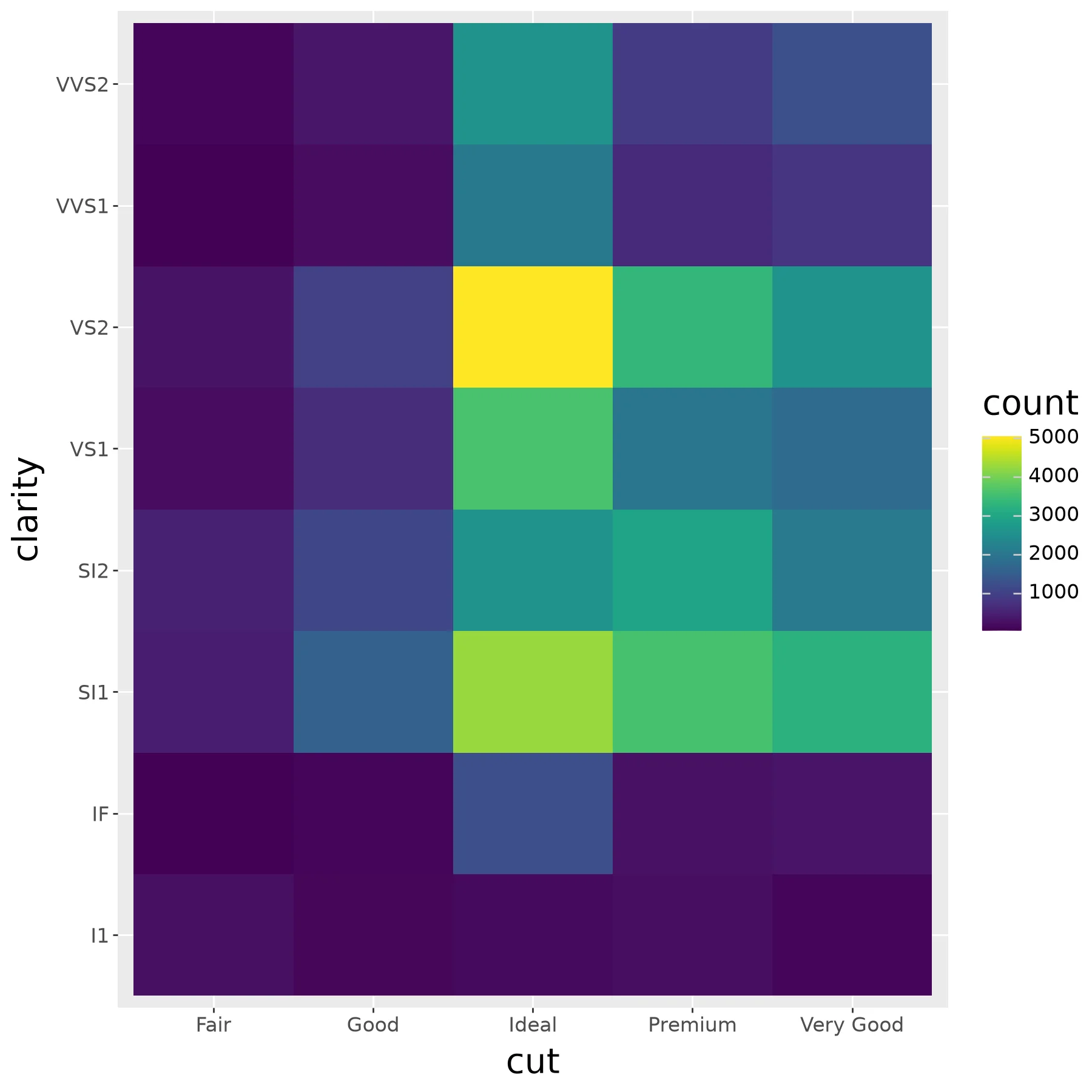
Code:
counts = (diamonds
          .groupby(['cut', 'clarity'])
          .size()
          .reset_index(name='count'))
(ggplot(counts) +
    aes(x='cut', y='clarity', fill='count') +
    geom_tile())
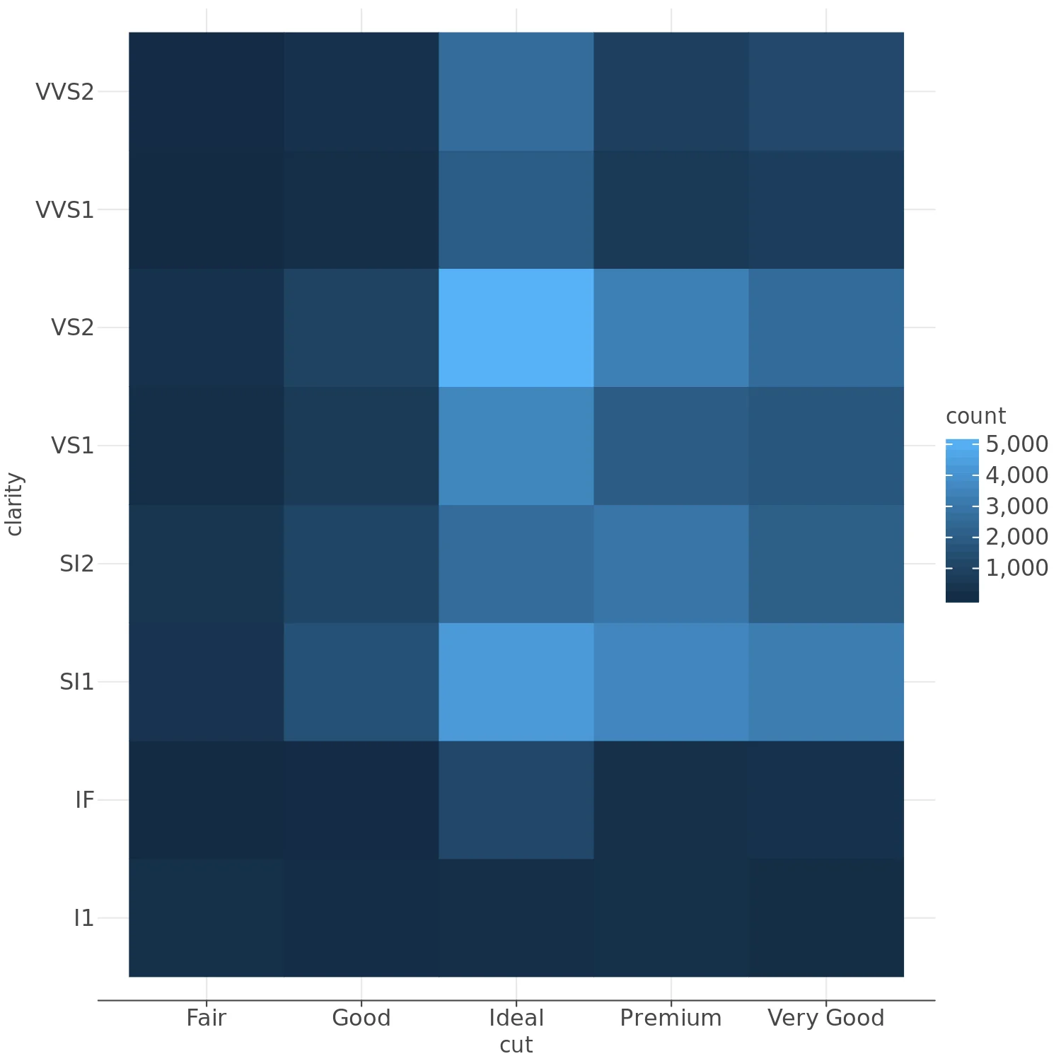
Code:
counts = (diamonds
          .groupby(['cut', 'clarity'])
          .size()
          .reset_index(name='count'))
(lp.ggplot(counts) +
    lp.aes(x='cut', y='clarity',
           fill='count') +
    lp.geom_tile())
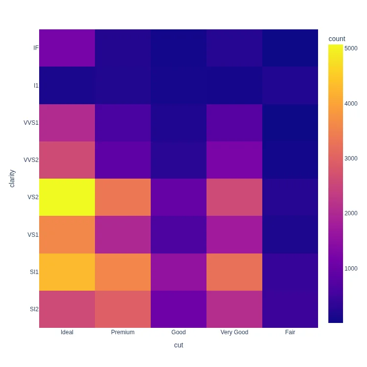
Code:
px.density_heatmap(
    diamonds, x='cut', y='clarity'
)
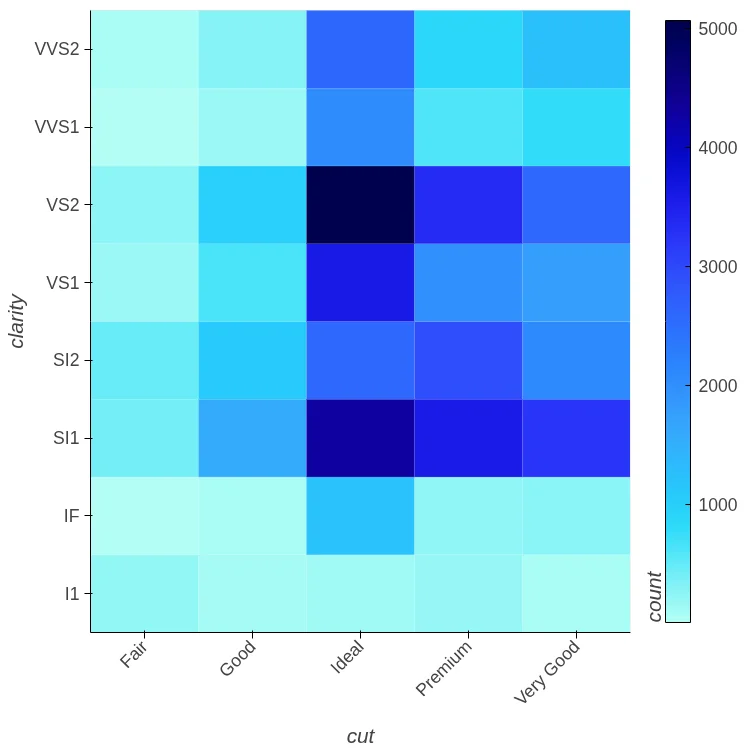
Code:
(diamonds
 .groupby(['cut', 'clarity'])
 .size()
 .reset_index(name='count')
 .hvplot.heatmap(x='cut', y='clarity',
                 C='count', rot=45))
Note:
hvPlot needs the counts up front C names
the column that colors each tile.
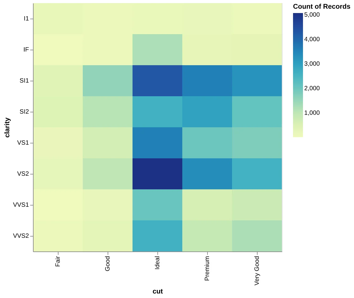
Code:
alt.data_transformers.disable_max_rows()
(
    alt.Chart(diamonds)
    .mark_rect()
    .encode(
        x='cut', y='clarity',
        color='count()',
    )
    .properties(width=400, height=400)
)
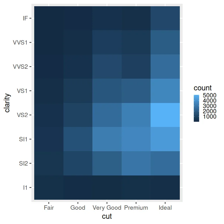
Code:
counts <- as.data.frame(
    table(cut=diamonds$cut,
          clarity=diamonds$clarity),
    responseName='count')
ggplot(data=counts) +
    aes(x=cut, y=clarity, fill=count) +
    geom_tile()

Note:
seaborn.objects has no
coord_flip, so the categorical variable is mapped toyinstead.